- Design Tips
- Tips & Tutorials

The Power of Color: How to Apply Color Theory in Your Presentations
Stop putting your audience to sleep with boring presentations learn how to apply color theory for a more impactful and engaging design..
In the digital age , presentation skills are more important than ever . With countless slideshows, webinars, and virtual meetings happening every day, it’s easy for your message to get lost in the noise. That’s where color theory comes in.
Color theory is the science and art of using color to create a harmonious and impactful visual experience . By understanding how colors interact and how they affect our mood and perception, you can take your presentations from boring to brilliant.
In this article, we’ll explore the basics of color theory and how you can apply it to your presentations to create a lasting impression on your audience. We’ll cover everything from color psychology to color combinations and show you how to use them to create compelling and effective presentations.
First, we’ll dive into the psychology of color . Did you know that different colors can elicit different emotional responses from your audience? For example, red is often associated with passion and energy, while blue is often associated with calmness and trustworthiness. By understanding the psychological impact of colors, you can use them strategically to enhance your message and connect with your audience on a deeper level.
Next, we’ll explore color combinations . Choosing the right colors can make or break your presentation. We’ll teach you the basics of color harmonies and show you how to create eye-catching color schemes that are both aesthetically pleasing and effective at conveying your message.
We’ll also cover practical tips on how to use color in your presentations , such as how to choose the right font color, how to use color to highlight important information, and how to avoid common mistakes that can detract from your message.
By the end of this article, you’ll have a solid understanding of color theory and how to apply it to your presentations . You’ll be able to create stunning visuals that capture your audience’s attention and leave a lasting impression. So, whether you’re a seasoned presenter or a beginner just starting out, this article is for you. Get ready to take your presentations from boring to brilliant with the power of color theory.
Psychology of Color
Color has a powerful impact on our emotions and perception. Understanding the psychology of color can help you use it to your advantage in your presentations, making them more engaging, memorable, and effective.

Let’s start with red. Red is a high-energy color that is often associated with passion, excitement, and urgency. It can stimulate the senses and increase heart rate and blood pressure. That’s why you’ll often see it used in advertising and marketing to grab people’s attention and create a sense of urgency. However, too much red can be overwhelming and even aggressive, so use it sparingly and strategically.
These are just a few examples of how color can affect our emotions and perception . By understanding the psychology of color, you can use it to your advantage in your presentations, creating a visual experience that not only looks great but also resonates with your audience on a deeper level and create the mood and atmosphere you want. So, choose your colors wisely and get ready to make an impact with the power of color psychology. Remember to balance colors appropriately and use them strategically to enhance your message and connect with your audience on a deeper level.
Color Combinations
Choosing the right color scheme for your presentation can be a daunting task, but it’s essential to creating a cohesive and impactful visual experience for your audience. Here are some tips on how to explore color combinations and choose the right colors for your presentation.
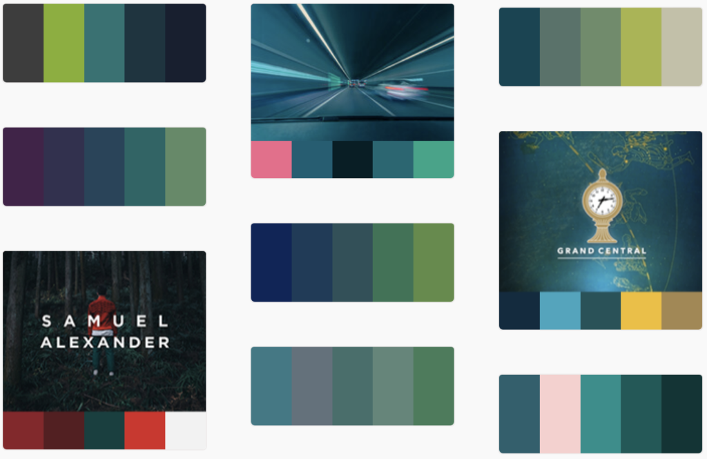
Start with a color wheel
A color wheel is a great tool for exploring color combinations. It shows the relationship between primary, secondary, and tertiary colors and can help you create complementary, analogous, or triadic color schemes. Play around with different combinations to see what works best for your message and brand.
Consider your brand
If you have an established brand, you may want to use your brand colors in your presentation to reinforce brand recognition. If not, consider the values and message of your presentation and choose colors that reflect those. For example, if your presentation is about nature, you may want to use green and earth tones.
Think about the mood
Different colors evoke different emotions and moods. Consider the mood you want to create in your presentation and choose colors that reflect that. For example, if you want to create a calming and peaceful atmosphere, you may want to use light blues or soft pastels.
Use contrast
Contrast can make your presentation more visually interesting and help important information stand out. Choose colors that contrast well with each other, such as black and white or red and green. But be careful not to use too many contrasting colors, as it can be overwhelming for your audience.
Keep it simple
Too many colors can be distracting and take away from your message. Stick to a few main colors and use them consistently throughout your presentation. This will create a more cohesive and professional look.
Consider accessibility
It’s important to choose colors that are accessible to all individuals, including those with color blindness. Avoid using color alone to convey important information and use high-contrast color combinations to make it easier for everyone to read and understand.
Test it out
Before your presentation, test out your color scheme on different devices and screens to ensure it looks good in all environments. You can also ask a few colleagues or friends for their feedback on the color scheme and adjust as needed.
In summary, exploring color combinations and choosing the right colors for your presentation takes some thought and consideration. Use a color wheel, consider your brand and the mood you want to create, use contrast, keep it simple, consider accessibility, and test it out. By following these tips, you can create a visually appealing and effective presentation that connects with your audience on a deeper level.
How to Choose the Right Color s for Presentations
Using color effectively in your presentations is an important part of creating a visually engaging and impactful experience for your audience. Here are some practical tips on how to use color in your presentations.
Choose the right font color
Font color is crucial for readability, so it’s important to choose a color that contrasts well with your background. For example, black or dark gray text works well on a light background, while white or light text is better on a dark background. Avoid using light-colored text on a light background or dark-colored text on a dark background, as it can be difficult to read.
Use color to highlight important information
Color can draw attention to important information and help it stand out from the rest of the content. Use a contrasting color to highlight key points, such as statistics or quotes. But be careful not to overdo it, as too much color can be overwhelming and detract from your message.

Create a consistent color scheme
A consistent color scheme can make your presentation look more polished and professional. Choose a few main colors and use them consistently throughout your presentation. This includes font color, background color, and accent colors. Use shades of the same color to create depth and interest.

Avoid common color mistakes
There are a few common mistakes that can detract from your message. For example, using too many bright or clashing colors can be distracting, while using too many pastel or muted colors can be boring. Avoid using neon colors, as they can be difficult to read and can give your presentation an unprofessional look.
Consider cultural differences
Different cultures can associate different meanings with colors. For example, in Western cultures, white is often associated with purity and innocence, while in some Asian cultures, it’s associated with mourning. Be mindful of the cultural context of your audience and choose colors that are appropriate.
Use color in charts and graphs
Charts and graphs can be made more visually appealing and easier to understand by using color to differentiate data sets. Use consistent colors throughout the chart or graph to create a clear visual hierarchy.

In summary, using color effectively in your presentations requires some thought and consideration. Choose the right font color, use color to highlight important information, create a consistent color scheme, avoid common color mistakes, consider cultural differences, and use color in charts and graphs. By following these practical tips, you can create a visually engaging and impactful presentation that resonates with your audience.
Tips and Tricks: How to Make Your Presentation Look Professional
Applying the theory of color to your presentations can take your design game to the next level. Here are some tips on how to apply color theory effectively in your presentations , along with some modern design tips to enhance your visuals .
Understand the basics of color theory
Understanding color theory is essential to using color effectively in your presentations. It’s important to understand the different color schemes, such as complementary, analogous, and monochromatic, and how they can be used to create visual interest and harmony. Additionally, knowing the emotions and associations that are commonly associated with certain colors can help you create a mood or convey a message.
Choose a color palette
Once you have a basic understanding of color theory, it’s time to choose a color palette for your presentation. You can choose a color palette based on your brand colors, the theme of your presentation, or the emotions you want to evoke. Stick to a limited color palette to keep your design cohesive and avoid overwhelming your audience.
Create visual interest with contrast
Contrast is important for creating visual interest and directing the viewer’s attention. Use contrasting colors to create a hierarchy of information and draw attention to important elements. This can include using a bright color for headings or important text, or using a contrasting color for buttons or calls to action.
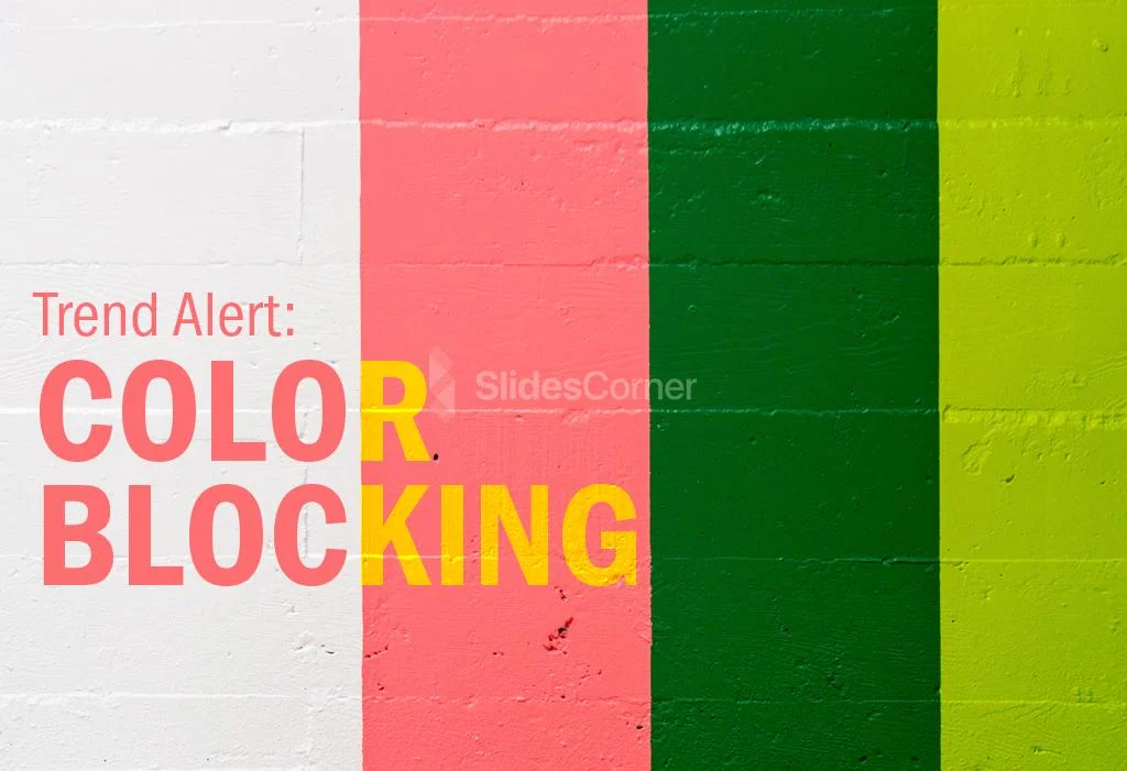
Use color blocking
Color blocking is a modern design trend that involves using large areas of color to create a bold and impactful design. Use color blocking to create a strong visual hierarchy and make important information stand out. For example, you can use a bright color for the background of a slide and use a contrasting color for the text.
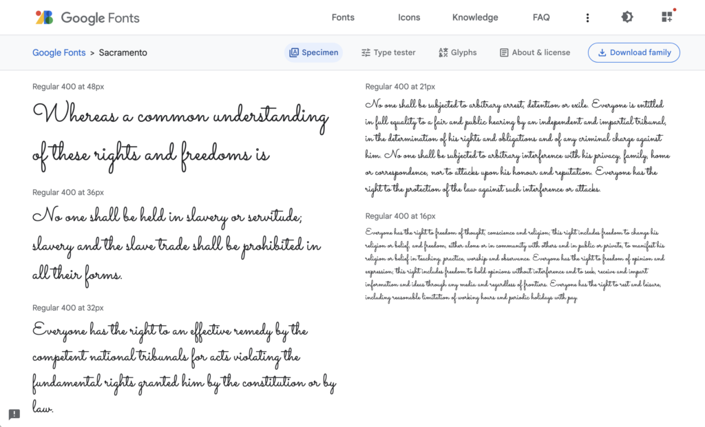
Consider typography
Typography is an important part of design, and it’s essential to consider the relationship between your font and your color palette. Choose fonts that complement your color palette and create a harmonious design. Use a bold font for headings and a more subtle font for body text. You can use a free tool like Google Fonts to search for the right font.
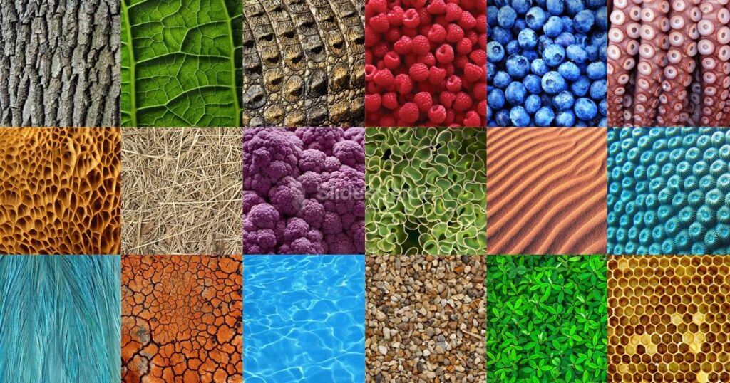
Add texture
Texture can add depth and interest to your design, and it can be achieved through the use of patterns or images. Use texture sparingly, as too much can be overwhelming. Consider using texture to add visual interest to backgrounds or to create contrast between different elements. Also, you can use our free backgrounds to enhance your slides.
In conclusion, applying the theory of color to your presentations requires a basic understanding of color theory, the ability to choose a color palette, creating contrast, using color blocking, considering typography, and adding texture. By following these tips, you can create a visually engaging and modern design that effectively communicates your message to your audience.
YOU MAY ALSO LIKE:

Download these aesthetic intense color gradient backgrounds to improve your PPT or Google Slides presentations.

Are you ready to create presentations that captivate and engage children? Follow these tips and…

Discover indispensable strategies to craft conference presentations that captivate and resonate with your audience.

Keeping your audience's attention for long periods can be one of the biggest challenges whilst…

Slideshows are quick to produce, easy to update and an effective way to inject visual…
Tags for this article
Share this article on social media, you may also like.
The Ultimate Guide to Creating Conference Presentations That Resonate with Your Audience
Creating Conference Presentations: A Guide to Captivating Your Audience
- Slidesgo School
- Presentation Tips
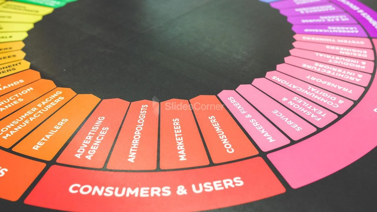
How to Choose the Best Colors for Your Presentations

Choosing colors for your slides is one of the most crucial decisions to make even before starting to work on your Google Slides or PowerPoint presentation. Basically, colors can help you communicate your message more effectively, and they can evoke many different feelings or emotions on your audience. Keep reading to find out how to choose the best colors for your presentation.
Color Psychology
Color temperature, neutral colors, some tips on how to combine colors for your presentation.
It is quite important to know how your audience perceives colors and how these are related to the topic you are talking about. For example, red can convey a sense of danger, but also love, depending on the context. These are some common connotations that colors have on humans:
- Red : Evokes passion and strength. It’s an energetic and intense color that represents power and determination. It’s usually present on brands related to beverages, gaming and the automotive industry.
- Blue : Conveys a sense of security, confidence, responsibility and calmness. It is the most representative color in the healthcare and finance industries.
- Yellow : This is the color of light. It is a stimulating color that conveys energy, awakes awareness and inspires creativity. You will surely find yellow in the food industry.
- Green : Undeniably, the color of nature, life and peace. This color conveys a sense of growth, balance and stability like no other. It is quite popular among big companies, especially in the energy and tech industries.
- White : It is considered the color of purity and innocence. When it comes to evoking simplicity, optimism and integrity, white is second to none. You will find it for sure in the healthcare industry, and it is making its way in the fashion industry too.
- Black : Even though black is associated with seriousness, it can also convey elegance and courage. Fashion brands and luxury products make good use this color.
Take note of these hints and try to choose the color that best suits your message. For example, in this template we used bright and vibrant colors, since it is an education-themed presentation intended for a very young audience:

Click here to download this template
Colors can be grouped based on their temperature , which can be determined by comparing any given color in the visible spectrum with the light that a black body would emit when heated at a specified temperature. So, according to their temperature, there are two groups of colors:
- Warm colors: These range from red and orange to yellow. If you click on the footer below, you will be able to download one of our templates containing a palette full of warm colors:

- Cool colors: These range from green and blue to violet. Again, click on the footer below to download a template that contains cool colors:

Mainly, warm colors convey energy and optimism—it is like giving a warm reception to your audience. On the other hand, cool colors are associated with serenity and confidence, just what you need to have a peaceful time.
White, black and all shades of gray are not considered neither warm nor cool. In fact, we could say colors such as creme, beige, brown and others with a high amount of gray are also neutral. These colors do not influence others and can actually be combined with almost any color. As for their meaning, elegance and solemnity are pretty much guaranteed, as well as harmony. When combining neutral colors, oftentimes a bright color is used as a contrast to highlight certain elements and bring them to the front. Click on the footer below to see an example of a presentation with neutral colors:

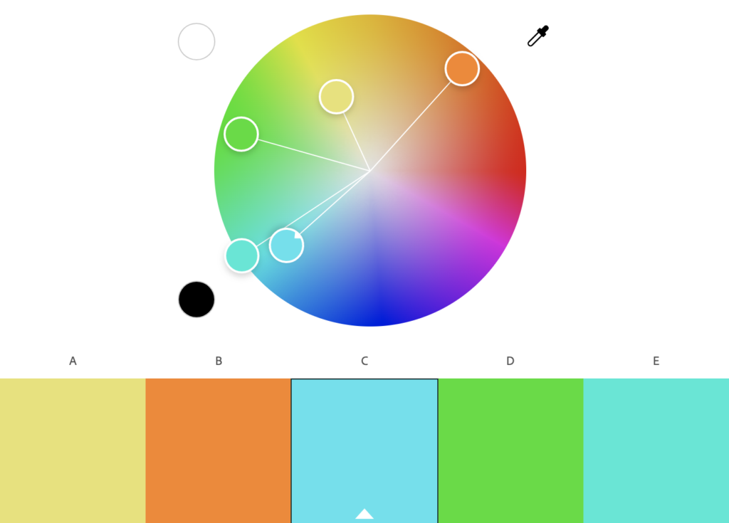
To achieve a nice color harmony and make the most of it, it is best if you take into account the color wheel, as well as the concepts of hue, saturation and brightness.
- Hue is basically what differentiates a color from any other. Thanks to the hue, you can visually tell apart red from blue, for example.
- Brightness defines how light or dark a hue is, and measures its capacity to reflect white light.
- Saturation refers to how pure a hue is. A saturated color appears more vivid, whereas a desaturated color looks duller.

With this information, you can make several different combinations:
- Monochromatic Color Scheme: These contain different shades of a single color. Click on the footer to see one of our monochromatic templates based on red.

- Complementary Color Scheme: These are composed of a pair of opposing colors on the color wheel. If you click on the footer below, you will be able to download a presentation template with this scheme.

Analogous Color Scheme: This scheme includes colors that are adjacent to each other on the color wheel. Click on the footer to see an example of this scheme applied to a presentation:

Triadic Color Scheme: This uses three colors equally spaced on the color wheel. Click on the footer to download a presentation that makes use of the triadic color scheme.

In order to get the best combination, you will need to consider how many colors you will use in each slide and how you will manage the contrast between them. These should also be suitable for your intended message or your brand. Finally, try not to overuse very intense colors—use them only for emphasis. Keep everything consistent by applying the same color to each instance of an element within your presentation (for example, use the same color in all the titles). Include illustrations or pictures that work well with the chosen palette. If you need to apply filters to the pictures, you can refer to our “ How to Apply Filters to the Pictures in Google Slides ” tutorial, or its PowerPoint equivalent. Some of our templates include color variants, making it so much easier for you to adapt them to your topic and/or brand. Just click one of the options that you will find below “Themes” on the right side of the screen.

Selecting color variants

Do you find this article useful?
Related tutorials.

New feature available: edit our templates with Canva
Whenever you need to create, Slidesgo is there. We’re continually enhancing your presentation design process with templates that are primed to impress for any occasion. And in order to let your ideas flow best, comfort is key. How could Slidesgo help you with this? By making you feel right at home with our resources, no matter your preferred platform.You spoke, and we listened. Now, your favorite slides can be accessed on a new platform: Canva! This new format adds to our existing options (PowerPoint and Google Slides), expanding your ways to utilize our first-rate presentation content. We’ve started with a selection of Canva-ready...

How to print PowerPoint notes
Crafting an impactful PowerPoint slideshow and delivering a captivating presentation are distinct skills. The first focuses on designing appealing visuals to convey a clear message, while the second involves employing effective presentation techniques to ensure the audience grasps the idea. The content of this article will help you with the latter part of this process, guiding future presenters on how to print PowerPoint with speaker notes to enhance your presentations success and effectiveness.

Discover Our Online Presentation Software for Free
We have great news for you today! If you’ve been a Slidesgo fan for years (or months, or weeks, or days, or mere hours, we welcome everyone!), you’ll probably know for now that our templates are available mostly in two formats: for use in Google Slides and PowerPoint.Google Slides is a free tool, since you only need a Google account in order to use it. PowerPoint, on the other hand, is part of the Microsoft Office suite, so it’s not a free program, but that didn’t stop it from being one of the most popular options in the world!What if we...

Webinar: Presentation Audit
With more than 15,000 templates released on Slidesgo and a user base composed of millions of people, we estimate that the total number of presentations created adds up to… um, a lot! Our team of professional designers work very hard to provide you with editable slides so that the only thing you need to do is, well, customize the elements to your liking. Starting from any given template, the results may vary a lot depending on the person who edited the contents.Have you ever wondered “Is my presentation good enough?” and wished that an expert on presentations looked at your template...
By Matt Moran January 3, 2024
22 Best PowerPoint Color Schemes to Make Your Presentation Stand Out in 2024
There’s nothing worse than an amateur PowerPoint presentation. If you’re going into a business meeting or sales pitch, your presentation slides should look as professional as you do. That’s why choosing the right color scheme is so important.
In this post, we’ll be sharing a roundup of 22 of the best PowerPoint color schemes you can use to make your presentation look the part.
All the color schemes on this list have been incorporated into templates created by professional designers, so they’re super-stylish and guaranteed to make your slides stand out.
Whether you’re an educator looking for a color scheme that will keep your students engaged, or a business professional who wants to make an impact in your next meeting, you’re sure to find something suitable below.
Tips for Choosing the Best PowerPoint Color Schemes
Before we jump into the roundup, let’s talk about how to choose the right color scheme for your needs. Here are a few things to bear in mind when you’re comparing your options.
1. Use High Contrast Colors
When it comes to color, contrast is the number one most important consideration. Text, icons, and other important graphics on your slides need to be highly readable, so you need to make sure to use high contrast colors for these elements.
In other words, use a color with a significantly different tone/brightness from your background. Certain colors are inherently lighter/darker than others. For example, blue is much darker than yellow. As such, these colors tend to pair well together.
I’d also recommend never combining warm and cold colors, like bright red on bright blue or vice versa. This is because human eyes have trouble distinguishing interactions between the different wavelengths, which causes eye fatigue.
2. Consider Color Associations (Psychology)
People have certain subconscious associations with different colors. For example, people associate blue with trust, calmness, and reliability, which makes it a safe choice for business presentations.
Green is associated with nature, peace, and organic products, which might make it a good choice if you’re working on a sales pitch for an eco-friendly product.
Black evokes sophistication, seriousness, evil, and mystery, so it can work just as well for spooky Halloween lesson PowerPoints as for high-end fashion brand presentations.
Try to choose a color scheme that fits the kind of associations you want to make. If you’re working on a brand PowerPoint presentation, a safe bet is to stick with your brand colors.
3. Always Use Gradients
In nature, colors rarely appear in solid blocks – they transition gradually from one hue to the next and blend into each other.
Because we’re used to seeing colors naturally act this way, you should try to do the same in your PowerPoint presentations by blending colors into each other using gradients. Blocks of solid color can look amateurish.
The good news is that all the templates on this list are designed by professionals who understand this and therefore use natural color gradients to create a professional look.
4. Choose the Right Color Scheme for Your Screen Type
Finally, don’t forget to consider the screen you plan on showcasing your PowerPoint presentation on. Darker color schemes will look good on close-up screens like tablets and desktops. However, lighter colors work better for projections as they tend to be more readable.
In particular, never use red text if you’re projecting your presentation onto an external screen, as if any kind of unwanted ambient light/glare hits the screen, the color will wash out. In fact, it’s best to avoid any brightly colored text if you’re using a projector.
22 Best PowerPoint Color Schemes
Alright, let’s jump into the list. Below, we’ve listed our top 22 favorite PowerPoint templates with awesome color schemes.
1. Shades of Grey and Yellow – Our Top Pick

If you’re looking for a darker color scheme to use for a business presentation, you can’t go wrong with the Hornette template. Darker shades of grey and black strike a serious tone that befits a corporate environment, which is offset by bold yellow highlights.
We like how the high contrast between the darker shades and the bold yellow can be used to direct the readers’ gaze to the most important elements on the page and make key messages stand out.
The template itself includes 50 slides, including a gallery and portfolio slide, and features creative layouts and useful graphics. All graphics can be resized and edited.
2. Teal and White

Teal is a color that blends blue’s dependability with green’s optimism and healing properties. The result is a calming, balanced color that’s packed with personality.
This multipurpose PowerPoint template uses teal alongside plenty of whitespaces and is perfect for business and personal presentations. All elements are fully editable, and if teal and white isn’t your style, you can pick another of the 5 included premade color schemes included.
3. Shades of Black

Dark themes are very on-trend right now. If you want to add a touch of sophistication to your presentation or strike a serious tone, you can’t go wrong with this Halbert PowerPoint template.
The all-black color scheme looks slick and elegant, and the white text is highly readable. This template works best when you don’t have to worry about room lighting, and might be a good fit for fashion presentations.
4. Color Fun

If you want something a little more upbeat, try this Color Fun PowerPoint template. It uses a wide color palette, which can help provide enough variety to better organize the different sections and elements on your slides.
It’s bright, upbeat, and sets a positive tone – without being too overwhelming. The designer has toned down the colors just enough that they’re not distracting and won’t cause eye fatigue.
5. Monochromatic Blue

This Tortoise PPT template uses a mix of light and darker blues to create a stylish, professional look. The download includes 150 slides in total, split into 5 colors (30 slides per variation). All graphics included are fully editable and resizable in PowerPoint.
6. Minimalist Light Colors

Bold and bright colors can work well but sometimes, it’s best to keep things simple. This clean and modern PowerPoint presentation follows the principle of minimalism, with very light shades like beige and pale green. It comes in a 1920x1080p format and includes a bunch of awesome icons and graphic elements that are fully vector editable.
7. Orange Burst

Orange is the most vibrant color in the color spectrum. It’s full of energy and life, so it’s perfect when you want to really get your audience excited about the contents of your presentation. This PowerPoint template from aqrstudio uses orange gradients alongside circular icons and graphics.
8. Yellows and Whites

If you’re looking for a yellow template, check out Soaring by Jumsoft. It features an energetic, professional design and includes 20 master slides in the standard 4:3 side, as well as charts, diagrams, tables, and other awesome visual elements. You can choose the layout that’s most suitable for your content and customize more or less everything in MS PowerPoint.

Pastels are the color trend of the year. These lighter, softer shades of colors have been embraced by younger generations like Millennials and Gen Z and have rapidly become associated with self-care for their ‘calming effect’. If you want to incorporate them into your PowerPoint color scheme, check out this pastel template by UnicodeID.
10. Organic Greens

Working on a food-related presentation for a culinary business? Or perhaps you’re putting together a pitch deck on an environmental topic? Either way, this organic green PowerPoint template has the perfect color scheme for you. It’s ideal for health and nature-related slides.
11. Bold Red and Black

The NOVA PowerPoint template by Artmonk uses a stunning red-on-black color scheme. It’s a bold color combination that packs a punch, so it’s great for presentations in which you’re trying to break the mold and make a statement. It’ll look great on screens but might not show up well on projector displays due to the dark background.
12. Bright Multicolor

Here’s another awesome multi-colored palette that’s upbeat and fun. Wide color palettes like this are great for large slide decks as they give you a lot of options to choose from. I can see this one working really well for creative agencies and personal portfolios.
13. Lime and Dark Blue

Blue and yellow is a classic combination. This lime and dark blue template offers a new twist on that classic combo to make it a little more exciting. If you already use dark blue as part of your brand color palette, this is a great template to use.
14. Pretty Pink

The Pretty Pink color scheme is perfect for creating feminine and youthful PowerPoint presentations. This would be perfect for female-oriented business products, or presentations about beauty, pop culture, and more.

Teal is the perfect color scheme for exuding wealth and intelligence. In color psychology, green connotes wealth and money, whilst blue evokes intelligence. Teal is the perfect blend of the two colors, which makes it a great choice for financial presentations and documentation.
16. Dark with Splashes of Color

If you want a luxurious and ultra-modern color scheme, Black with splashes of color is just the ticket. The black creates a sleek and professional feel, whilst the bold and colorful highlights make the key information in your presentation pop.

Coral is a bold and vivid color scheme perfect for making an impact on your presentations. This PowerPoint template utilizes coral as the background of each slide which helps the text and other visuals to really stand out.
18. Classic Blue and White

If you’re looking for a clean, modern, and professional color scheme for your PowerPoint presentations, you can’t go wrong with classic blue. The color scheme evokes professionalism and technological prowess and is perfect for tech businesses and startups. The Contact PowerPoint from Envato Elements is a great example of how this color scheme can be used.
19. Pinks and Purples

Pinks and Purples is a vibrant and feminine color scheme that would work perfectly for beauty brands and retail stores. The colors are bold and inviting and have a luxurious feel. This Beauty Care template from Envato Elements utilizes this color scheme as well as unique shapes to make for a visually interesting presentation.
20. Winter Watercolors

Winter Watercolors is a great color scheme for festive presentations. The muted, blue, and green cold tones are easy on the eye and evoke a homily feeling. This would be perfect for creating slideshows for Christmas parties or other winter-themed events.
21. Coral Highlights

Unlike the last coral color scheme we looked at, which used a coral background with white text, this template uses mostly white slide backgrounds. Coral is used much more sparingly to highlight key elements on the slide. This gives the PowerPoint a more relaxed and feminine touch.
22. Primary Colors

This Primary Colors color scheme is perfect for adding a vibrant touch to your presentations. This color scheme is a modern take on the classic colors of red, yellow and blue, and would be perfect for creating fun and engaging business presentations.
Related Posts
Reader interactions, droppin' design bombs every week 5,751 subscriber so far.
You have successfully joined our subscriber list.
Leave a Reply Cancel reply
Your email address will not be published. Required fields are marked *
Home Blog Design Color Theory for Presentations: A Detailed Guide for Non-Designers
Color Theory for Presentations: A Detailed Guide for Non-Designers
Color theory is a common conversation topic for graphic designers as its rules guide every aspect of a quality-crafted project. We can ask ourselves then: does color theory apply to presentation design? The short answer is: definitely yes.
To elevate the impact that your presentations can have, we designed this guide, intended to help people who are not necessarily knowledgeable in graphic design. We will cover in detail what color theory is, how different color schemes make a psychological effect on your target audience, recommended color schemes and pairings, and accessibility rules. Also, you can find two step-by-step examples in the final section on how to craft high-quality presentations by following these rules.

Table of Contents
Color properties and models
- On primary, Secondary, and Tertiary colors
Color temperature
Why do we use color theory, monochromatic, complementary, rectangle or tetradic, split complement, accessibility rules for color theory, black: luxurious, sexy & powerful, white: fresh and clean, silver: innovation and modernity, red: power, action & confidence, blue: trustworthiness, stability & safety, yellow: happiness, energy & attention, green: money, health, nature & luck, purple: wisdom, creativity & ambition, brown: strength, security & isolation, orange: uplifting, attention & energy, pink: girly and romance, case study 1: creating a presentation with contrasting values, case study 2: create a presentation for eco-friendly purposes, case study 3: create a vibrant presentation to engage your audience, final tips for proper usage of color theory in presentation design, what is color theory.
We can resume color theory as guidance on color mixing and combinations for achieving harmonious results, but to truly understand color theory, we must understand the concept of color itself.
The initial findings and research on color date back to ancient Greece , where Aristotle understood colors as “a mixture of light and darkness,” but discordances were seen in the way the human eye was able to perceive the phenomenon of color. Demokritos understood colors as the energy emitted from self-radiating objects but could not be extracted for artistic purposes. For philosophers like Plato, color was perceived after the rays emitted by the self-radiating objects collided with “pure rays” placed in the human eyes by the gods. Therefore the perception of “color” mainly depended on the properties of those rays (size, strength, and speed).
Even if we can criticize such simplistic approaches to color perception these days, the truth is those definitions aren’t that far from contemporary concepts. The color theory formalization process started with the findings of Leone Battista Alberti, referring to the mixture of colors as an infinite process in which other hues are created, but recognized only four true colors: red, blue, green, and grey. For Alberti, white and black were alterations in different colors.
The works of Leonardo da Vinci were geared toward the interaction of light and shade, where white represented the light and black the absence of color. This formulation was adequately analyzed by Sir Isaac Newton in 1666 when he observed that white light was composed of the entire spectrum of colors present in the rainbow. His experiment, made using two prisms, proved that light lacked any proper color on its own, but “color” was a human perception of the range of energies emitted when light fulfilled these three premises:
- It had a medium for propagation: air, water, etc.
- It involved interacting with at least two elements: an object and light.
- It had a spectator whose rational interpretation was able to “decode” the energy into a “color.”
The direct consequence of Newton’s findings is the method by which we can analyze a color’s properties.
- Hue : How is the color perceived (if it is blue, red, yellow, etc.).
- Saturation : Also known as Intensity, it refers to how vivid color is. The more saturation it has, the stronger the color it will be. The lower the saturation value is, the more grayish the color would look.
- Value : Speaks of the amount of light present in color. Colors with considerable amounts of light are referred to as Tints , whereas colors lacking light are known as Shades .

Thanks to these properties, colors can be classified according to their interaction with each other in two big models:
- Additive color model : This is where RGB comes from. Red, Green, and Blue make the primary colors as they are the colors available in the photoreceptors of the human eyes. Since white is conceived as the combination of red, green, and blue in equal parts, any ratio alteration creates the different colors we can perceive. Hence, black is defined as the removal of the three primary colors. This theory was conceived by James Clerk Maxwell and is fundamental for any kind of visual media.
- Subtractive color model: This model refers to CYMK, the acronym being Cyan, Yellow, Magenta, and Black. It is called subtractive as the concept behind it is purely physics-based. If we take the light spectrum and mix it with pigments, certain pigments absorb part of the light spectrum before letting the light bounce. Therefore, light waves are “subtracted” from the original light source when the color reaches the viewer’s eye. For instance, white objects lack pigments; that’s why the full spectrum reaches the object and can be perceived as white. As you add more pigments, you subtract more light waves from the light source, getting to the point where an object is perceived as black (hence why the letter K is in the acronym).
Now, these two different color perception models are applied in various mediums. As mentioned above, the RGB color range from the additive color model is used in visual media, such as computers and television. Up to 16.7 million colors can be created from this model, and the methodology for this is by mixing each channel (red, green, and blue) in a range from 0 (least saturated) to 255 (most saturated).
The CYMK color range from the subtractive color model is used for print media in a broad range of options: paper, textile, dyes, ink, etc. Unlike the RGB mode, CMYK is heavily restricted to an estimated 16k possible colors. Since CMYK is based on pigments, the conformation of each color is expressed in percentages for each tint.
On Primary, Secondary, and Tertiary Colors
We have approached a great deal of information, but what about what the teacher told us about “primary” and “secondary” colors in school? Well, let’s blame artists for this.
During the 18th century, discussions about color vision came to the convention that all elements were made out of three primary colors: red, yellow, and blue. This was due to the belief that these three tints could mix all the other colors perceived by the human eye. The RYB model distinct red, yellow and blue as the primary colors , where the mixture of these hues produces the secondary colors : orange, green, and violet.
Tertiary colors result from mixing a primary and a secondary color but include a higher ratio of the primary color. By doing that, you end up with these colors:
- Blue-green (Teal) = Blue + Green
- Yellow-green (Chartreuse) = Yellow + Green
- Red-orange (Vermilion) = Red + Orange
- Red-purple (Magenta) = Red + Purple
- Blue-purple (Violet) = Blue + Purple
- Yellow-orange (Amber) = Yellow + Orange
Although lighting professionals typically coin this concept, the truth is we can classify colors by their “temperature.” For artists and any kind of visual/printed medium, color temperature is a relative concept that relates to how cold or warm a color is perceived and the psychological effects linked to it.
Why is the color temperature a relative concept? Simple, it’s strictly related to the color in proximity to it. For example, if we take a wine color sample (red-violet) and put it close to a blue-colored object, the wine color will be perceived as warmer . On the other hand, if we take that same sample and place it next to a red thing, the wine color is observed as cooler due to the presence of blue pigment.
As a convention, colors can be classified according to their temperature as:
- Warm colors : Red, yellow, and orange hues
- Cool colors : Blue, blue-green, and violet hues
Some colors are “in-between” as they can both be warm or cold. Examples of these are pink, green, and gray.
In a later section, we will analyze the impact color temperature has on psychology and its usage for transmitting emotions in a message.
As in any discipline, we need a framework to provide quality results. Color theory is the consequence of centuries of research made by thinkers, scientists, and artists about the behavior of color and the human psyche.
This framework ensures we work under visually harmonic results for the desired outcome. Correct usage of color theory can elevate a design to its maximum potential. Although, we should consider that design is not the ultimate reason why the research on color and its theorization happened in the first place. In 1879 Odgen Rod published Modern Chromatics , the first scientifical publication made by a physicist about color theory taking notions from Jack Clerk Maxwell’s postulates. His work inspired the creation of a color standardization system, resumed in the 1912 book Color Standards and Color Nomenclature by Robert Ridgway.
In a different line of research, color representation was an idea often revisited during the 18th and 19th centuries. 3D shapes displayed the different hues, shades, and tints: spheres, pyramids, and cones. Eventually, the method was inefficient for any respectable academic or professional work. It was by the hand of professor Albert Munsell (creator of the Munsell Color System, still used to date) that a proper relationship between hue, saturation, and value was established. His discoveries involved a rigorous methodology in which the three color properties were expressed in percentages as a “rational way to describe color” – contrasting with the traditional (and misleading) color naming system.
Munsell’s first findings were published in his 1905 Color Atlas , improved later in the 1929 Munsell Book of Color . The impact of Munsell’s research was that his system was almost instantly adopted by the United States Department of Agriculture (USDA) for soil research and later on by the American National Standards Institute (ANSI) for the standardization of skin and hair colors in forensic pathology. Other known usages of Munsell’s system include dental restoration practices (for defining dental pieces’ tint) or comparing digital media to human color vision.
A final application of color theory and the one that mainly involves us in crafting presentations came from the findings of art theorist and artist Wassily Kandinsky . He established the nexus between colors and the effect on human behavior – a study that later evolved into the discipline of Color Psychology . His perception of the spirituality found in art is heavily used to date in marketing as specific colors were able to alter the mood of the audience. We will elaborate on this topic in a later section of this guide.
Types of Color Schemes
In this section, we will explain in detail each of the color schemes. Consider this article on color mixing for presentations as complementary information about tips for how to balance the color ratio and how to select a scheme.

A monochromatic color scheme applies a single color with variations in shades and tints. This kind of scheme is often found in house paint palettes, and the overall effect is consistency.
Whereas it lacks contrast to make it look “vibrant,” the monochromatic scheme is one of the preferred choices of many designers as simply you cannot go wrong with it. It takes the decision of color matching out of the scene, and you can play with different shades and tints of the same hue to make transitions, highlight an element, etc.

The analogous color scheme works with a pairing of the main color and the two directly next to it in the color wheel. One example we can take is an analogous scheme of blue with blue-green and green.
Overall, it is a color scheme that can be applied in most scenarios without harsh dynamic range impact. Its expected usage is for logos or branding, looking for a harmonic result in which the different colors blend together to convey a message.

If you want to create an impactful contrast, this is your color scheme. The complementary color scheme uses two colors directly across the color wheel. Any other tints or shades relevant to those two colors can also be used.
And here’s why color theory is critical when approaching a presentation design. How would you actually use the colors in this complementary color scheme? 50/50? If that’s your initial guess, you are awfully wrong.
To preserve harmony in the composition, the advisable route is to consider one color as the predominant and the second contrasting color as the accent . The different tints and shades can be used in similar proportions, always as subordinates of those two.
The complementary color scheme is ideal for graphs, charts, and infographics. Its striking contrast makes elements outstand; thus, it’s advisable not to overload the balance between predominant and accent. One part can be colored in the accent color, then tints and shades of that color make the different points of the graph. The predominant color becomes the background for that presentation.

The tetradic color scheme defines a rectangle area where the four corners are the selected colors for the palette. It is one of the schemes that oughts to be used with extreme caution.
As a result of this selection process, we end up with two bold tones, and two muted ones, which are secondary colors related to the first ones. To apply the rectangle color scheme, start by making one color dominant . Balance the rest of the colors as subtle accents for different sections. To avoid its overwhelming effect, you can use either black or white (depending on your selection of colors) to tone down the color explosion.
Mobile development is a fine example of applying a tetradic color scheme, where we can see menus with cards in different colors. Keep a close eye on it; you will subtly find the other three tones in each card. Companies like Google or Microsoft use tetradic schemes for their logos, as it boosts the idea of diversity and openness.

The triadic color scheme is trendy in flyers design and is also known to produce the best colors for presentations. Since all colors are equally distant in the color wheel, you get a high contrast composition; however, the best part of this color scheme is to play with the softer tints each color has as it gets closer to white.
Say you pick blue-violet as the dominant color. Yellow-green will be the color to contrast that blue-violet for a balanced look (red-orange if your take was to make it highly vibrant), so you can use either 100% yellow-green or a softer tint of it for different parts of your design. Then, the red-orange becomes a hue to add dynamism to the composition in attention-grabbing details.

The square color scheme is a bolder version of the rectangle color scheme. Coining the idea of even spaces between colors, you end up with dramatic changes in hues while preserving one primary color, which is one of the reasons why web designers often pick this color scheme.
For correctly applying this scheme, we suggest you pick the darkest hue as the dominant color , then gradually introduce the others using the 60-30-10 rule for a balanced composition. Using white or black as the predominant color is an alternative, whereas the others picked by the square color scheme make the composition pop.

Finally, we have the Split Complement or Split Complementary color scheme, which resembles a tree structure. This scheme picks a primary color. Instead of selecting its direct complementary, it opts for a split in which the two colors are chosen on each side of the complementary color.
This kind of scheme is ideal for infographics and presentations since you balance the high contrast of the Complementary scheme with two subtler but intense colors. The second reason why so many users are fans of this scheme is that it keeps a proper balance between warm and cool colors.
Let’s assume red-violet is going to act as the base color . Then blue-violet can be used to enforce some shadow areas and yellow to bring life to the composition in a striking way. Since the contrast can be overwhelming, be mindful about the dosage of color you apply, and mostly: choose the base color with care . As an extra note, you can use a tint of the selected base color if you consider the chosen one is far too bold (e.g., if you picked yellow as the base color).
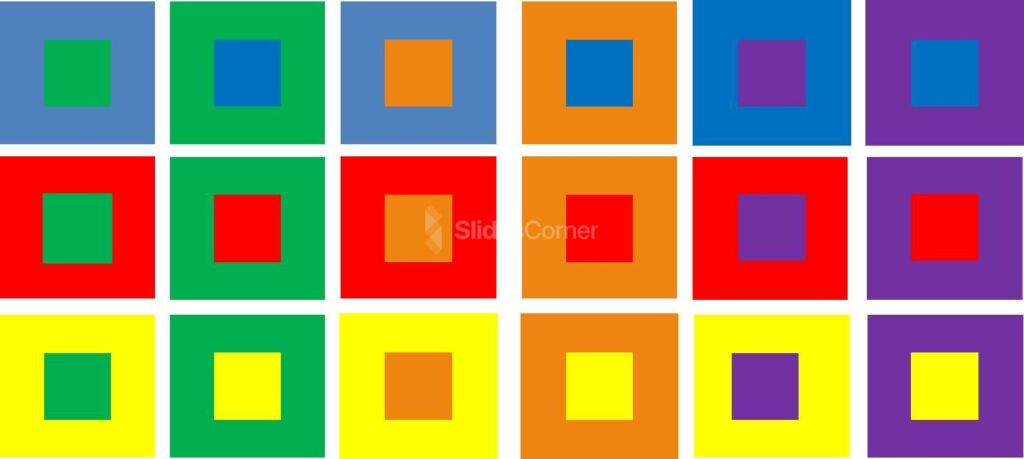
Color isn’t the answer to every project. Even if you consider the first step of picking the proper color scheme for your design is done, there are some extra rules you ought to check to ensure design accessibility . We cannot be more clear about this topic: if your design doesn’t follow the basic accessibility rules, all that hard work was done for nothing. Why? Let’s consider the following scenario.
You designed a presentation. The slides are done and ready to be projected for your audience. After the conference started, people in the back rows complained they could not understand what was written in your slides. Or worse: they get confused when trying to visualize graphs. And this doesn’t just affect people with visual impairments (which you should always consider when designing your slides) – different lighting conditions can hinder your own presentation performance from your workspace if the color contrast isn’t appropriate.
Therefore, we will resume the principal guidelines for accessibility that concern color theory:
- Contrast foreground and background : To ensure your presentation is readable, apply a color contrast of 4.5:1 for placeholder text and 3:1 for titles. This also applies if the text was rasterized as part of an image. You can see the difference below between what’s considered a faulty contrast and a well-made pairing.
- A word of caution : Please look at the font color’s overall lightness. There’s a specific reason for not using 100% lightness because it causes visual discomfort to the user.

- Don’t assume people understand color the same way: As we’ve seen above, the perception of color is subjective and can be influenced by factors that can be both psychological, physiological, or even educational. Let’s take a classic as an example. A form section that says, “Required fields are in red.” Whereas this can be simple to understand, a person with daltonism or achromatopsia (total color blindness) won’t even know where to look. Instead, use a visual cue to help the user understand where to look, such as “Required fields are marked with an *.”
- Test designs in different sizes: Something that can be seen as balanced on a printed paper or computer screen may be overwhelming when reduced to mobile format. It’s a good practice to test the color schemes in different screen sizes to be confident users can read and understand our content, regardless of the medium they use.
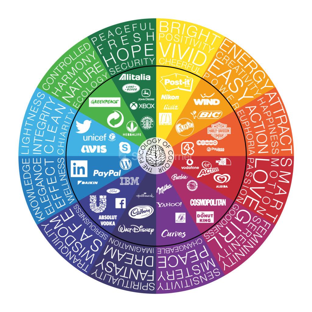
Psychological effects associated with effective color theory application
Even though the naming is relatively recent, color psychology is the discipline that understands the relationship between color and human interaction. So significant is the importance for this study area that food packaging doesn’t happen accidentally, as improper color usage can alter how you perceive that food. Marketing, interior design, gaming industry, graphic designers , and so many other industries apply the guidelines of color psychology in their daily production to grant consumer satisfaction.
This section will explore the intrinsic messages that color can transmit and how our presentations can benefit from that.

As an easy term, black can be understood as the absence of color. People can also interpret black as the lack of light or the technical fact that black can absorb the entire light spectrum.
Since we can analyze the color meanings by its positive and negative associations, we start with the positive feelings oozed by the color black. It is a direct message of sophistication and luxury. People instantly associate black with the color of tuxedos, black limos, and many spy-themed movies.
The black color also speaks of power, and it’s not without a cause, as court dresses historically have been black. Banking institutions reserve the black color for their premium members’ cards.
Negative connotations of the color black are feelings that evoke depression. This can be easily fixed by a sound, contrasting presentation color palette.
Opt for a black-themed presentation if you wish to transmit exclusivity, a VIP product or service for your audience. Gold accents work perfectly for this kind of topic, although somewhat cliché. Instead, you can work with ochre and coffee tones with subtle white accents to make the design tridimensional. Use texture images, such as carbon fiber, to reinforce the message of something luxurious that can elevate the customer’s standards.
Word of advice: not all black colors are precisely “black” – You can find warmer blacks, which work best with ochre tones, and cooler blacks that get along best with silver/gray hues.

White speaks of purity, of something clean and innocent, hence why it is the main color picked for wedding dresses, baptisms, or hotel bedding. White also transmits minimalism, which is why nordic styling often pairs warm wood with matte white finishes for table lamps or furniture. It has a conveyed message of austerity.
As a color, technically speaking, is the full spectrum of light without being bounced. Therefore, white can be understood as a blank state, a new beginning of sorts. Its simplicity makes easier the effort to craft a presentation, so that’s the reason behind many users opting for classical white-predominant themes.
Negatively speaking, white can evoke bad feelings for those who have photophobia (intolerance to harsh lights) due to its striking contrast. Remember the recommendation above for not using pure 100% lightness in the white text? The same applies here for backgrounds unless you have a keen desire to hurt the spectators’ eyesight. Lower the value of white to 80-90% if your presentation is going to be purely white-based, and use 100% lightness for accent details if you prefer.
Pure white can also be perceived as dull, so pairing it with another hue is necessary for specific industries for quality presentation design.

Silver or gray (depending on whether it resembles a metallic look) is a color of grace and modernity. It transmits a message of a change of direction, as light can bounce off it. Hence, professionals use it not just for technological aspects but also mental health as you feel all mental blocks are getting lifted.
It is a color often associated with wealth – its direct relationship with the silver metal – and thanks to being shiny, clean, and alluring, it is associated with everything modern and hi-tech.
Whereas it can be seen as a perfectly balanced color, it can easily be misused and fall under the bland side of the color spectrum. Melancholy and loneliness are negative feelings sometimes associated due to the lack of a prominent hue on them. Don’t be fooled by such a statement as there aren’t two equal grays in the world: put two gray color samples side by side, and you’ll notice the subtle differences in hue.
It is a color that dignifies, speaks of maturity, and a well-organized scenario. The corporate world uses this color in almost every scenario without even relating that embedded message, and at the same time, it reinforces the meaning.

In color psychology, the primary colors are the ones that transmit the most powerful messages. Red conveys the fiery energy that fuels power and confidence. It is a color with a duality no other hue can express, and we will analyze why.
On a positive note, red is associated with love and passion. The image of a woman wearing a red dress or holding a red bottle of perfume not just seeks to evoke passion but to present the woman as a confident person, capable of making her own choices to shape her future. She is the coveted element of desire, not by her sex but by the ideal of power she can transmit.
Traditionally, red is the color of power in cultural scenarios. The Academy Awards attendants and nominees walk over the “red carpet.” Political parties use the color red for their logos. Anyone who sees the color red can instantly associate with the brand Ferrari and their Cavallino Rampante logo.
Physiologically, red is powerful enough to produce these physical effects:
- Elevate blood pressure
- Enhance metabolic rate
- Increase heart rate
- Induce hyperventilation
- Increase appetite
That’s why using red is not something to take for granted. Abusing the usage of red in a presentation can cause discomfort, whereas proper usage of red makes it engaging and dynamic. Remember that red is also the color used for signage in the case of “danger,” “stop,” “fire,” and several other negative connotations.
Be cautious when using pure red as your dominant color. Sometimes it’s best to play it safer and opt for a shade or a tint not so predominant in the message.

Blue is a color that instantly uplifts productivity. Commonly found in nature as in the daytime sky or water, it inspires serenity in the spectator, building confidence to become more productive.
One of the reasons blue is so commonly used in designs is because it’s felt as something conservative. Like you cannot go wrong when using blue or pairing blue with another color. That’s another sign of how much of an intense presence blue has in our daily life that we feel natural to pair blue with another hue.
As one of the primary colors, blue creates a strong feeling of stability and safety. Businesses, banking institutions, and health centers use blue to transmit their values of professionalism and trustworthiness. Psychologically, blue has the opposite effect to red regarding pulse rate, so it’s not unusual to find blue hues in offices requiring much concentration time.
Negatively, blue is associated with sadness, as in the common saying “feeling blue.” Pure blue schemes can seem detached to some audiences; therefore, opt for a Split Complement , Analogous , or Rectangle color scheme to make it look attention-grabbing. Some schemes pairing blue shades with ochre, brown, or orange can transmit the message of luxury when done with subtlety.

As the final primary color, it’s bright and intense, becoming one of its main usages as an attention-grabber. In general guidelines, we must not overuse yellow as a color in designs since it quickly builds visual fatigue. Physiologically, that has been related to the amount of lighting it emits in comparison with other colors (hence, its similar performance to white in cases of photophobia). However, we must not forget yellow can also increase the metabolic rate.
Yellow can get perception dualities as we’ve seen with red: some people find it cheerful, inspiring happiness and energy (e.g., SpongeBob SquarePants character), and others perceive it as absolutely annoying. That’s due to the attention-grabbing factor, so we must apply it carefully in presentation design.
Due to it being a stimulating color, we would recommend using tints of yellow as background color if yellow is a must. Avoid pure yellow at all costs. Some people interpret the yellow color as aggressive, and your presentation conveys the wrong message. Psychologically, it has been studied that conceited people prefer yellow color , whereas introverts react negatively to it. Instead, use a color scheme that pairs yellow with a less dramatic color, and apply yellow as the accent color of your scheme.

Is there any other instant connotation for green besides nature, outdoors, and ecology? Green is distinguished as a refreshing color and associated with health and eco-friendly practices.
As a combination of the steady blue and the happiness-booster yellow, green mellows the soul, taking us to a relaxing atmosphere. This is why designers create “green spaces” inside office buildings – becoming critical in dense capital cities with limited outdoor places to unplug from work.
Historically, humanity has associated green with different values:
- Money : Currency bills, such as the US dollar.
- Health : There are cultural associations of the color green with fertility, eating healthy, the agricultural industry, and living stress-free.
- Nature : The outdoors, green energy, eco-friendly organizations.
- Luck : A four-leaf clover, casinos, winning.
On the other hand, there’s the common saying that one can be “green with envy”, or relate to motion-sickness. Thankfully, that’s not the message green transmits when used in the design.
Before applying green to your slides, remember it’s not the same message you send when using an olive green (that speaks of elegance and earthiness) as when using an aqua green (freshness, sports). Be mindful when picking the green hue and research its own meaning before using the color because you just like it.

Although this color is associated with feminist movements these days, purple historically speaks of wisdom and creativity. It has an embedded message of ambition due to its cultural references to royalty and the clergy. You may ask yourself why if black is associated with the luxurious, we say that purple is the color of royalty. Well, the answer to that question we have to speak about a dye named Tyrian purple , with an insanely costly procedure that only allowed the extremely wealthy population to wear clothes in that color.
Changing perspectives, we can speak of the purple color from a creative aspect as a color that boosts inspiration. Its link to spirituality is well-documented, and one of its most controversial usages is the work of artist Francis Bacon in Study after Velázquez’s Portrait of Pope Innocent X . Also, purple is a color associated with courage. The Purple Heart medal is a military decoration of the United States awarded in the name of the US President to those wounded or killed during service.
The shades of purple can evoke exotic perceptions, from wine to delicate flowers such as orchids to precious gemstones such as Amethyst.
Since it’s not a color felt as natural by humans, we can create vibrant presentations on different topics that take the user away from conventionalism.

Brown is a color commonly used for outdoor adventures or to introduce all-terrain experiences in isolated places. Being the color usually associated with earth, it’s not a surprise to find the values of strength and reliability linked to the color brown, even if it’s not a color easy to manage as it leans towards both orange and yellow.
Warmth, comfort, and security are feelings transmitted by the color brown for its close relationship with nature. That could explain why security firms opt to include brown in their branding strategies and pair it with black to enforce the importance of “securing the valuables.”
To apply it in presentation design, it is a color that must be balanced in a complementary or split complementary scheme, preferably with a blue tint. Orange can bring far too much energy to the scene, so use the combination of brown + orange with caution (the same rules apply with brown + yellow).

Depending on where its hue leans, we can say orange can be an uplifting color on an extremely attention-seeking one. The strong-red oranges are used for attention, such as in signage, whereas yellow-orange speaks of happiness, of being carefree. The “ideal” orange – such as the one in the photo above – is a color that transmits the feeling of energy, leading parcel delivery companies to use it for their marketing strategies.
As a highly energetic color, it’s often found in uniforms for sports, mascots, energy drinks, etc. People associate orange with summer and autumn: spectacular sunsets, orange juice, flowers, and so on. For the Asiatic culture, orange is a spiritual color that speaks of meditation, leaving materialism behind and Buddha. For Americans, orange is linked to Thanksgiving and Halloween.
Thankfully, orange is a color easy to pair in most scenarios as it blends with a multitude of colors. Still, we recommend it to mute the pure orange, opting for a sophisticated shade of it and leaving the intense orange hues as accent colors.

Last but not least, we will speak about the pink color. It is a color associated with the feeling of kindness, love, and femininity. A broad range of shades transmits different messages: whereas pastel pinks can evoke tenderness, a vibrant shade of pink such as magenta can be observed as aggressive by some audiences.
Joyful, pink is a girly tone that makes you feel integrated. As if you achieved your most desired dreams and you celebrate the outcome surrounded by your loved ones. For artists, it is a vibrant color that contrasts with often “dull” colors such as gray and black for interesting composition values.
If you can look aside the simplistic “girl” color concept, it’s a refreshing color that instantly takes people to a feeling of inspiration and renewal.
Case studies for color theory
In this final section of the article, we will use four different case studies to explain why some color selections are made in regard to sending the viewer a message with the presentation. Please keep in mind that most presentation templates are fully editable; therefore, if you love a design, but you don’t feel comfortable with its color range, you can change the color palette for ppt presentation by making a custom theme in PowerPoint .
This first case study involves a medium-sized company that seeks to automatize its candidate selection process for the HR department through AI technology. As not every single member in the managerial area is convinced about this idea, the HR department prepared what’s known as a force field analysis presentation .
Thanks to the force field analysis model, the HR department presents the initiative, its driving forces (being the Pros of the initiative), and the restraining forces (the cons of this initiative) are easy to identify and represent with the help of a force field analysis slide template .

In a Complementary color scheme, the elements that weigh on the decision are represented in two colors: sapphire blue for the driving forces and orange-red to expose the restraining forces. Since we talk about something corporative, the same sapphire blue was used for the initiative area, not influencing the palette with another color.
Conducting the analysis from a color psychology perspective, the orange-red is attention-grabbing enough for people not to ignore the cons that this project can experience over time, whilst also reflecting an energetic resistance to change. Sapphire blue, on the other hand, speaks of professionalism. Of trusting the process in the decision to make since it’s time to move on and pursue bigger horizons – and the current selection process for new personnel is both time-demanding and often not tailored for certain departments.
In our second case study, a waste management company is visiting potential customers to offer their services whilst also educating company owners on the importance of treating production waste with the care it requires.
This next slide introduces the ecology of waste management, in which, depending on the original materials, there are multiple methods to repurpose waste rather than piling it up in open outdoor spaces.

The waste management presentation template used features a Monochrome color scheme in shades and tones of green. The greens used are not also randomly selected:
- Dark green used in the title and accent effects speaks of the fact that waste can be repurposed into money, and that fact can easily become a driving force for customers to change their waste management policies.
- Bright green in the accent sections and number of slides refers to rebirth. Of giving new life to what’s considered decay.
- Pale green in the cogwheels and placeholder text percentages is a symbol of peace. Remembers the audience that being mindful about the final destination of our production processes is part of having a corporate social responsibility.
- Mint green is a signal for refreshment. Of lifting taxing decisions and outsourcing from people knowledgeable in the subject.
With this case study, you can appreciate how slide color schemes can reinforce the message to transmit without filler words.
The next case study to analyze comes from a group of young software developers presenting their skills to a customer for a web design project. Despite not having a large trajectory in the industry, their team is well-balanced between experienced developers and creative designers to meet the demands of their clients.
This programming presentation template is the chosen asset to introduce their services visually compellingly while also listing their project portfolio.

A fine example of a Split Complementary color scheme, no doubt. The color selected was yellow-red, using blue and violet as the other two colors that made up this scheme. Since yellow is far too intense, it’s left as the accent color for some sections, and the background is a darker blue leaning towards blue-violet. The vector images follow suit by combining the colors selected in the palette, using gradients and lighter tints.
The question becomes now: what about the aqua tone? Sometimes, designers can combine color schemes inside a design to balance the overall composition. Since yellow would be too much attention-grabbing, and the presence of blues and violets is covered, there is a secondary usage of the Analogous color scheme, opting for a tint of the blue-green next to the blue color. The discrete way in which it was used brings life to the image and centers the vision in the placeholder text area.
To conclude this guide, it is essential to answer a common question: how do I pick the colors for my slide design project?
For some people, inspiration about a word, a concept, or a product to present directly leads to the color selection of the main color – or at least an indicator of which hue would work best. Then, the selected color scheme helps to build up the entire color palette for the presentation. In some other cases, an image can become the leading source of inspiration. That’s the reason why you should check tools such as Design Seeds’ Instagram Profile or even Pinterest.
Online tools can help us easily come up with good colors for presentations. Some recommendations for this are Coolors or COLOURlovers . Although… what if you already got inspiration from a presentation you attended but don’t know which colors were used? This incredible tool may cheer you up: Site Palette , a Google Chrome extension that gives you the entire list of colors used, with their HEX values to reproduce them in your designs.
Check out our complete tutorial on how to make a PowerPoint Presentation .

Like this article? Please share
Presentation Approaches, Presentation Ideas, Presentation Skills Filed under Design
Related Articles

Filed under Design , Presentation Ideas • May 1st, 2024
The Power of Mind Map Note Taking for Presenters
Add a new tool to your repertoire of presentation skills by mastering the art of mind map note taking. An ideal process to facilitate content retention.

Filed under Design • April 23rd, 2024
How to Create the Perfect Handouts for a Presentation
Learn how to create effective handouts for presentations and the recommended structure for handouts with this guide.

Filed under PowerPoint Tutorials • April 1st, 2024
How to Add Subscript and Superscript in PowerPoint
Using subscript and superscript in PowerPoint shouldn’t be a challenge. Learn how to properly use these two special type symbols with this guide.
Leave a Reply
Connect with us
How to choose the best presentation color schemes & combinations
Present better.
- Flat Design
- Minimalist Design
- Colorful, Bright, and Bold Design
- Infographic-Style Slides in Presentations
- Bold Typography Design

When designing a presentation, or even just experimenting with design, you'd be surprised at the different color combinations you can create. Choosing a color scheme is tricky, but understanding the basics of color theory allows… ... read more When designing a presentation, or even just experimenting with design, you'd be surprised at the different color combinations you can create. Choosing a color scheme is tricky, but understanding the basics of color theory allows you to develop the perfect color palette for your presentation. close
Selecting a color scheme that stirs the desired reaction in your audience is a tricky and challenging process. Unfortunately, picking out an appropriate color scheme isn’t as simple as putting together the colors you like. The color choices used in a PowerPoint presentation reflect the character and personality of your business. When the color wheel offers itself to your imagination, how do you know how to use it correctly?
We cannot underestimate the power of color. It’s a language of its own, influencing emotions and setting the mood for your presentation before you even begin to speak. Presentation slides can convey a relaxed, professional, or confident persona based on the color scheme alone.
What do colors mean?
Starting off with the tough question: what is color?
All that color comes down to is perception. When an object reflects light, it reflects different combinations of wavelengths that our brains interpret as color. And once we begin to understand color theory, we start to have a better understanding of how we perceive colors.
What is color theory?
Color theory offers a foundation for understanding the rules around color and color schemes. It is a basic guideline for mixing colors and analyzes the visual effects of how colors mix or contrast with each other.
Once you understand the logic of color, you can create and use color palettes more effectively and confidently.
Primary colors
Primary colors are colors that cannot be created by mixing colors and they are yellow, red, and blue. When it comes to creating a color palette, the primary colors anchor the color scheme. Meaning that using any one or any combination of the primary colors will place limits on your color scheme when you decide to select other colors.
Secondary colors
The secondary colors are created by mixing the purest form of any two primary colors. The three secondary colors are orange, purple, and green.
Tertiary colors
Tertiary colors take things a step further. They are created by mixing a primary color with a secondary color, making them a mix of several colors. But unlike secondary colors, they are not mixed in equal amounts.
For example, red-purple, or magenta, is a mix of red and purple, meaning it is two parts red and one part blue.
The six tertiary colors are red-purple (magenta), red-orange (vermillion), blue-purple (violet), blue-green (teal), yellow-orange (amber), and yellow-green (chartreuse).
The color theory wheel

What are the additive and subtractive color theories?
The additive and subtractive color models are systems of color reproduction related to how the eye receives light to produce colors.
The additive colors are red, green, and blue, or RGB. The RGB color models are for electronic screens like computers or TVs. It begins with black and then adds red, green, and blue light to convey a spectrum of colors. When more colors are added, the result is lighter and closer to white. With the three colors combined in equal amounts, you get white light.
Meanwhile, the subtractive color model applies to any color typically seen on a physical surface, namely paper. In this model, you subtract colors to get closer to white. The subtractive colors are cyan, magenta, yellow, and key/black (CYMK), and these are usually the colors listed on printer cartridges. When these colors are printed, they absorb the light and appear black.

How to combine colors?
Using the color wheel, we can experiment with color combinations to create original and effective color schemes. There are seven major color schemes in graphic design that designers regularly use and return to.
Warm colors
If you draw a line through the color wheel, it cleanly separates the warm and cool colors. The warm colors are reds, yellows, and oranges, and they are hues associated with energy, brightness, and action.
Cool colors
Cool colors are blues, greens, and purples, and they often connote feelings of peace, calm, and serenity.

Complementary colors
A complementary color scheme comes from combining colors that stand directly opposite each other on the color wheel (such as purple and green, orange and blue) and their respective tints.
Since this color scheme offers a strong contrast, it’s best to use one color as a dominant color and use the second color as an accent in designs. Use contrast to highlight important points in your presentation.

Split complementary colors
A split complementary color scheme features a selected base color and the two colors that neighbor that base color’s complement. The result is a versatile and nuanced color palette that is more diverse than a complementary color scheme while still maintaining a healthy and interesting contrast.
Although this color scheme is easy to achieve, it can be tricky to maintain. A split complementary scheme offers more color combinations, but it takes a bit of experimenting to find a good balance.

Triads and tetradic color combinations
A triadic color combination creates a balanced contrast by featuring three colors at an equal distance from each other on the color wheel, forming a triangle. However, it can feel overwhelming when the colors selected are bold. This can be handled by choosing one color to be the dominant one and using the others sparingly or by selecting a softer tint.
A tetradic color scheme is achieved by drawing a rectangle on the color wheel, resulting in a vibrant color scheme.

Analogous colors
Analogous colors sit next to each other on the color wheel and together create a soothing color scheme. When using analogous colors like red, yellow, and orange together, it’s best to have one color dominate, the second color support, and a third color accent.

Monochromatic colors
With a monochromatic color scheme, you choose one color and support it with its varying shades and tints. The result is a calm and consistent feel that looks polished and professional. This type of color scheme is easy to use since you only need to select one color and then use black, white, or grey to change it.
How to choose a color scheme?
These formulas for putting together color combinations are easy to pick up with enough practice. Yet, the challenge lies in the other factors you must consider when choosing colors for your color palette, which affect the impact and effectiveness of your color scheme.
Consider the user experience
When creating a presentation, consider the audience and the purpose. For example, using a monochromatic color palette is appropriate for a professional presentation , while complementary palettes are versatile for different types of occasions.
But also remember the details; for example, a bright background could be distracting and make it hard to read the text.
Set a mood for your color scheme
What is the mood you want to convey? If you want an energetic presentation, you’re better off using brighter colors like reds and yellows. While shades of blue are great for creating a peaceful and serene mood. Or you could tone down the clutter by creating negative space in black or white.
Working with high contrast
Be clever with your use of contrast. If you’re using a dark background, use light text that your audience can read, and vice versa. It’s important to use high contrast in more professional presentations to draw the audience’s attention to the contents. Draw attention to your important points with accent colors.
Follow the 60-30-10 rule
Originally an interior design rule, the 60-30-10 principle has proved to be a great tip for graphic design . It adheres to a balance of 60% of the main color (for backgrounds), 30% of the secondary color (filling in shapes or images), and 10% for the accent colors in outlines and text.
Refer to your color wheel
Use the color wheel to your advantage. Refer to it constantly to select color combinations of different color schemes. Sometimes, a color scheme that may look good in theory might not work with your presentation. It takes several tests to find a scheme that resonates with your personality and serves your presentation.
Draft multiple designs
As with any creative endeavor, there is no way to find out how your ideas will work without drafting and experimenting. In your quest of finding the appropriate color scheme, you need to create multiple drafts with your palette suggestions and see which works best. It’s good to step away from your work and sleep on it to refresh your perspective.
Keep it simple
Don’t overthink it. Keep your color scheme simple. A monochromatic palette is a great starting point for beginners since you’d only be working with one color. For more advanced users, try not to work with more than four colors; anchor your design in one dominant color and use the others for support.
Avoid unnecessary usage of color
Exercise restraint. Not every instance will need an explosion of color. For example, in a chart with only two variables, heights, and length suffice as differentiating factors. But when a third or fourth variable is introduced, then the color becomes necessary to emphasize or highlight differences.
Be consistent with color across charts
When using multiple charts and graphs, make sure to be consistent throughout the presentation when referring to the same groups. It keeps the document neat and organized and helps the reader follow along.
Leverage the meaningfulness of color
Different colors hold different meanings and symbolism. If you’re using color in graphs to represent certain groups, then keep in mind the colors they are typically associated with to make it easier for a reader to follow.
A general rule to follow is avoiding high color brightness and saturation or at least keeping them to highlight a particular element.
Attend to color blindness
Be inclusive of those with color blindness. The most common form of color blindness causes those afflicted to confuse red and green, and less commonly the confusion between yellow and blue. So use variety in the lightness and saturation to differentiate between colors rather than relying only on hue.
Sites like Coblis have color blindness simulators to help you get an idea of how your visuals will look and if there are potential ambiguities.
Types of color palettes
When it comes to data visualization, color is a necessary component in visual aids such as charts and elements. Misusing color could be distracting or confusing, but using color productively helps you tell the story you want to tell. Depending on the data you want to convey, there are different types of color palettes to consider.
Qualitative palette
A qualitative palette is used when the information presented deals with categorical variables such as age groups, countries, race, etc. In a qualitative palette, a distinct color is assigned to each variable or group.
A qualitative palette relies on the colors to differentiate between several variables, so try to limit the palette to no more than ten colors. Any more would create confusion in distinguishing between groups. Play around with hues, lightness, and saturation to create distinctiveness between colors.
It’s also important to maintain overall cohesion to not create unintentional bias by highlighting certain variables more than others.

Sequential palette
A sequential palette is used when the variables are numeric and typically portrayed sequentially. Often in a sequential palette, the lightness or hues are the distinguishing factors between variables.
The use of lightness is the most recognizable form of a sequential palette, which is why a single hue could be used. Low values are connoted with lighter colors, while darker colors are used for higher values. Otherwise, it is recommended to use two adjacent colors from a warm or cool palette.

Diverging palette
A diverging palette is applied when numeric variables have a central value (like zero). It’s useful to think of a diverging palette as two sequential palettes meeting at a middle point. The two sides are assigned two distinctive colors, and as with sequential palettes, lightness is used to portray distance from the central value.

Discrete vs. continuous palette
Sequential and diverging color palettes interact with data values with either discrete colors akin to a numerical value or through a continuous fading function between the variable and color.
Often, the process of creating color palettes follows the first method of using discrete or distinct colors, even though it would make sense to use a continuous color function to communicate the relationship between values.
However, people distinguish details such as length or position more quickly than they do color differences. So discrete palettes highlight patterns in the data, and we can set a clearer range within a discrete palette. While on a continuous palette, data would be pushed into a narrower range.

How to create a color scheme for your presentation
With the variety of color schemes and color palettes possible, where do you even begin creating your own? There are many variables involved in building a color scheme for your presentation, so start at the root and select colors appropriate for your goal. You can also reach out to our team for their presentation design (and palette-making) expertise.
Our presentation design services
Pick your colors
Building a color scheme begins with selecting colors that fit your purpose and mood. The process of picking colors is simplified once you can select a base color to build on.
The dominant color
Visual language is very effective in creating a subconscious connection and resonating with your audience. So begin by selecting a dominant color that encapsulates your beliefs and best represents your topic and niche to create the base for your color palette.
The secondary color
A secondary color supports your scheme’s dominant color and makes it stand out more.
The accent color
Accent colors are used to contrast and emphasize points in a presentation. Complementary colors make for perfect accent colors as they offer a bold contrast that attracts the eye. Accent colors are meant to be used sparingly to not overwhelm the viewer.

Keep colors in balance
Maintain a balance with your color palette and diversify the use of colors in highlighting text or brightening slides. Apply the 60-30-10 rule to your dominant, secondary, and accent colors.
Use the theme color palette
When creating your presentation, take advantage of the theme palette feature in PowerPoint and Google Slides. This tool allows you easy access to your color palette and lets you quickly change the colors of text and elements in your presentation at once without having to do them individually.
Use the tools at your disposal
There are several tools available for building a color scheme and using color palettes in presentation and design software. Use them to create a cohesive and engaging color scheme to be used in your presentations.
Tools and resources for using colors
By now, you should have a pretty good idea of color theory and how to build a color scheme. However, that shouldn’t discourage you from using tools and resources that help you speed up the process of selecting the perfect color scheme for your presentation.
Data Color Picker
Data Color Picker is a great tool for generating color schemes for sequential and diverging palettes. Often, some hues are left out between the two endpoints of a sequential palette, but Data Color Picker has a default tab for palettes that is perfect for generating multi-hued palettes.
Chroma.js Color Palette Helper
This tool has detailed options for crafting a color palette, with options for the type of palette desired (sequential, diverging), correcting lightness, and a color blindness simulator. These features of the chroma.js Color Palette Helper allow for more refined and cohesive palettes.
Color Thief
Since there aren’t many tools for creating qualitative palettes, you could extract potential color palettes from images with colors that resemble your intended mood. Color Thief is a tool that lets you generate a color palette from your own uploaded pictures. Although you would need to tweak your options to create an appropriate palette, Color Thief is a great starting point.
Viz Palette
Similar to Coblis, Viz Palette is a color palette tool that allows you to see how your palettes are perceived by individuals with different color perception deficiencies and color contexts. Furthermore, you can alter the color palette instantly in the tool.
Adobe Color
Adobe Color is a free Adobe tool for building color palettes based on different schemes and combinations. Moreover, it offers premade color schemes to play around with, use in your presentation, and even save if you’re an Adobe user.
Illustrator Color Guide
In the Illustrator Color Guide, you could generate a 5-color scheme along with its tints and shades based on the one color you select. And with preset modes, you could select the type of color scheme you want to create. You can save your color palettes to return to them in future presentations.
Preset Color Guides
Chances are, you’re familiar with Microsoft Office products. Well, did you know that all of the Office softwares have preset color schemes that you can use for your projects? In PowerPoint, you can find the color schemes in the Colors menu in the Slide Master view. You could select an option or customize your own.
Recommended for you..

12 March 2024
Persuasive storytelling for consulting presentations

17 April 2024
Mastering McKinsey presentation storytelling

21 April 2024
MECE Principle: Towards clearer decision-making
30+ Stylish PowerPoint Color Schemes 2024
Color is an element that can make or break a design, and that rule holds true for presentation design as well. Choosing the right PowerPoint color scheme is super important.
But there’s one extra thing to consider – where your presentation will be given. A PowerPoint presentation can look quite different on a computer or tablet versus on a projected screen.
When it comes to selecting a PowerPoint color scheme, this is an important consideration. We’ve rounded nearly stylish PowerPoint color schemes as inspiration. While darker color schemes might look great close-up on screens, opt for lighter backgrounds (for enhanced readability) for projected presentations.
Note: The last color in each scheme is for the slide background.
How Does Unlimited PowerPoint Templates Sound?
Download thousands of PowerPoint templates, and many other design elements, with a monthly Envato Elements membership. It starts at $16 per month, and gives you unlimited access to a growing library of over 2,000,000 presentation templates, fonts, photos, graphics, and more.

Pitch Deck Templates
Startup pitch deck.

Pitch PowerPoint

Mystify Presentation
Explore PowerPoint Templates
1. Blue, Gray Green & Orange

With a bright overall scheme that’s easy on the eyes, this color scheme can help you create a modern PowerPoint presentation that’s readable and friendly. You can even tweak the colors somewhat to better work with your brand, if necessary.
The best thing about this color palette is that it lends itself to plenty of different presentation styles and applications.
2. Violet Gradient

Using the first two colors noted above, you can create a dark-to-light monotone gradient that can make for a modern PowerPoint design style.
Take this concept and expand it to any other colors you like for your spin on this modern color scheme.
3. Mint and Orange

On paper, these colors don’t seem to blend all that well, but with the right application min and orange on a black background can work.
Use a pair of colors like this for presentations where you are trying to make a bold statement or impact. This concept is often great for trendy topics or ideas that are a little unconventional.
4. Bright Blue and Light

The brighter, the better! Bright blue color schemes are a major trend in PowerPoint design … and for good reason. The color combination creates a bright, light feel with easy readability. Those are two things that pretty much everyone wants in a presentation template design.
The other thing that’s great about a color scheme like this – which focuses on one color – is that it matches practically everything else in the design with ease. It’s great for image-heavy presentations or those where text elements are a key focal point.
5. Teal and Lime

Two colors that you might not expect to see paired create a classy combo that’s interesting and engaging. Both teal and lime are considered “new neutrals” and work with a variety of colors easily. (What’s somewhat unexpected is putting them together.)
What’s great about this PowerPoint color scheme is that the extra interest from the hues can help generate extra attention for slides. The template in the example also mixes and matches teal and green primary color blocks to keep it interesting from slide to slide.
6. Colorful Gradients

Gradients are a color trend that just keeps reinventing and resurfacing. In the latest iteration, gradients are bright with a lot of color. Designers are working across the color wheel for gradients that have more of a rainbow effect throughout the design, even if individual gradients are more subtle.
What you are likely to see is a variety of different gradients throughout a project with different colors, but maybe a dominant color to carry the theme. Use this for presentation designs that are meant to be more fun, lighter, and highly engaging.
7. Light Blue Minimal

This color scheme with light blue and a minimal aesthetic is super trendy and so easy to read. You can add a lot of style with a black-and-white style for images or a deep blue accent for header text.
While a pale blue is ideal here, you could also consider experimenting with other pastels and the same overall theme for a modern presentation design.
8. Bright with Dark Background

The combination of bright colors on a dark background can be fun and quite different from the traditional PowerPoint color schemes that are often on white or light backgrounds. This design style for a presentation is bold and engaging but can be a challenge if you aren’t comfortable with that much color.
When you use a style like this, it is important to think about the presentation environment to ensure that everything will look as intended. A design like this, for example, can work well on screens, but not as well on a projector or in a large room.
9. Navy and Orange

The navy and orange color combination is stylish and classic for presentation design. To add a fresh touch consider some of the effects such as the template above, with color blocking and overlays to add extra interest.
What makes this color combination pop is the element of contrast between a dark and a bright pair. The navy here is almost a neutral hue and works with almost any other design element.
10. Dark and Light Green

A modern take on a monotone color scheme involves using two similar colors that aren’t exactly tints and tones of one another. This pairing of dark green and light (almost minty) green does precisely that.
What’s nice about this color scheme is that the colors can be used almost interchangeably as primary elements or accents. It provides a lot of flexibility in the presentation design.
11. Bright Crystal Blue

Blue presentation color schemes will always be in style. The only thing that changes is the variance of the hue. This pair of blues – a bright crystal blue with a darker teal – works in almost the same way as the pair of greens above.
What’s nice about this color palette though is that the dark color is the accent here. That’s a modern twist on color design for presentations.
12. Blue and Yellow

Blue and yellow are classic pairings and can make for a striking presentation color combination. With a bright white background, these hues stand out in a major way.
What works here is the element of contrast. A darker blue with a brighter yellow creates an almost yin and yang effect with color. The only real caution is to take care with yellow on a white or light background with fonts or other light elements.

Teal is a personality-packed color choice. If you are looking for a bold statement with a PowerPoint template, start here.
While the above color scheme also includes a hint of yellow for accents, the teal color option is strong enough to stand alone. You could consider a tint or tone for a mono-look. It also pairs amazingly well with black-and-white images.
Teal is a fun color option that will provide a lot of practical use with your slide deck.
14. Bright Coral

This color scheme is one of those that you will either love or hate. The bright coral color is powerful and generates an immediate reaction.
It’s also quite trendy and will stand out from many of the other more bland PowerPoint colors that you may encounter. This is a great option for a startup that wants to present with a bang or a brand that has a similar color in its palette. It may not work so well for more traditional brands or those that are more conservative with their slide designs.
15. Dark Mode Colors

A dark mode color scheme might be the biggest trend in all of design right now, and that also applies to presentation design.
This purple and emerald color paired with black with white text looks amazing. It is sleek, modern, and has high visual appeal without having to use a lot of images.
This works best for digital presentations when you don’t have concerns about room lighting to worry about.
If you aren’t ready to jump into dark mode on your own, the Harber template above is a great start with nice color, gradients, and interesting shapes throughout the slide types.
16. Navy and Lime

A navy and lime combination is a modern take on colorful neutrals that are anything but boring.
These colors have a nice balance with a white or light background and are fairly easy to use. With so many brands already using blue in their base color palette, this is an option that works and is an extension of existing elements for many brands. (Use your blue and add the lime to it.)
Also, with this color combination, the idea of a minimal overall slide structure is nice so that the power of the colors and impact comes through. They work beside images in full color or black and white.
17. Modern Blue

When you aren’t planning to use brand colors – or maybe as a startup or independent contractor so you don’t have them yet – a modern color combination can add the right flair to a PowerPoint presentation.
The bright grayish-blue in the Lekro PowerPoint template – you can find it here – adds the right amount of color without overwhelming the content. Plus, subtle orange accents help guide the eye throughout this PowerPoint color scheme. https://elements.envato.com/lekro-powerpoint-presentation-67YW3M
18. Blackish and Yellow

While at first pass, black and yellow might seem like a harsh color combination, it can set the tone for a project that should emanate strength. This PowerPoint color scheme softens the harshness of the duo with a blackish color, that’s grayer and has a softer feel.
Pair this combo on a light background or with black and white images for a stylish, mod look.
19. Orange and White

A bright color can soften the harshness of a stark PowerPoint design. Especially when used for larger portions of the content area, such as background swatches or to help accent particular elements.
The Sprint template makes great use of color with a simple palette – orange and white with black text – but has slide ideas that incorporate the color throughout for something with a more “designed” look to it. (And if you aren’t a fan of the orange, change the color for use with this template to keep the modern feel.)

Purple presentations are in. The color, which was once avoided by many in design projects, has flourished with recent color trends.
Because more funky, bright colors are popular, a presentation with a purple focus can be acceptable for a variety of uses. The use in Batagor template has a modern design with a deep header in the featured color, which works best with images that aren’t incredibly bold in terms of color.
21. Blue-Green Gradients

Another trending item in color is the use of gradients. This trend can be applied to PowerPOint presentations as well.
Use a blue-to-green gradient for a soft and harmonious color scheme that won’t get in the way of content. Use each hue alone for accents and informational divots throughout the presentation design.
22. Black and White

Minimalism is a design trend that never goes away. A black-and-white (or gray) presentation screams class and sophistication.
It can also be easy to work with when you don’t want the color to get in the way of your message. And if a design can stand alone without color, you know it works.
23. Reds and Black

If you are designing a presentation for viewing on screens, such as desktops or tablets, a dark background with bright color accents and white text can work well. (This combination gets a lot trickier on projector displays.)
While reverse text and red aren’t always recommended, you can see from the Nova template that they can be a stunning combination. But note, this modern color scheme is best for specific content and audiences.
24. Blue and Pink

This color scheme is a spin on Pantone’s colors of the year from 2016. https://designshack.net/articles/graphics/how-to-use-the-pantone-color-of-the-year-in-design-projects/ The brighter, bolder versions of rose quartz and serenity and fun and sophisticated.
The unexpected combo sets the tone with a strong, trustworthy blue and adds softness with the paler pink. The colors work equally well with white or darker backgrounds.
25. Blue and Green

Blue and green accents can help a black or white background come to life in a presentation template. The colors here can work with either background style, based on how you plan to display your presentation.
What’s nice about these colors is that they are pretty neutral – since both are found in nature – and can be used with ease for design or text elements in a PowerPoint color scheme.
26. Beige and Gray

If you are looking for a softer color palette, consider beige and gray. These hues can work well on screens or projected, making them a versatile option.
The nice thing about such a neutral palette is that it gives content plenty of room, so that will be the true focus of the presentation.
27. Tints and Tones

While the purplish blue-gray in the Business PowerPoint Presentation template is stunning, it represents a greater trend in presentation design. Pick a color – maybe your dominant brand color – and use tints and tones for the presentation color scheme.
By mixing the color with white or black and gray, you’ll end up with a stunning set of color variations that match your messaging.
28. Bold Rainbow

While most of the color schemes featured here only include a color or two, bright color schemes with wider color variations are trending.
This distinct “rainbow style” can be somewhat difficult to use without rules for each color. Proceed with caution.
29. Bright Neutrals

Lime green is the brightest “neutral” you might ever use. A fun palette that’s versatile can be a solid foundation for a color palette.
It works exceptionally well in the Rouka PowerPoint template thanks to a pairing with a subtle gray background. Using a light, but not white, background can be great for screens and projected presentations because it takes away some of the harshness of a white background. The subtle coloring is easier on the eyes for reading and viewing.
30. Rich Browns

Browns aren’t often what comes to mind when thinking of building a color scheme, but rich browns can be a modern option.
Pair a neutral beige-brown with a darker color for an interesting contrast that works with almost any style of content.
31. Mint Green

Go super trendy with a modern and streamlined palette of mint green and gray on white. While this combination can have a minimal feel, it also adds a touch of funkiness to the design.
Add another hint of color – think orange – for extra accents.
32. Dark Gray and Blue

It doesn’t get more classy than a combination of grays and blues. This new take on a classic color scheme adds another brighter blue as well to pick up on modern trends.
Just be careful with text using a dark background such as this one. White is probably your best option for typography (and look for a font with thicker strokes!)
Are looking for custom service?
- Presentation Design
- Report Design
- Brochure Design
- Infographic Design
- Illustration Design
- Package Design
- Exhibition Design
- Print Design
- Logo Design
- Video Animation
- Motion Graphics
Tips and Tricks
The Psychology of Color in Presentation Design
Emily Bryce
26 April 2023

As a presentation designer, you know that colour plays a vital role in the success of any presentation. The colours you choose can influence the mood, emotions, and perceptions of your audience. Understanding the psychology of colour can help you create presentations that are more engaging, memorable, and effective. In this article, we’ll take a closer look at the psychology of colour in presentation design and provide tips on how to use colour effectively.
Color and Emotion
Color has the power to evoke strong emotions and influence our mood and behavior. This is because color is processed by the limbic system in our brain, which is responsible for our emotional responses. Different colors can evoke different emotions and feelings in people, and this is why it is important to carefully consider the colors you use in your presentation.
For example, warm colors like red, orange, and yellow can evoke feelings of excitement, energy, and warmth. These colors are great for grabbing attention and creating a sense of urgency, making them ideal for highlighting important information or calls to action.
On the other hand, cool colors like blue, green, and purple can evoke feelings of calmness, serenity, and relaxation. These colors are great for creating a sense of stability and trust, making them ideal for presenting data or statistics.
Color and Contrast
Another important aspect of using color in presentation design is contrast. Contrast refers to the difference between two colors and can help draw attention to specific elements of your presentation.
For example, using a high-contrast color scheme like black and white can help make your text and images stand out and create a sense of clarity and simplicity. However, using too much contrast can be overwhelming and distracting, so it is important to use it sparingly and strategically.
Using complementary colors (colors opposite each other on the color wheel) is another effective way to create contrast and draw attention to specific elements of your presentation. For example, pairing a blue background with orange text can create a visually striking and attention-grabbing effect.
Color and Branding
In addition to evoking emotions and creating contrast, color can also play an important role in branding and identity. Using consistent colors in your presentations can help reinforce your brand and make your content more recognizable and memorable.
If your company has established brand colors, it is important to incorporate them into your presentations to maintain consistency and reinforce your brand identity. However, if you are creating a presentation for a specific event or audience, it is important to consider the preferences and expectations of that audience and adjust your color scheme accordingly.
The Basics of Colour Psychology
Colour psychology is the study of how colours affect human behaviour, emotions, and perceptions. Different colours can elicit different emotional and psychological responses, and these responses can vary depending on cultural and individual differences. For example, in Western cultures, red is often associated with passion, love, and excitement, while in some Asian cultures, it is associated with luck, happiness, and prosperity.
When it comes to presentation design, understanding the basic emotions and perceptions associated with different colours can help you create a presentation that is more impact full and effective. Here are some common colours and their associated emotions and perceptions:
– Red: passion, love, excitement, urgency – Orange: warmth, enthusiasm, energy, creativity – Yellow: happiness, optimism, positivist, clarity – Green: growth, harmony, balance, nature – Blue: trust, calmness, professionalism, reliability – Purple: luxury, creativity, imagination, spirituality – Black: elegance, sophistication, power, authority – White: purity, simplicity, cleanliness, clarity
Using Colour Effectively in Presentation Design
Now that you have a basic understanding of the psychology of colour, it’s time to put it into practice in your presentation design. Here are some tips for using colour effectively:
1. Use a consistent colour scheme: Choose a colour scheme that matches the theme of your presentation and use it consistently throughout your slides. This will create a cohesive and professional look that will make your presentation more memorable and impact full.
2. Use colour to highlight key points: Use colour strategically to draw attention to important information or key points in your presentation. For example, use a bold colour to highlight a statistic or a key takeaway.
3. Use contrast to make text and graphics stand out: Use contrasting colours to make text and graphics stand out. For example, use a light background with dark text or a dark background with light text to make your content more readable.
4. Consider your audience: Keep in mind the cultural and individual differences in the perception of colour. For example, if you are presenting to an international audience, be aware of cultural differences in the meaning of colours.
5. Don’t overdo it: While colour can be a powerful tool, it’s important not to overdo it. Too many colours can be overwhelming and distracting, so stick to a simple colour scheme and use colour strategically to enhance your message.
In conclusion , the psychology of colour plays a crucial role in presentation design. By understanding the emotions and perceptions associated with different colours, you can create presentations that are more engaging, memorable, and effective. Use colour strategically to highlight key points, create contrast, and make your content more readable. Keep in mind the cultural and individual differences in the perception of colour, and don’t overdo it. With these tips in mind, you’ll be able to create presentations that leave a lasting impression on your audience.
Stay Updated
Join our exclusive subscribers list to receive the latest design trends, industry updates and digital world insights in your inbox.
You can read our privacy policy here .
Related Posts

10 Tips for Creating Effective Presentations

How to Choose the Right Font for Your Presentation

Top 5 Mistakes to Avoid in Your Next Presentation

5 Creative Presentation Ideas to Wow Your Audience
My Presentation Designer is a brand of Out of Box Ltd. which is a registered company in England and Wales under company no. 06937876 and VAT ID GB381889149 .
Copyright © 2015-2023 • My Presentation Designer • All rights reserved.
Find the images you need to make standout work. If it’s in your head, it’s on our site.
- Images home
- Curated collections
- AI image generator
- Offset images
- Backgrounds/Textures
- Business/Finance
- Sports/Recreation
- Animals/Wildlife
- Beauty/Fashion
- Celebrities
- Food and Drink
- Illustrations/Clip-Art
- Miscellaneous
- Parks/Outdoor
- Buildings/Landmarks
- Healthcare/Medical
- Signs/Symbols
- Transportation
- All categories
- Editorial video
- Shutterstock Select
- Shutterstock Elements
- Health Care
- PremiumBeat
- Templates Home
- Instagram all
- Highlight covers
- Facebook all
- Carousel ads
- Cover photos
- Event covers
- Youtube all
- Channel Art
- Etsy big banner
- Etsy mini banner
- Etsy shop icon
- Pinterest all
- Pinterest pins
- Twitter all
- Twitter Banner
- Infographics
- Zoom backgrounds
- Announcements
- Certificates
- Gift Certificates
- Real Estate Flyer
- Travel Brochures
- Anniversary
- Baby Shower
- Mother’s Day
- Thanksgiving
- All Invitations
- Party invitations
- Wedding invitations
- Book Covers
- Editorial home
- Entertainment
- About Creative Flow
- Create editor
- Content calendar
- Photo editor
- Background remover
- Collage maker
- Resize image
- Color palettes
- Color palette generator
- Image converter
- Contributors
- PremiumBeat blog
- Invitations
- Design Inspiration
- Design Resources
- Design Elements & Principles
- Contributor Support
- Marketing Assets
- Cards and Invitations
- Social Media Designs
- Print Projects
- Organizational Tools
- Case Studies
- Platform Solutions
- Generative AI
- Computer Vision
- Free Downloads
- Create Fund

10 Color Palettes to Nail Your Next Presentation
Bring your a-game to your next pitch meeting with these sure-to-dazzle color palettes..
Color is a powerful design tool. The right scheme can energize and motivate, soothe and inspire. With that in mind, we’ve put together a batch of ten eye-catching color palettes, each intended to have a different psychological effect on your presentation audience.
Perhaps you’re a young startup and need to excite potential investors , or maybe you want to ensure that viewers remain focused on important data. Whatever the style of presentation or pitch, you’ll find a color palette that suits your presentation needs in the list below.
- Introducing Creative Flow on Shutterstock Enterprise
- 7 Creative Tips for When You’re in a Slump
Simply take a note of the HEX codes in these inspiring color palettes, and apply your swatches to backgrounds , typography , or sales presentation templates for your next PowerPoint presentation or Google Slides pitch.
Now, let’s get started! It’s time to nail that pitch.

License this image via Pikoso.kz .
What Are the Best Colors for Presentations?
The best colors to use in PowerPoint , Google Slides, and other presentation software can vary widely depending on your audience, brand, and what you’re trying to achieve with the presentation.
A pitch for a new client might require exciting, inspiring color choices that help your audience to feel energized , while a data-heavy presentation to long-standing investors might require a more stable and reassuring color scheme.
- 10 Psychological Color Palettes to Win Friends and Influence People
- How to Use the Color Wheel to Build a Brand Palette
Below, you’ll find 10 color palettes for presentations that tap into the power of color psychology , helping you to choose colors that will always work in your favor.
These stylish color palettes can work for a variety of presentation purposes, like corporate reports, brand launches , and Q1 forecasts.
Scroll down to find the perfect presentation palette to help you bring the power of color to your next pitch.
1. The Perfect Color Palette to Energize Your Audience
Orange has been proven to promote energy and appetite in viewers, so it’s the perfect color choice for presentations that need to have an upbeat feel.
To keep your audience engaged throughout a long presentation, it helps to balance orange’s energy with the soothing, expansive mood of violet blue .
Blue-sky thinking is blue for good reason—this is a color that provokes inspiration and openness to new ideas.
To keep your energized palette crisp and clean, turn to ice white and pitch black to ensure your text remains crisp and legible.

2. The Best Color Palette to Calm and Reassure the Room
Sometimes, it’s more important to calm and reassure your audience than to energize or surprise them. Presentations focused on mental well being , health , or wellness wouldn’t benefit from a neon palette , for example.
Instead, bring a zen mood to the boardroom with this palette of soothing hues. Spring green , mulberry purple, terracotta, and blue gray have a grounding effect and mimic the soothing colors found in nature to create an ultra-relaxing effect.

3. The Perfect Color Palette to Boost Confidence
Red is traditionally the color of confidence, proven to make viewers feel stronger and more self-assured in its presence. However, pure red can be overtly aggressive, and the forceful effect of the color can be heightened on bright screens. Much better to temper red’s aggression with softer red orange , fuchsia , and shell pink .
This is still a highly confident palette with its graduation of warm hues, and its assertion is even stronger when paired with mysterious and authoritative plum purple .

4. The Best Color Palette to Appeal to Corporate Businesses
This color scheme gives a nod to the traditional palettes of the financial and legal world. Bottle green and cognac brown are teamed with dark racing-green and old gold for an established and luxurious effect.
Corporate presentations can be difficult to enliven, as they require a degree of formality and convention. However, this palette steps away from oft-used navy blue toward something more interesting.
Evocative of leather and velvet, this is a cocooning and moneyed palette that will help corporate clients feel like you understand their formal world.

License this image via AlonaPhoto .
5. The Best Palette to Look Cool and On-Trend
Many startups, entrepreneurs, and young brands want to appeal to Gen Z audiences , and they need to have a cool color palette to match.
Whether you’re presenting a new product launch or looking to entice an on-the-pulse angel investor, this violet and neon palette will cement your cool credentials.
Look to urban colors, such as neons and grays, to create presentation slides with an ultra-cool mood.
This urban-inspired presentation palette combines deep and inky violet with acid lime yellow for a high-contrast effect, while concrete gray and moody black provide a neutral offset.

6. The Perfect Color Palette to Look Innovative
Young companies or startups pitching for their first round of investments need a palette that will communicate a spirit of innovation and fresh thinking. A perfect color palette for tech businesses or science startups, this palette has a futuristic, forward-looking mood.
Purple is the most intellectual and mysterious of all colors, making it a good fit for businesses offering something a little different from the norm, especially in the tech sector .
Neon pink is an unexpected choice for work presentations, but here it’s the perfect companion to purple and violet blue, bringing energy and a youthful mood.

7. The Best Color Palette to Appear High-End
Elevate your high-end presentations with this luxurious color scheme that borrows from vintage color schemes of the 1930s and 1940s.
If you’re pitching for a high-end brand or simply want to bring an elegant mood to your presentation slides, this claret and copper scheme will help your PowerPoint templates feel opulent and expensive.
Dark brick red and olive green are traditional establishment colors that give a nod to beautiful brick architecture and vintage uniforms.
This affluent color palette would also be a good fit for the hospitality, travel, or luxury goods sectors. Team with metallic backgrounds and crisp white text for simple luxury.

8. The Best Color Palette to Improve Focus
If you have vitally important data or a specific message you want your viewers to remember, consider this presentation palette of focus-promoting colors that will prevent your audience from mid-pitch window gazing.
Blue and green are the two colors most associated with improving focus and concentration, with blue promoting expansive thinking and green providing a harmonic, nature-inspired mood.
In this business color palette, rich teal combines both of these hues for a serious focus hit. Earthy burnt orange prevents teal from feeling lethargic, while giving the palette a grounded edge that feels serious and cerebral.

9. The Best Color Palette to Promote Sustainability
As sustainability is a central concern for many businesses today, it might be in your interest to give your presentations an environmental edge.
While businesses are often advised to avoid greenwashing , for the purpose of presentations, green is still the most reliable color for communicating environmentally-themed messages. It helps to immediately situate your audience within an eco-friendly mindset .
Whether you want to discuss how your company can become more eco-friendly or promote a sustainable product to a potential buyer, this fresh and verdant palette will give your slides a nature-inspired mood.
Emerald green , sage, and deep bottle green are made crisp and contemporary when teamed with chalk white.

10. The Perfect Color Palette to Boost Creativity
We could all do with a little more creativity in our working day, and you can turn to selective color choices to boost your weekly brainstorming session.
For presentations that need to appear creative or boost the creative potential of your audience, bright colors are stimulating, expressive, and promote a sense of childlike play and experimentation.
This is a colorful pick-me-up scheme for work-weary souls—a perfect presentation color palette for team-building days, ideation sessions, or for subjects that are more outside-the-box than usual.
Orange and pink perk up the palette with warm tones , while viridian green and azure blue bring a fresh, tropical feel to this fun, creative color palette.

License this cover image via VISTA by Westend61 .
Recently viewed
Related Posts

Brand Colors: The How and Why of Picking the Right Colors
Whether you’re working on a major rebrand or just getting started at a new company, the impact that color has on your logo can make a huge difference.

Inspiring Sketchbook Cover Ideas for Self-Publishing Artists
Check out these tried-and-true methods—and examples—for creating book covers that capture the mood of your art or photography book.

How to Design Podcast Cover Art
Your podcast’s visual identity is just as important as its content. Try seven tips to make your podcast covers stand out from the crowd.

How We Show It: Authentic Sustainable Imagery
Sustainability has an image problem. Here’s how we can start thinking about the big picture and get people motivated for change.
© 2023 Shutterstock Inc. All rights reserved.
- Terms of use
- License agreement
- Privacy policy
- Social media guidelines

- SUGGESTED TOPICS
- The Magazine
- Newsletters
- Managing Yourself
- Managing Teams
- Work-life Balance
- The Big Idea
- Data & Visuals
- Reading Lists
- Case Selections
- HBR Learning
- Topic Feeds
- Account Settings
- Email Preferences
How to Make a “Good” Presentation “Great”
- Guy Kawasaki

Remember: Less is more.
A strong presentation is so much more than information pasted onto a series of slides with fancy backgrounds. Whether you’re pitching an idea, reporting market research, or sharing something else, a great presentation can give you a competitive advantage, and be a powerful tool when aiming to persuade, educate, or inspire others. Here are some unique elements that make a presentation stand out.
- Fonts: Sans Serif fonts such as Helvetica or Arial are preferred for their clean lines, which make them easy to digest at various sizes and distances. Limit the number of font styles to two: one for headings and another for body text, to avoid visual confusion or distractions.
- Colors: Colors can evoke emotions and highlight critical points, but their overuse can lead to a cluttered and confusing presentation. A limited palette of two to three main colors, complemented by a simple background, can help you draw attention to key elements without overwhelming the audience.
- Pictures: Pictures can communicate complex ideas quickly and memorably but choosing the right images is key. Images or pictures should be big (perhaps 20-25% of the page), bold, and have a clear purpose that complements the slide’s text.
- Layout: Don’t overcrowd your slides with too much information. When in doubt, adhere to the principle of simplicity, and aim for a clean and uncluttered layout with plenty of white space around text and images. Think phrases and bullets, not sentences.
As an intern or early career professional, chances are that you’ll be tasked with making or giving a presentation in the near future. Whether you’re pitching an idea, reporting market research, or sharing something else, a great presentation can give you a competitive advantage, and be a powerful tool when aiming to persuade, educate, or inspire others.
- Guy Kawasaki is the chief evangelist at Canva and was the former chief evangelist at Apple. Guy is the author of 16 books including Think Remarkable : 9 Paths to Transform Your Life and Make a Difference.
Partner Center
Designing Effective PowerPoint Presentations – Color Schemes
Color has an effect on how we perceive information. Choosing the right color scheme directly impacts the visual communication of your content and the success of your presentation. Let’s take a look at what goes into choosing the right color scheme.
When you’re conceptualizing your presentation, you should always keep your presentation situation in mind. What kind of audience are you expecting? What emotional message do you want your presentation to communicate? These and other similar questions can help you find the right color scheme. Once you’ve picked a base color, a color wheel can help you find complimentary colors.
Colors and What They Communicate
Colors are often associated with emotions and feelings. Here’s a list of some colors and the emotions and associations they evoke:
- red: passion, anger, speed
- yellow: kindness, youth, joy
- green: nature, growth, balance
- blue: knowledge, trust, security
- white: purity, peace, virtue
- black: luxury, secrecy, formality

Monochromatic Color Scheme
A monochromatic color scheme uses various shades and tones of one base color. This understated and harmonious color palette is great for more factual presentations.

Complementary Colors
Complementary colors are found opposite each other on the color wheel. Using complementary colors creates a vivid color scheme which is ideal for presentations that aim to motivate and stimulate.

Triadic Color Scheme
A triadic color scheme uses three colors that are evenly spaced out on the color wheel. These colors need to be carefully balanced. Choose one as your dominant color and use the other two as accent colors.

Analogous Color Scheme
This scheme uses colors that are found next to each other on the color wheel. Because these colors are so similar, make sure there is enough contrast between them. This can be used to create a very subtle and balanced color palette without any sharp contrasts.
Now you can get started finding the perfect color scheme for your presentation. A large selection of ready-made templates in different colours and designs can also be found in our shop .
Share this post
- share
- save

Design Thinking: Problem Solving with a Difference

Why Corporate Mission Statements Are So Important

7 Tips & Learnings from the Apple Keynote

Tips for creating and delivering an effective presentation
In this article.
Creating an effective presentation
Delivering an effective presentation
Tips for creating an effective presentation
Top of Page
Tips for delivering an effective presentation

Need more help?
Want more options.
Explore subscription benefits, browse training courses, learn how to secure your device, and more.

Microsoft 365 subscription benefits

Microsoft 365 training

Microsoft security

Accessibility center
Communities help you ask and answer questions, give feedback, and hear from experts with rich knowledge.

Ask the Microsoft Community

Microsoft Tech Community

Windows Insiders
Microsoft 365 Insiders
Was this information helpful?
Thank you for your feedback.
We use essential cookies to make Venngage work. By clicking “Accept All Cookies”, you agree to the storing of cookies on your device to enhance site navigation, analyze site usage, and assist in our marketing efforts.
Manage Cookies
Cookies and similar technologies collect certain information about how you’re using our website. Some of them are essential, and without them you wouldn’t be able to use Venngage. But others are optional, and you get to choose whether we use them or not.
Strictly Necessary Cookies
These cookies are always on, as they’re essential for making Venngage work, and making it safe. Without these cookies, services you’ve asked for can’t be provided.
Show cookie providers
- Google Login
Functionality Cookies
These cookies help us provide enhanced functionality and personalisation, and remember your settings. They may be set by us or by third party providers.
Performance Cookies
These cookies help us analyze how many people are using Venngage, where they come from and how they're using it. If you opt out of these cookies, we can’t get feedback to make Venngage better for you and all our users.
- Google Analytics
Targeting Cookies
These cookies are set by our advertising partners to track your activity and show you relevant Venngage ads on other sites as you browse the internet.
- Google Tag Manager
- Infographics
- Daily Infographics
- Popular Templates
- Accessibility
- Graphic Design
- Graphs and Charts
- Data Visualization
- Human Resources
- Beginner Guides
Blog Beginner Guides How To Make a Good Presentation [A Complete Guide]
How To Make a Good Presentation [A Complete Guide]
Written by: Krystle Wong Jul 20, 2023

A top-notch presentation possesses the power to drive action. From winning stakeholders over and conveying a powerful message to securing funding — your secret weapon lies within the realm of creating an effective presentation .
Being an excellent presenter isn’t confined to the boardroom. Whether you’re delivering a presentation at work, pursuing an academic career, involved in a non-profit organization or even a student, nailing the presentation game is a game-changer.
In this article, I’ll cover the top qualities of compelling presentations and walk you through a step-by-step guide on how to give a good presentation. Here’s a little tip to kick things off: for a headstart, check out Venngage’s collection of free presentation templates . They are fully customizable, and the best part is you don’t need professional design skills to make them shine!
These valuable presentation tips cater to individuals from diverse professional backgrounds, encompassing business professionals, sales and marketing teams, educators, trainers, students, researchers, non-profit organizations, public speakers and presenters.
No matter your field or role, these tips for presenting will equip you with the skills to deliver effective presentations that leave a lasting impression on any audience.
Click to jump ahead:
What are the 10 qualities of a good presentation?
Step-by-step guide on how to prepare an effective presentation, 9 effective techniques to deliver a memorable presentation, faqs on making a good presentation, how to create a presentation with venngage in 5 steps.
When it comes to giving an engaging presentation that leaves a lasting impression, it’s not just about the content — it’s also about how you deliver it. Wondering what makes a good presentation? Well, the best presentations I’ve seen consistently exhibit these 10 qualities:
1. Clear structure
No one likes to get lost in a maze of information. Organize your thoughts into a logical flow, complete with an introduction, main points and a solid conclusion. A structured presentation helps your audience follow along effortlessly, leaving them with a sense of satisfaction at the end.
Regardless of your presentation style , a quality presentation starts with a clear roadmap. Browse through Venngage’s template library and select a presentation template that aligns with your content and presentation goals. Here’s a good presentation example template with a logical layout that includes sections for the introduction, main points, supporting information and a conclusion:

2. Engaging opening
Hook your audience right from the start with an attention-grabbing statement, a fascinating question or maybe even a captivating anecdote. Set the stage for a killer presentation!
The opening moments of your presentation hold immense power – check out these 15 ways to start a presentation to set the stage and captivate your audience.
3. Relevant content
Make sure your content aligns with their interests and needs. Your audience is there for a reason, and that’s to get valuable insights. Avoid fluff and get straight to the point, your audience will be genuinely excited.
4. Effective visual aids
Picture this: a slide with walls of text and tiny charts, yawn! Visual aids should be just that—aiding your presentation. Opt for clear and visually appealing slides, engaging images and informative charts that add value and help reinforce your message.
With Venngage, visualizing data takes no effort at all. You can import data from CSV or Google Sheets seamlessly and create stunning charts, graphs and icon stories effortlessly to showcase your data in a captivating and impactful way.

5. Clear and concise communication
Keep your language simple, and avoid jargon or complicated terms. Communicate your ideas clearly, so your audience can easily grasp and retain the information being conveyed. This can prevent confusion and enhance the overall effectiveness of the message.
6. Engaging delivery
Spice up your presentation with a sprinkle of enthusiasm! Maintain eye contact, use expressive gestures and vary your tone of voice to keep your audience glued to the edge of their seats. A touch of charisma goes a long way!
7. Interaction and audience engagement
Turn your presentation into an interactive experience — encourage questions, foster discussions and maybe even throw in a fun activity. Engaged audiences are more likely to remember and embrace your message.
Transform your slides into an interactive presentation with Venngage’s dynamic features like pop-ups, clickable icons and animated elements. Engage your audience with interactive content that lets them explore and interact with your presentation for a truly immersive experience.

8. Effective storytelling
Who doesn’t love a good story? Weaving relevant anecdotes, case studies or even a personal story into your presentation can captivate your audience and create a lasting impact. Stories build connections and make your message memorable.
A great presentation background is also essential as it sets the tone, creates visual interest and reinforces your message. Enhance the overall aesthetics of your presentation with these 15 presentation background examples and captivate your audience’s attention.
9. Well-timed pacing
Pace your presentation thoughtfully with well-designed presentation slides, neither rushing through nor dragging it out. Respect your audience’s time and ensure you cover all the essential points without losing their interest.
10. Strong conclusion
Last impressions linger! Summarize your main points and leave your audience with a clear takeaway. End your presentation with a bang , a call to action or an inspiring thought that resonates long after the conclusion.
In-person presentations aside, acing a virtual presentation is of paramount importance in today’s digital world. Check out this guide to learn how you can adapt your in-person presentations into virtual presentations .

Preparing an effective presentation starts with laying a strong foundation that goes beyond just creating slides and notes. One of the quickest and best ways to make a presentation would be with the help of a good presentation software .
Otherwise, let me walk you to how to prepare for a presentation step by step and unlock the secrets of crafting a professional presentation that sets you apart.
1. Understand the audience and their needs
Before you dive into preparing your masterpiece, take a moment to get to know your target audience. Tailor your presentation to meet their needs and expectations , and you’ll have them hooked from the start!
2. Conduct thorough research on the topic
Time to hit the books (or the internet)! Don’t skimp on the research with your presentation materials — dive deep into the subject matter and gather valuable insights . The more you know, the more confident you’ll feel in delivering your presentation.
3. Organize the content with a clear structure
No one wants to stumble through a chaotic mess of information. Outline your presentation with a clear and logical flow. Start with a captivating introduction, follow up with main points that build on each other and wrap it up with a powerful conclusion that leaves a lasting impression.
Delivering an effective business presentation hinges on captivating your audience, and Venngage’s professionally designed business presentation templates are tailor-made for this purpose. With thoughtfully structured layouts, these templates enhance your message’s clarity and coherence, ensuring a memorable and engaging experience for your audience members.
Don’t want to build your presentation layout from scratch? pick from these 5 foolproof presentation layout ideas that won’t go wrong.

4. Develop visually appealing and supportive visual aids
Spice up your presentation with eye-catching visuals! Create slides that complement your message, not overshadow it. Remember, a picture is worth a thousand words, but that doesn’t mean you need to overload your slides with text.
Well-chosen designs create a cohesive and professional look, capturing your audience’s attention and enhancing the overall effectiveness of your message. Here’s a list of carefully curated PowerPoint presentation templates and great background graphics that will significantly influence the visual appeal and engagement of your presentation.
5. Practice, practice and practice
Practice makes perfect — rehearse your presentation and arrive early to your presentation to help overcome stage fright. Familiarity with your material will boost your presentation skills and help you handle curveballs with ease.
6. Seek feedback and make necessary adjustments
Don’t be afraid to ask for help and seek feedback from friends and colleagues. Constructive criticism can help you identify blind spots and fine-tune your presentation to perfection.
With Venngage’s real-time collaboration feature , receiving feedback and editing your presentation is a seamless process. Group members can access and work on the presentation simultaneously and edit content side by side in real-time. Changes will be reflected immediately to the entire team, promoting seamless teamwork.

7. Prepare for potential technical or logistical issues
Prepare for the unexpected by checking your equipment, internet connection and any other potential hiccups. If you’re worried that you’ll miss out on any important points, you could always have note cards prepared. Remember to remain focused and rehearse potential answers to anticipated questions.
8. Fine-tune and polish your presentation
As the big day approaches, give your presentation one last shine. Review your talking points, practice how to present a presentation and make any final tweaks. Deep breaths — you’re on the brink of delivering a successful presentation!
In competitive environments, persuasive presentations set individuals and organizations apart. To brush up on your presentation skills, read these guides on how to make a persuasive presentation and tips to presenting effectively .

Whether you’re an experienced presenter or a novice, the right techniques will let your presentation skills soar to new heights!
From public speaking hacks to interactive elements and storytelling prowess, these 9 effective presentation techniques will empower you to leave a lasting impression on your audience and make your presentations unforgettable.
1. Confidence and positive body language
Positive body language instantly captivates your audience, making them believe in your message as much as you do. Strengthen your stage presence and own that stage like it’s your second home! Stand tall, shoulders back and exude confidence.
2. Eye contact with the audience
Break down that invisible barrier and connect with your audience through their eyes. Maintaining eye contact when giving a presentation builds trust and shows that you’re present and engaged with them.
3. Effective use of hand gestures and movement
A little movement goes a long way! Emphasize key points with purposeful gestures and don’t be afraid to walk around the stage. Your energy will be contagious!
4. Utilize storytelling techniques
Weave the magic of storytelling into your presentation. Share relatable anecdotes, inspiring success stories or even personal experiences that tug at the heartstrings of your audience. Adjust your pitch, pace and volume to match the emotions and intensity of the story. Varying your speaking voice adds depth and enhances your stage presence.

5. Incorporate multimedia elements
Spice up your presentation with a dash of visual pizzazz! Use slides, images and video clips to add depth and clarity to your message. Just remember, less is more—don’t overwhelm them with information overload.
Turn your presentations into an interactive party! Involve your audience with questions, polls or group activities. When they actively participate, they become invested in your presentation’s success. Bring your design to life with animated elements. Venngage allows you to apply animations to icons, images and text to create dynamic and engaging visual content.
6. Utilize humor strategically
Laughter is the best medicine—and a fantastic presentation enhancer! A well-placed joke or lighthearted moment can break the ice and create a warm atmosphere , making your audience more receptive to your message.
7. Practice active listening and respond to feedback
Be attentive to your audience’s reactions and feedback. If they have questions or concerns, address them with genuine interest and respect. Your responsiveness builds rapport and shows that you genuinely care about their experience.

8. Apply the 10-20-30 rule
Apply the 10-20-30 presentation rule and keep it short, sweet and impactful! Stick to ten slides, deliver your presentation within 20 minutes and use a 30-point font to ensure clarity and focus. Less is more, and your audience will thank you for it!
9. Implement the 5-5-5 rule
Simplicity is key. Limit each slide to five bullet points, with only five words per bullet point and allow each slide to remain visible for about five seconds. This rule keeps your presentation concise and prevents information overload.
Simple presentations are more engaging because they are easier to follow. Summarize your presentations and keep them simple with Venngage’s gallery of simple presentation templates and ensure that your message is delivered effectively across your audience.

1. How to start a presentation?
To kick off your presentation effectively, begin with an attention-grabbing statement or a powerful quote. Introduce yourself, establish credibility and clearly state the purpose and relevance of your presentation.
2. How to end a presentation?
For a strong conclusion, summarize your talking points and key takeaways. End with a compelling call to action or a thought-provoking question and remember to thank your audience and invite any final questions or interactions.
3. How to make a presentation interactive?
To make your presentation interactive, encourage questions and discussion throughout your talk. Utilize multimedia elements like videos or images and consider including polls, quizzes or group activities to actively involve your audience.
In need of inspiration for your next presentation? I’ve got your back! Pick from these 120+ presentation ideas, topics and examples to get started.
Creating a stunning presentation with Venngage is a breeze with our user-friendly drag-and-drop editor and professionally designed templates for all your communication needs.
Here’s how to make a presentation in just 5 simple steps with the help of Venngage:
Step 1: Sign up for Venngage for free using your email, Gmail or Facebook account or simply log in to access your account.
Step 2: Pick a design from our selection of free presentation templates (they’re all created by our expert in-house designers).
Step 3: Make the template your own by customizing it to fit your content and branding. With Venngage’s intuitive drag-and-drop editor, you can easily modify text, change colors and adjust the layout to create a unique and eye-catching design.
Step 4: Elevate your presentation by incorporating captivating visuals. You can upload your images or choose from Venngage’s vast library of high-quality photos, icons and illustrations.
Step 5: Upgrade to a premium or business account to export your presentation in PDF and print it for in-person presentations or share it digitally for free!
By following these five simple steps, you’ll have a professionally designed and visually engaging presentation ready in no time. With Venngage’s user-friendly platform, your presentation is sure to make a lasting impression. So, let your creativity flow and get ready to shine in your next presentation!
Discover popular designs

Infographic maker

Brochure maker

White paper online

Newsletter creator

Flyer maker

Timeline maker

Letterhead maker

Mind map maker

Ebook maker
How to Change Color Scheme in PowerPoint

PowerPoint presentations are an effective way to convey information and ideas to an audience. To make your presentation stand out and catch the attention of your viewers, it is important to choose the right color scheme. A color scheme can make or break the success of your presentation, so understanding the significance of color schemes in PowerPoint is essential.
Table of Contents
Understanding the Importance of Color Scheme in PowerPoint Presentations
A color scheme is essentially a set of pre-defined colors that you can apply to all of the elements in your PowerPoint presentation, including slide backgrounds, text, charts, tables, and more. A well-chosen color scheme can help to emphasize key points, create a sense of visual cohesiveness, and engage your audience. The right color scheme can also help you to establish your brand and communicate your message more effectively.
When choosing a color scheme for your PowerPoint presentation, it’s important to consider the psychology of color. Different colors can evoke different emotions and reactions from your audience. For example, blue is often associated with trust and reliability, while red can convey a sense of urgency or excitement. By understanding the impact of color on your audience, you can choose a color scheme that not only looks visually appealing but also supports the message you are trying to convey.
Choosing the Right Color Scheme for Your Presentation
Before you jump into creating and customizing your color scheme, it is important to choose the right one for your presentation. Always keep in mind the purpose of your presentation and your target audience. Consider the color meanings and how they relate to your message. For instance, blue is often associated with trust and reliability, while yellow is more cheerful and optimistic.
In addition, you can browse through the built-in color schemes provided by PowerPoint or use a color wheel to build your own scheme. There are also online resources and tools that can help you generate color schemes based on your preferred hues or images.
Another important factor to consider when choosing a color scheme is accessibility. It is crucial to ensure that your color choices are accessible to all individuals, including those with color vision deficiencies. You can use online tools to check the contrast ratio between your background and text colors to ensure readability. Additionally, avoid using color as the sole means of conveying information, as this can exclude individuals who cannot distinguish between certain colors.
Customizing the Default Color Scheme in PowerPoint
If you are using a default color scheme, you can modify it to fit the theme of your presentation. To do this, navigate to the Design tab, click on the “More” arrow in the Variants group, and select “Colors.” From here, you can choose “Customize Colors” to open the “Create New Theme Colors” dialog. You can then choose the colors you want to change and select new ones from the color wheel.
It is important to choose colors that complement each other and are easy on the eyes. Avoid using too many bright or contrasting colors, as this can be distracting for your audience. Stick to a color scheme that is consistent throughout your presentation to maintain a professional and cohesive look.
Another way to customize your color scheme is to use a pre-designed template. PowerPoint offers a variety of templates that come with their own color schemes, fonts, and layouts. You can browse through the available templates by clicking on the “Themes” button in the Design tab. Once you find a template you like, you can customize it further by modifying the colors and fonts to fit your specific needs.
How to Create a New Color Scheme in PowerPoint
If you want to create a completely new color scheme, you can click on “Create New Theme Colors” in the same “Colors” dropdown menu. Here, you can specify the colors for text, background, accents, hyperlinks, and followed hyperlinks. You can also choose whether to use dark or light colors for your background and text.
When creating a new color scheme, it’s important to consider the overall tone and message of your presentation. For example, if you’re creating a presentation for a financial institution, you may want to use more conservative colors such as navy blue and forest green. On the other hand, if you’re creating a presentation for a creative agency, you may want to use brighter, more vibrant colors to reflect the company’s personality.
Another tip for creating a new color scheme is to use color theory to your advantage. Colors can evoke different emotions and feelings, so it’s important to choose colors that align with the message you’re trying to convey. For example, blue is often associated with trust and reliability, while red can evoke feelings of excitement and passion.
Applying a Color Scheme to an Existing Presentation in PowerPoint
If you want to apply an existing or newly created color scheme to an existing presentation, you can do so by going to the Design tab and clicking on “Colors.” From here, you can select the color scheme you want to apply from the dropdown menu. Once you have selected the color scheme, it will be instantly applied to your presentation.
It’s important to note that applying a new color scheme to an existing presentation can drastically change the look and feel of your slides. Make sure to preview the changes before finalizing them, and consider adjusting other design elements such as fonts and backgrounds to ensure a cohesive and visually appealing presentation.
Tips for Creating an Effective and Professional-looking Color Scheme in PowerPoint
Here are some tips for creating an effective and professional-looking color scheme in PowerPoint:
- Choose colors that complement each other and enhance your message. Avoid using too many colors or colors that clash.
- Use contrasting colors for text and background to make it easy to read.
- Limit your color palette to three main colors for a cohesive look.
- Use shades and tints of your selected colors to create more depth and variation.
Another important tip to keep in mind is to consider the psychology of color. Different colors can evoke different emotions and feelings in your audience. For example, blue is often associated with trust and professionalism, while red can convey excitement and urgency. Think about the message you want to convey and choose colors that align with that message. Additionally, be mindful of cultural associations with certain colors, as they can vary across different regions and audiences.
Utilizing Complementary Colors in Your PowerPoint Presentations
Complementary colors are those colors that are opposite each other on the color wheel, such as blue and orange or green and red. Using complementary colors can create a strong visual impact in your presentation and help to emphasize your message. However, be careful not to use too much of a complementary color as it can be overwhelming.
When choosing complementary colors for your presentation, it’s important to consider the context and purpose of your presentation. For example, if you’re presenting financial data, you may want to use complementary colors that convey a sense of stability and trust, such as blue and yellow. On the other hand, if you’re presenting a creative project, you may want to use more vibrant and energetic complementary colors, such as purple and yellow.
In addition to using complementary colors, you can also incorporate other design elements to enhance the visual impact of your presentation. This can include using contrasting fonts, incorporating images and graphics, and utilizing white space effectively. By combining these design elements with complementary colors, you can create a presentation that is not only visually appealing but also effectively communicates your message to your audience.
Incorporating Brand Colors into Your PowerPoint Presentations
If you have established brand colors, it is important to use them consistently throughout your presentation to reinforce your brand message. You can incorporate your brand colors into your color scheme by using the “Create New Theme Colors” dialog and inputting the exact values for your brand colors.
Another way to incorporate your brand colors is by using them in your images and graphics. You can use your brand colors to create custom shapes, icons, and illustrations that align with your brand message. This will not only make your presentation visually appealing but also help to reinforce your brand identity.
It is also important to consider the psychology of colors when incorporating your brand colors into your presentation. Different colors can evoke different emotions and feelings in your audience. For example, blue is often associated with trust and professionalism, while red can evoke feelings of excitement and urgency. By understanding the psychology of colors, you can strategically use your brand colors to enhance your message and connect with your audience on a deeper level.
How to Modify Individual Colors within a Color Scheme in PowerPoint
In some cases, you may want to modify specific colors within your color scheme without changing the entire scheme. To do this, go to the “Customize Colors” dialog in the “Colors” dropdown menu. Click on the color you want to modify and select a new color from the color wheel. You can also adjust the brightness or saturation of the color using the slider.
Advanced Techniques for Customizing Color Schemes in PowerPoint
For more advanced customization, you may want to use the “Format Background” or “Format Shape” tools in the “Design” tab. These tools allow you to apply gradient fills, textures, and other effects to individual slides or objects.
Troubleshooting Common Issues when Changing Color Schemes in PowerPoint
When changing your color scheme, some elements in your presentation may not update automatically. This may include certain chart styles, shape fills, or image backgrounds. To fix this, simply select the object and manually change the colors using the “Format” or “Fill” options.
Best Practices for Using Color Schemes to Enhance Your PowerPoint Presentations
When used correctly, color schemes can enhance your presentation and communicate your message more effectively. However, it is important not to overuse colors or create a cluttered or distracting design. Keep it simple and only use colors that truly add value to your presentation.
Using Third-party Tools to Create and Apply Unique Color Schemes in PowerPoint
Finally, there are many third-party tools and add-ins available that can help you create and apply unique color schemes in PowerPoint. These tools often offer more advanced customization options and can save you time and effort in your design process.
Conclusion: Mastering the Art of Changing Color Schemes in PowerPoint
Changing color schemes in PowerPoint can be both challenging and rewarding. By understanding the importance of color scheme and using the right techniques and tools, you can create captivating, professional, and effective presentations every time. Follow the tips and guidelines outlined in this article, experiment with different color combinations, and don’t be afraid to get creative!
By humans, for humans - Best rated articles:
Excel report templates: build better reports faster, top 9 power bi dashboard examples, excel waterfall charts: how to create one that doesn't suck, beyond ai - discover our handpicked bi resources.
Explore Zebra BI's expert-selected resources combining technology and insight for practical, in-depth BI strategies.

We’ve been experimenting with AI-generated content, and sometimes it gets carried away. Give us a feedback and help us learn and improve! 🤍
Note: This is an experimental AI-generated article. Your help is welcome. Share your feedback with us and help us improve.

IMAGES
VIDEO
COMMENTS
Yellow. As with several of the colors above, we borrow our perception of yellow from nature. The sun, sunflowers, summer and golden plains — yellow occupies the place in our brain reserved for joy, optimism and fun.. If you want your presentation to have a warm, happy and upbeat feel, try making yellow your focus color, just make sure you choose an appropriate background color to make it pop ...
This is why using varying tones, shades and tints is so vital to an effective presentation. For example, in the color scheme below, the use of different tones, shades and tints makes this a very eye-catching combination: ... One designer's secret for finding just the right color scheme for your presentation is to use the tool Adobe Color CC.
By following these tips, you can create a visually appealing and effective presentation that connects with your audience on a deeper level. How to Choose the Right Colors for Presentations. Using color effectively in your presentations is an important part of creating a visually engaging and impactful experience for your audience.
Click on the footer below to see an example of a presentation with neutral colors: ... The first focuses on designing appealing visuals to convey a clear message, while the second involves employing effective presentation techniques to ensure the audience grasps the idea. The content of this article will help you with the latter part of this ...
16. Dark with Splashes of Color. If you want a luxurious and ultra-modern color scheme, Black with splashes of color is just the ticket. The black creates a sleek and professional feel, whilst the bold and colorful highlights make the key information in your presentation pop.
Choosing presentation colors that work together to create a harmonious or contrastive effect can be done using the color wheel. Monochromatic colors, which use different shades, tints, and tones ...
Psychological effects associated with effective color theory application. ... This can be easily fixed by a sound, contrasting presentation color palette. Opt for a black-themed presentation if you wish to transmit exclusivity, a VIP product or service for your audience. Gold accents work perfectly for this kind of topic, although somewhat cliché.
Light Background with Dark Text and Graphics. Background - warm beige. Text and Graphics - dark blue, black, dark purple. Accent Colors - dark green, burgundy. The beige background combines the emotional impact of brown and white without gaining too much of the negative effect of these colors such as boring and staid.
The additive colors are red, green, and blue, or RGB. The RGB color models are for electronic screens like computers or TVs. It begins with black and then adds red, green, and blue light to convey a spectrum of colors. When more colors are added, the result is lighter and closer to white.
This trend can be applied to PowerPOint presentations as well. Use a blue-to-green gradient for a soft and harmonious color scheme that won't get in the way of content. Use each hue alone for accents and informational divots throughout the presentation design. 22. Black and White.
Keep it simple. One key rule in the use of color theory for presentations is to keep colors simple and balanced. Choose a palette of no more than three colors (black and white don't count as colors for this purpose). Create a simple but eye-catching color scheme by choosing two tones, shades, or tints of one color.
In conclusion, the psychology of colour plays a crucial role in presentation design. By understanding the emotions and perceptions associated with different colours, you can create presentations that are more engaging, memorable, and effective. Use colour strategically to highlight key points, create contrast, and make your content more readable.
Spring green, mulberry purple, terracotta, and blue gray have a grounding effect and mimic the soothing colors found in nature to create an ultra-relaxing effect. License these images via Michaela Warthen, bezikus, and Milosz_G. License this image via bezikus. 3. The Perfect Color Palette to Boost Confidence.
When in doubt, adhere to the principle of simplicity, and aim for a clean and uncluttered layout with plenty of white space around text and images. Think phrases and bullets, not sentences. As an ...
Pick a color that reinforces your presentation topic or represents your niche within the industry. DOMINANT SECONDARY ACCENT 2. The secondary color Its primary purpose is to make the dominant color look good, analogous colors make great color sidekicks. DOMINANT SECONDARY ACCENT 3. The accent color
Choosing the right color scheme directly impacts the visual communication of your content and the success of your presentation. Let's take a look at what goes into choosing the right color scheme. When you're conceptualizing your presentation, you should always keep your presentation situation in mind.
Use Contrasting Colors: Using contrasting colors can help draw attention to specific elements of your presentation, such as important text or images. Use Warm Colors for Action: If you want your audience to take action, consider using warm colors such as red, orange, or yellow. These colors are often associated with energy and urgency.
Tips for creating an effective presentation. Tip. Details. Choose a font style that your audience can read from a distance. Choosing a simple font style, such as Arial or Calibri, helps to get your message across. Avoid very thin or decorative fonts that might impair readability, especially at small sizes. Choose a font size that your audience ...
Apply the 10-20-30 rule. Apply the 10-20-30 presentation rule and keep it short, sweet and impactful! Stick to ten slides, deliver your presentation within 20 minutes and use a 30-point font to ensure clarity and focus. Less is more, and your audience will thank you for it! 9. Implement the 5-5-5 rule. Simplicity is key.
Discover the transformative power of color psychology in PowerPoint presentations. Learn how to effectively use colors to evoke emotions, highlight key points, and engage your audience.
If you are using a default color scheme, you can modify it to fit the theme of your presentation. To do this, navigate to the Design tab, click on the "More" arrow in the Variants group, and select "Colors.". From here, you can choose "Customize Colors" to open the "Create New Theme Colors" dialog. You can then choose the colors ...