
Short Presentation in PowerPoint: How to Win Your Audience over with a 5 Minute / 5 Slide Presentation! -Includes Examples
There are occasions when you only have limited time to give a PowerPoint presentation. This is where knowing how to create and deliver a short PowerPoint presentation is essential. Done right, you really only need a few minutes to deliver your presentation, get your ideas across and achieve your goals.
You may well be thinking, “No! How can I squash my ideas into that time? Only five minutes?” Actually, it’s easier than you think with the right structure . Here’s how!
Why give a short presentation?
So when might you only have a few minutes to give a presentation? When making the first steps in applying for a job, for example, or when presenting a product or business idea to potential prospects and investors.
The length does NOT have to be a disadvantage! A well-put-together short presentation, delivered smartly, can actually engage your audience more than a presentation lasting much longer.
Sure, you can go into more detail in a longer presentation, but it’s often more difficult for your audience to stay focused for the full duration. Scientific studies show that most listeners have trouble maintaining their concentration after just 20 minutes.
Haven’t you been there yourself? So why ask your audience to do something you find difficult, unless they’re already on board with your ideas?
Short presentations are actually a great way to present facts, ideas or concepts clearly in only a few minutes. However, take care not to overload them with too much information. It’s important to distill the content of your presentation down to the essentials and key messages.
The purpose of a short presentation is usually to draw your audience’s attention to either you or your product. You don’t get much time to do this, so you need to know how to focus on what’s important. The following tips may help.
Short PowerPoint presentation: set-up and structure
A short presentation should have a clear structure so that the audience can easily grasp and digest the information. So:
Introduction :
A brief explanation of what the presentation will be about.
Main body :
This is the actual content of the presentation. This is where to present the most important information.
Conclusion :
A brief summary of what you covered in the presentation.
Also, keep in mind the order of your slides. The first and last slides are the most important as studies have shown these are what people remember . So make sure that these two slides are particularly engaging and give the audience a good overview of your topic.
The order of the other slides is important too, but not as crucial as the first and last slides. Just play around with the order a bit and find what works best for you.
Make the presentation count
How you design your slides is important here. Create slides that are as clear and professional-looking as possible. Be careful not to put too much text on a slide, and make sure you use a font size that is large enough to be clearly seen by everyone.
If you try to put so much text on a slide that you need to make the font too small, you’ll lose your audience’s attention. For tips on choosing the right font, see our “ Fonts in PowerPoint ” post.
Try using pictures and graphics to make your slides more vivd . A picture, as they say, is worth a thousand words. Use images to illustrate and support your statements.
As well as adding visual interest to your slides, they arouse emotions in the audience, whether they know it or not, which makes you and your presentation topic seem more approachable. Be careful not to place too many images on one slide, though, as this can make it look messy.
Surefire ways to make your short presentation compelling:

- Present no more than three main points . More than this and you’ll lose your audience.
- Have a clear structure , so your audience always knows where you are and what’s coming next. Getting the structure of the presentation clear in advance really helps. Our article „Preparing a PowerPoint Presentation: 11 Tips” shows you how to make the best use of your presentation preparation time.
- Make it easy for the audience to follow you. Use clear and simple language and avoid jargon. Smart use of images and graphics will make your content more vivid.
- Stay positive and confident . Your audience should be reassured that you really know your stuff; how else are they going to take your ideas seriously? Try to avoid coming across as arrogant, though – that automatically puts people off.
- Maintain eye contact with the audience. This demonstrates interest and appreciation – both important factors in convincing people and thus gaining potential customers.
- Be ready for questions . At the end of your presentation, allow a few minutes for questions and discussion. This gives your audience the opportunity to go into further detail or address other aspects as well. We’ve set out a few tips for including Q&A sessions in our article „ Prepare for your Q&A in Presentations” .
Short PowerPoint Presentation Example #1: The Five-Minute / Five-Slide Presentation
A classic example here is the five-minute presentation . This is similar to a Pitch-Presentation , but structured slightly differently. Read on to see how.
What does a 5-minute / 5-slide presentation entail?
Imagine you have to present yourself, your company or your product in just a few minutes. You only ever need five slides for this . One way of structuring this, and creating a coherent storyline, would be:
- Overall idea (1st slide) A brief introduction. One slide showing your name might well suffice; you can then briefly describe your field of work or what you do within the company.
- Introduction (2nd slide) Start with a funny story, an anecdote or a quote to attract your audience’s attention. Then briefly address what you will be talking about. This slide can serve as a short introduction to the topic (company, product or service range).
- Main message (3rd slide) Try to illustrate the main point of your presentation with one or two simple graphics or diagrams. Photos related to your content or theme are also very useful here. PowerPoint is brilliant for this. Aim for as little text as possible, with the visuals doing the work for you.
- Main concepts (4th slide) Underline your main message with three to five essential arguments and present them on a single slide (animated one after the other, if needs be). Remember that people’s attention span drops off sharply after absorbing five ideas.
- Conclusion (5th slide) Keep your conclusion short and end your presentation with a summary of the content and key messages of your presentation. These are, of course, what you want your audience to remember.
TIP: When preparing your presentation, remember the main question in your audience’s mind: “ What’s in it for me? ” We’ve covered this in our post about customer benefits . The overriding principle is KISS (Keep It Simple, Stupid). Design and present everything as simply as possible!
Questions and discussion after the presentation:
If you have time, give your audience the opportunity to ask questions after the presentation, or actively try to spark a discussion and then moderate it. Allow about 5-10 minutes for this. If necessary, you can create back-up slides beforehand, to deepen certain sub-areas in case of specific questions.
Tips for your Q&A session can be found in our Q&A post .
Less is more
It’s sadly not uncommon to see slides stuffed with far too much information, whether text or images. The presenter certainly meant well, but failed to realise that their audience wouldn’t be able to process and absorb all that information at once. So try to stick to the following when putting your presentation together:
- Maximum one image per slide
- Only one topic per slide
- Minimal text
- Font size at least 18 point
- Maximum two fonts; sans serif fonts are more legible
- Display figures as graphs and diagrams
- No more than four colors per slide
In a five-minute presentation, you need to get to the point as quickly as possible . So skip the lengthy introductions and aim to grab your audience’s attention right at the start. Try to summarize your presentation as pithily as possible, too, to leave them wanting more.
While presenting, don’t forget to establish eye contact with the audience . Just standing there reading the text of a presentation from the slides is a common mistake, and one which quickly loses an audience’s attention.
Try to speak as fluently and freely as possible , so that you don’t look as though you’re just reading off your content (which can come across as a lack of competence or preparation). Invest enough time in preparing your presentation and practice it in front of an audience of acquaintances or, if needs be, in front of a mirror, until you’ve internalized the content and flow of your presentation.
Coming across as confident is just as important for the success of your presentation as its actual content. Don’t underestimate the influence that body language, speaking speed, gestures and facial expressions have on how the audience perceives your presentation. We go into this in detail in our “body language” post.
Keep your presentation lively by using figures of speech or catchy metaphors at appropriate points. We’ve gone into how (and why) to integrate rhetoric into your presentation in our „Public speeking skills” post.
Short Presentation PowerPoint Example #2: The Three-Minute Presentation

Imagine you only have three minutes. Three minutes in which to tell your audience everything they need to know about your idea, your product and your company. Well, it’s possible with a three-minute presentation! This is exactly what it sounds like: a coherent narrative, or story, in three minutes.
How to get your presentation to the point
The essence of this concept is to answer these three questions “ What’s it about?”, “How does it work?” and “What’s in it for me? ” in a few short paragraphs, a handful of slides and finally a short, pithy statement. A strong and compelling three-minute presentation will consist of roughly 25 sentences.
Write these down in advance so you have a clear outline in your head , making the presentation lively. Short and snappy is what you’re aiming for. You can get to the meat of your presentation in three minutes; try it! Even if you have longer to present, it’s a tremendously useful exercise.
“If I’d had more time, I would have written a shorter letter.” Blaise Pascal, mathematician and philosopher
The above quote is really on point. It takes time and effort to organize your thoughts into short, coherent sentences, but it’s so worth it. There’s a lot of excess verbiage about, the result of people just writing down whatever comes to mind, however disorganized it is. This has the effect of boring or confusing people, or both. It really pays to condense your thoughts smartly.
So you need to work out which are your most important points, weigh them against each other, and discard any excess. This is the only way to communicate clearly and concisely.
It’s really useful to have the essentials of what you want to communicate distilled into their bare bones when time is short. If you know exactly what you need to say, you can fit it into whatever time slot you’re given, even if the half hour you’d expected ends up being only five minutes.
This is also invaluable if your boss unexpectedly asks you what you’re working on, or if you’re talking to a client and they want a brief overview of your presentation.
Getting your presentation distilled down to three minutes is very advantageous , even if you plan on presenting for longer. Concentrating on the essentials not only shows creativity, but also organizational and communication skills. You’ll have a strong core to your message and won’t need to depend on your presentation slides and charts.
Storytelling or Elevator Pitch?
An elevator pitch gets to the heart of your ideas in just a few minutes, and is great for getting someone new to what you’re presenting to want to learn more.
The focus in an elevator pitch is on the positive aspects of your ideas , for example their uniqueness and utility. Of course, the pitch must be delivered persuasively enough for the conversation to continue in a follow-up meeting afterwards!
Storytelling focuses on the story , which pulls the power of emotions into your content, selling them better. So storytelling can also work for a three-minute presentation. Do keep it short and resist going off on tangents, though. We’ve covered all this in our “Storytelling” post.
When you don’t have enough time to present (all) your slides
Even if the time you’re allowed for a presentation is really short (say your customer or client arrives late, then has to leave for another appointment soon), you can still make a strong impression with a three-minute story. It means you always have a plan B up your sleeve.
If you know exactly what you want to communicate, it will be easy to spontaneously adapt it to whatever time limits you are given. This way, many of your slides, diagrams and graphics are an added extra, rather than being something you are lost without.
Short PowerPoint presentations: More examples
Short presentations are an effective way to engage your audience with your idea, offer or brand. They can also be used to draw attention to a specific aspect or trigger an action. Short presentations are often used as presentation teasers to capture the audience’s interest and make them want to learn more. Examples include:
- Presenting a new brand or product
- Presenting a current topic or trend
- Presenting your company’s successes or growth
- Presenting your company’s vision or mission statement
- An informational or educational presentation
- A scientific topic within your own discipline
- A research paper, a concept, an innovative project
- A hot social or political topic
- A presentation on climate change, migration, globalization, inflation, conflicts
- A topic from your private life such as a vacation, a special experience or a passion
- A historical event
- The history and development of a company you admire
- An artist whose work you find interesting
- Your favorite book/movie/musical/etc.
As you can see, the short presentation is ideal for a huge range of topics and occasions. Two examples are introducing a new product or a new service to potential customers. How to get those into the short presentation format?
Presenting a new product
When introducing a new product, first highlight its key features and benefits. Then explain the different applications of the product and provide examples of them. Finally, you can ask the audience to test the product and give feedback.
Introducing a new service
present this successfully, start by highlighting the added value and customer benefits. Then explain the different areas of application in more detail and show with concrete examples of where your service can be used meaningfully, and the advantages and results it has led to with your existing clientele.
To sum up: Short PowerPoint presentations – how to effectively use limited time to deliver your presentations in a target-oriented way

Short presentations are a great way to present and communicate topics to an audience. Why? Because they help the audience grasp the key message of the presentation in the shortest amount of time.
This is especially important when the audience is in the middle of a conference or workshop and has a limited attention span. Presentations are an important means of conveying information to an audience. So follow our tips to make your short presentation the best it can be and achieve your goals.
Got further questions about short PowerPoint presentations, or indeed general questions about PowerPoint? Please don’t hesitate to contact us! Feel free to email us your question at [email protected] . We’re always happy to help!
Looking for professionally designed slide templates to strengthen your short presentation? Have a look around our store! We have a huge range of slides on business topics. Get the best basis for your short presentation today! ► To the Store
You might also be interested in these articles:
- Pitch Presentations
- Speech techniques for Presentations
- Storytelling in Presentations
- Elevator Pitch
- Preparing Presentations: 11 Tips
- Body language in Presentations
- Customer Benefits for Your Presentations
- Q&A that’s how you manage it
Share this post
- share
- save

Design Thinking: Problem Solving with a Difference

Why Corporate Mission Statements Are So Important

7 Tips & Learnings from the Apple Keynote

Cloud Storage

Custom Business Email

Video and voice conferencing

Shared Calendars

Word Processing

Spreadsheets
Presentation Builder

Survey builder

Google Workspace
An integrated suit of secure, cloud-native collaboration and productivity apps powered by Google AI.
Tell impactful stories, with Google Slides
Create, present, and collaborate on online presentations in real-time and from any device.
- For my personal use
- For work or my business

Jeffery Clark
T h i s c h a r t h e l p s b r i d g i n g t h e s t o r y !

E s t i m a t e d b u d g e t

Make beautiful presentations, together
Stay in sync in your slides, with easy sharing and real-time editing. Use comments and assign action items to build your ideas together.

Present slideshows with confidence
With easy-to-use presenter view, speaker notes, and live captions, Slides makes presenting your ideas a breeze. You can even present to Google Meet video calls directly from Slides.

Seamlessly connect to your other Google apps
Slides is thoughtfully connected to other Google apps you love, saving you time. Embed charts from Google Sheets or reply to comments directly from Gmail. You can even search the web and Google Drive for relevant content and images directly from Slides.

Extend collaboration and intelligence to PowerPoint files
Easily edit Microsoft PowerPoint presentations online without converting them, and layer on Slides’ enhanced collaborative and assistive features like comments, action items, and Smart Compose.

Work on fresh content
With Slides, everyone’s working on the latest version of a presentation. And with edits automatically saved in version history, it’s easy to track or undo changes.

Make slides faster, with built-in intelligence
Assistive features like Smart Compose and autocorrect help you build slides faster with fewer errors.

Stay productive, even offline
You can access, create, and edit Slides even without an internet connection, helping you stay productive from anywhere.
Security, compliance, and privacy

Secure by default
We use industry-leading security measures to keep your data safe, including advanced malware protections. Slides is also cloud-native, eliminating the need for local files and minimizing risk to your devices.
Encryption in transit and at rest
All files uploaded to Google Drive or created in Slides are encrypted in transit and at rest.
Compliance to support regulatory requirements
Our products, including Slides, regularly undergo independent verification of their security, privacy, and compliance controls .
Private by design
Slides adheres to the same robust privacy commitments and data protections as the rest of Google Cloud’s enterprise services .

You control your data.
We never use your slides content for ad purposes., we never sell your personal information to third parties., find the plan that’s right for you, google slides is a part of google workspace.
Every plan includes

Collaborate from anywhere, on any device
Access, create, and edit your presentations wherever you are — from any mobile device, tablet, or computer — even when offline.

Get a head start with templates
Choose from a variety of presentations, reports, and other professionally-designed templates to kick things off quickly..

Photo Album

Book Report

Visit the Slides Template Gallery for more.
Ready to get started?

- Get started with computers
- Learn Microsoft Office
- Apply for a job
- Improve my work skills
- Design nice-looking docs
- Getting Started
- Smartphones & Tablets
- Typing Tutorial
- Online Learning
- Basic Internet Skills
- Online Safety
- Social Media
- Zoom Basics
- Google Docs
- Google Sheets
- Career Planning
- Resume Writing
- Cover Letters
- Job Search and Networking
- Business Communication
- Entrepreneurship 101
- Careers without College
- Job Hunt for Today
- 3D Printing
- Freelancing 101
- Personal Finance
- Sharing Economy
- Decision-Making
- Graphic Design
- Photography
- Image Editing
- Learning WordPress
- Language Learning
- Critical Thinking
- For Educators
- Translations
- Staff Picks
- English expand_more expand_less
PowerPoint Tips - Simple Rules for Better PowerPoint Presentations
Powerpoint tips -, simple rules for better powerpoint presentations, powerpoint tips simple rules for better powerpoint presentations.

PowerPoint Tips: Simple Rules for Better PowerPoint Presentations
Lesson 17: simple rules for better powerpoint presentations.
/en/powerpoint-tips/embed-excel-charts-in-a-slide/content/
Simple rules for better PowerPoint presentations
Have you ever given a PowerPoint presentation and noticed that something about it just seemed a little … off? If you’re unfamiliar with basic PowerPoint design principles, it can be difficult to create a slide show that presents your information in the best light.
Poorly designed presentations can leave an audience feeling confused, bored, and even irritated. Review these tips to make your next presentation more engaging.
Don't read your presentation straight from the slides
If your audience can both read and hear, it’s a waste of time for you to simply read your slides aloud. Your audience will zone out and stop listening to what you’re saying, which means they won’t hear any extra information you include.
Instead of typing out your entire presentation, include only main ideas, keywords, and talking points in your slide show text. Engage your audience by sharing the details out loud.
Follow the 5/5/5 rule
To keep your audience from feeling overwhelmed, you should keep the text on each slide short and to the point. Some experts suggest using the 5/5/5 rule : no more than five words per line of text, five lines of text per slide, or five text-heavy slides in a row.

Don't forget your audience
Who will be watching your presentation? The same goofy effects and funny clip art that would entertain a classroom full of middle-school students might make you look unprofessional in front of business colleagues and clients.
Humor can lighten up a presentation, but if you use it inappropriately your audience might think you don’t know what you’re doing. Know your audience, and tailor your presentation to their tastes and expectations.
Choose readable colors and fonts
Your text should be easy to read and pleasant to look at. Large, simple fonts and theme colors are always your best bet. The best fonts and colors can vary depending on your presentation setting. Presenting in a large room? Make your text larger than usual so people in the back can read it. Presenting with the lights on? Dark text on a light background is your best bet for visibility.

Don't overload your presentation with animations
As anyone who’s sat through a presentation while every letter of every paragraph zoomed across the screen can tell you, being inundated with complicated animations and exciting slide transitions can become irritating.
Before including effects like this in your presentation, ask yourself: Would this moment in the presentation be equally strong without an added effect? Does it unnecessarily delay information? If the answer to either question is yes—or even maybe—leave out the effect.
Use animations sparingly to enhance your presentation
Don’t take the last tip to mean you should avoid animations and other effects entirely. When used sparingly, subtle effects and animations can add to your presentation. For example, having bullet points appear as you address them rather than before can help keep your audience’s attention.
Keep these tips in mind the next time you create a presentation—your audience will thank you. For more detailed information on creating a PowerPoint presentation, visit our Office tutorials .
/en/powerpoint-tips/three-tips-for-beautiful-powerpoint-presentations/content/

- May 26, 2021
PowerPoint 101: The 5/5/5 Rule

When it comes to presentations, we believe that content should drive design. That is, the way that you structure and organize your presentation should follow the needs of the content, rather than a rigid structure.
But this is a lot of work, and isn’t always easy, particularly if you are still learning the ropes of presentation design and storytelling. That’s where rules come in. If you’re struggling to get started, or are unsure of how best to structure a PowerPoint presentation, rules can offer an easy on-ramp to help you get going. And the 5/5/5 Rule is both one of the simplest and most effective.
What is the 5/5/5 Rule
The 5/5/5 Rule explains what it is right in the name: when creating slides for your presentation, use at most:
5 words on a single line
5 lines of text on a single slide.
5 slides that apply the first two rules in a row
Now, let’s take a closer look at each part of the rule, and see how it helps build a better presentation.
Presentations are multi-dimensional. They rely on a combination of written words, spoken language, and visual storytelling to effectively communicate information. So if you are writing out lengthy, complete sentences in order to make sure that “all the information is there,” you are missing the point (and the value) of PowerPoint.
By applying the “5 words per line” rule, you’re ensuring that your writing stays sharp and clear, and that the audience is focused more on you than on the screen. As we noted in our blog 3 ways to up your PowerPoint game , too much content can actually lead to less information retention, which is very counterproductive.
When we are designing PowerPoints for clients, we have our own general rule we try to follow: one idea per slide .
That’s because people tend to think of a slide as a single unit of content. This tells the brain to keep those ideas together, creating associations between bits of info and helping us to cement them in our minds. And if a seminal piece of neuroscience is true, we can hold “ seven, plus or minus two ” pieces of short-term information in our brains.
By limiting yourself to 5 lines of text, not only are you helping to make your presentation more effective, you’re also helping your audience to internalize more of the information your trying to share.
(No more than) 5 slides that apply the first two rules in a row
If you followed the first two rules to the letter on every slide in your PowerPoint, you could still have way too much content for an effective presentation. So if you catch yourself relying too heavily on the first two 5’s, you should take a step back and look for ways to vary your content.
This could mean trimming back certain slides to reduce the amount of content, adding in more images/infographics, or simply removing some slides altogether.
When to use the 5/5/5 Rule
The purpose of this rule isn’t to blindly apply it to every PowerPoint you make. Rather, it’s to force you to take a step back and carefully consider each slide you’re creating for it’s content as well as keep the audience’s considerations front and center.
It’s also a great way to outline your content. If you’re ever feeling stuck on how to get started with a big presentation, creating content within the 5/5/5 Rule can help you to structure your presentation just enough that you can ignore the rule.
- Pitch & Sales Presentations
- Marketing Presentations
- Storytelling
Related Posts
Embedding Fonts in PowerPoint: Not just for PCs any more!
The Curse of Knowledge: Or, how to “know your audience”
How to Create the Perfect Infographic
SUBSCRIBE TO OUR NEWSLETTER
PowerPoint tips and tricks, new presentation design ideas, and other bold ideas, delivered directly to your inbox.
We use essential cookies to make Venngage work. By clicking “Accept All Cookies”, you agree to the storing of cookies on your device to enhance site navigation, analyze site usage, and assist in our marketing efforts.
Manage Cookies
Cookies and similar technologies collect certain information about how you’re using our website. Some of them are essential, and without them you wouldn’t be able to use Venngage. But others are optional, and you get to choose whether we use them or not.
Strictly Necessary Cookies
These cookies are always on, as they’re essential for making Venngage work, and making it safe. Without these cookies, services you’ve asked for can’t be provided.
Show cookie providers
- Google Login
Functionality Cookies
These cookies help us provide enhanced functionality and personalisation, and remember your settings. They may be set by us or by third party providers.
Performance Cookies
These cookies help us analyze how many people are using Venngage, where they come from and how they're using it. If you opt out of these cookies, we can’t get feedback to make Venngage better for you and all our users.
- Google Analytics
Targeting Cookies
These cookies are set by our advertising partners to track your activity and show you relevant Venngage ads on other sites as you browse the internet.
- Google Tag Manager
- Infographics
- Daily Infographics
- Popular Templates
- Accessibility
- Graphic Design
- Graphs and Charts
- Data Visualization
- Human Resources
- Beginner Guides
Blog Data Visualization 120+ Presentation Ideas, Topics & Example
120+ Presentation Ideas, Topics & Example
Written by: Ryan McCready May 08, 2023

Did you know that 46% of people can’t sit through a presentation without losing focus?
That’s why I wanted to learn how to make a presentation that will captivate an audience. After looking at hundreds of different authors, topics and designs, I’ve assembled over 100 presentation ideas and tips on how to design a compelling presentation for:
- Social media
- Online courses
- Pitch decks
- Lead generation
In this blog, you’ll find 120+ presentation ideas, design tips and examples to help you create an awesome presentations slide deck for your next presentation.
To start off, here’s a video on the 10 essential presentation design tips to make sure that your presentations don’t fall under the YAWN category.
1. Use a minimalist presentation theme

CREATE THIS PRESENTATION TEMPLATE
The best designs can also be some of the simplest you see. In the Airbnb pitch deck below, they use a minimalist color scheme and font selection.

A minimalist design is sleek, organized and places the most important thing in focus: your information. There are no distracting stock images, icons, or content. Everything on this unique presentation feels like it belongs and works together perfectly.
Learn how to customize this template:
2. Use a consistent design motif throughout your presentation
Here’s a go-to tip to for a cohesive presentation design: use a design motif. The motif could be a recurring shape (like circles, lines or arrows) or symbol (like a leaf for “growth” or a mountain for “goals”). For more ideas, check out our guide to common symbols and meanings used in design .
For example, this presentation template uses circles as a design motif. The same circle icon is used in three different colors to add a bubbly touch to the design. The team photos are also incorporated using circle frames:

3. Use an eye-catching presentation background image

Like with any type of design work, you should want to catch the eye of your audience. In a presentation, this should be done from the beginning with a compelling background image or a color gradient.

In this presentation template, the creators were able to do just that with a landscape photo. When a presentation like this is seen on social media, during a webinar or in person, your audience will definitely listen up.
4. Visualize your points with icons

Icons are the perfect visuals to include in presentations. They’re compact and can convey a concept to your audience at a glance. You can even combine multiple icons to create custom illustrations for your slides.
Use the Icon Search in Venngage to find illustrated and flat icons:
5. Use a black & white color scheme for a corporate presentation design

In the presentation below there are only two colors used: black and white. Now, you might be worried that only using two colors is boring, but it all comes down to balance.

Playing off the ideas of classic minimalism, the designer made this presentation look sleek and professional. And now your content can be the main attraction of your presentation as well!
6. Repurpose your slide deck into an infographic

Different types of presentations serve different purposes and sometimes it helps to work smarter, not harder when you are creating a unique presentation. In fact, the spacing, layout, and style used in this presentation makes it easy to repurpose the same images into an infographic.

This allows you to create two unique pieces of content from one idea! Which is exactly what Officevibe did .

Join Venngage’s CEO, Eugene Woo, to learn how you can design impactful infographics that will help maintain trust, increase productivity and inspire action in your team.
SIGN UP NOW
7. Break your genre mold for a fun presentation idea

When I first clicked on this creative presentation from SEMrush, I was not expecting to be transported into a comic book. I’m glad I clicked because it may be the most unique slide deck I have ever seen. Going this extreme with your presentation ideas may seem a bit risky, but to be able to break the mold in this age of cookie-cutter presentations is worth it.
To leave a lasting impression on your audience, consider transforming your slides into an interactive presentation. Here are 15 interactive presentation ideas to enhance interactivity and engagement.
8. Make your presentation cover slide count

As I was scrolling through all of the presentations, this one made me stop in my tracks. It could be that I have a life-long love of Star Wars, or it could be that their presentation cover slide was designed to do just that: grab your attention. That’s why you should not stick with a boring, text-only title slide. Don’t be afraid to use icons and illustrations to make a statement.
9. Alternate slide layouts to keep your presentation engaging

Keeping your audience engaged throughout an entire presentation is hard, even if you have been working on your presentation skills . No one wants to look at slides that look exactly the same for an hour. But on the other hand, you can’t create a unique masterpiece for each slide.

That’s why I’m very impressed with what the designers did in the presentation example above. They use a consistent visual theme on each slide, but alternate between vertical and horizontal orientations.
The swapping of orientations will show people that the presentation is progressing nicely. It can help you make a strong, almost physical, distinction between ideas, sections or topics.
10. Make your audience laugh, or at least chuckle

Sometimes you need to not take your business presentations too seriously. Not sure what I mean? Go check out slide number 10 on this slide deck below.

If you did not actually laugh out loud, then I don’t know what to tell you. Small illustrated embellishments can be very powerful because they evoke an emotional response and to gain your audience’s trust.
Did you know 70% of employees think that giving a good presentation is an essential workplace skill? Check out the top qualities of awesome presentations and learn all about how to make a good presentation to help you nail that captivating delivery.
11. Supplement your presentation with printed materials

Printed takeaways (such as brochures and business cards ) give audience members a chance to take home the most important elements of your presentation in a format they can easily access without using a computer. Make sure you brand these materials in a way that’s visually consistent with your slide deck, with the same color scheme, icons, and other iconic features; otherwise, your recipients will just end up scratching their heads.

If you’re giving people multiple materials, try packaging them all into one convenient presentation folder. There are over 100 styles with a wide range of custom options, so feel free to get creative and make your folder stand out. Sometimes a unique die cut or an unusual stock is all you need to make something truly memorable. Here are some brochure templates to get you started.
12. Only use one chart or graphic per slide

Having too much information on a slide is the easiest way to lose the focus of your audience. This is especially common when people are using graphs, charts or tables .

In this creative slide deck, the author made sure to only include one focal point per slide, and I applaud them for it. I know this may sound like a simple presentation tip, but I have seen many people lose their audience because the slides are too complex.
13. Keep your employee engagement presentations light

Sometimes you need to get away from stuffy, professional presentation ideas to capture your audience’s attention. In this case, Officevibe used some very colorful and playful illustrations to stand out from the crowd.

I mean, who could not love the plant with a face on slide number 9? And if you want to see some more icons and illustrations like this, be sure to check out our article on how to tell a story with icons.
14. Feature a map when talking about locations

Including a map in your creative presentations is a fantastic idea! Not only do they make an interesting focal point for your slide layout, they also make location-based information easier to understand.

This cool presentation example by our pro designers at Venngage uses maps to visualize information. This map both dominates the screen, and also displays all the locations being covered.
15. Use a font that is large and in charge

If you are presenting to a small group or a packed stadium, make sure your audience can see your text! Use a large and in charge font that can be read from even the nosebleed seats.
Honestly, you really never know where your unique presentation will be seen. It could be seen in a conference room or conference hall, and everything in between. Be ready to present almost anywhere with a bold and easy to read font.
16. Use pop culture references to build a fun presentation

Using a meme or pop culture reference is another way that you can jive with your audience. It can be used to quickly get a point across without saying a word or create a moment that you can connect with the room. For example in this presentation, they used Napoleon Dynamite to give the audience feelings of nostalgia.
17. Use more than one font weight on your presentation cover slide

Just like you would never use one font on an infographic, you should never use just one font on your presentation (for more tips, read our guide on how to choose fonts ). In this presentation example from HubSpot, they use a bunch of different font weights to add emphasis to key words and ideas.
As you can see, they use a bold font on the presentation cover to bring attention to Steve Jobs name. This makes it easy for the audience to know what your presentation is going to be about from the beginning as well.
18. Use a color theme for each idea

Color is another extremely powerful nonverbal tool that you can use to guide your audience. By using a different color for each section of your creative presentation, Dell is able to clearly indicate when they are switching points or ideas. Going from green to orange, and even red almost effortlessly.

This is a great way to design a list, guide, or a how-to presentation as well. And each color can be assigned to a different step or number with ease.
Need help picking the perfect color palette? Start here !
19. Use illustrations instead of pictures

An easy way to keep your design consistent throughout your unique presentation is to use illustrations like in this slide deck by Domo.
They used illustrations instead of pictures to show off their subject on slide numbers 4-10 and it looks fantastic. This will ensure that the audience focuses on the content, instead of just the photo they could have used.
It also helps that illustrations are a top design trend for 2020 .
20. Use contrasting colors to compare two perspectives or sides of an argument

Contrasting colors can be used to quickly show each side of topic or an argument. For example in this presentation, they use this trick to show the difference between their company and the competition.

They use color very effectively in this example to show their company is better, in a nonverbal way. With a lighter color and illustrated icons, the company is able to position them as the better choice. All without saying a word.
Now if they would have used similar colors, or a single color the effect wouldn’t have been as strong or noticeable.
21. Include your own personal interests

This example is one of the most interesting and cool presentations I have seen in awhile, so I suggest checking out the entire thing. The creator inserts a bunch of his personal interests into the slide to make his presentation about education fun and relatable. And they even use a Super Mario Bros inspired presentation cover, so you know it has to be fantastic!
22. Try to stick to groups of three

How many major ideas should be present on your presentation aid? Never break your presentation layout down into anything more than thirds. This means there should be at most three columns, three icons, three ideas and so on. A great example of this idea starts on slide number 9 in this slide deck and continues throughout the rest of the presentation.
Here is a great three columned slide template to get started with.
23. Add a timeline to help visualize ideas

One of the best ways to visualize a complex process or historical event is to use a timeline presentation. A list of all the steps or events is just not going to cut it in a professional setting. You need to find an engaging way to visualize the information.

Take the presentation example above, where they outline the rise and fall of Athens in a visually stimulating way.
24. Label your graphs & charts

If the people at Pollen VC had not added those annotations to the graphs on slide number 5, I would have definitely not known what to make of that graph.
But when you combine the visuals on a graph with descriptive text, the graph is able to paint a picture for your audience. So make your graphs easy to understand by annotating them (this is a chart design best practice ).
Create a free graph right here, right now!
25. White font over pictures just works

There is a reason that you see so many quotes or sayings in a white font that are then overlaid on an image. That it is because it just works in so many situations and the text is very easy to read on any image.
If you do not believe me, look at the slide deck example above where they use a white font with a few different fonts and about 100 images. Plus the presentation template is chocked full of other tips on how to create a winning slideshow.
26. Color code your points across the whole presentation

Here is another example of a presentation that uses color to keep their points organized. In this case, they use 10 different pastel colors to match the 10 different tips for employee engagement.

Check out our guide for how to pick the best colors for your visuals .
27. Use a simple flow chart to break down a process

If you’re a fan of the movie Step Brothers , you may have heard of Prestige Worldwide before. In this fun presentation example they are back to sell you on their business model and growth plans.
This time, the presentation will be effective because it actually talks about what the business does.

Instead of making a music video, they use a helpful flowchart template to explain their business model. I would recommend following their lead and creating a dynamic flow chart to visually break down any process. Try making your own flowchart with Venngage.
28. Make your slide deck mobile friendly

As more people move to mobile as their main device each year, making your presentations mobile-friendly is becoming increasingly important. This means that the text is large and there aren’t too many small details, so everything can scale down. Just like in this presentation example from the creators at Globoforce.
29. Don’t be afraid to include too many examples

If you are presenting a complex idea to a group, especially a large audience, I would recommend having a ton of good examples. Now, I would try not to overdo it, but having too many it is better than having too few.
In this creative presentation, the people at With Company spend about 20 slides just giving great examples of prototyping. It doesn’t feel too repetitive because they all are useful and informative examples.
30. Use consistent visual styles for an elegant presentation design

I have already written extensively about using icons in all of your design projects . I haven’t talked as much about matching icons to your presentation template.

But that’s just as important, especially if you want to create a professional presentation for your audience.
As you can see in the example above, the designer used minimalist icons that fit the slide designs. All of the other graphics, charts and visual elements fit together nicely as well.
Plus the icons don’t distract from the content, which could ruin a stellar presentation.
31. Use a consistent presentation layout

In this example from Bannersnack, they use a consistent layout on each of their slides to help with the flow by using the same margins and text layout.

It’s a solid presentation example because they help the user know where to look immediately. It may seem like they are playing it safe, but anything that can speed up the time it takes for a user to read the content of the slides, the better.
32. Use loud colors as much as possible

This is one of my favorite presentations because of the highlighter yellow they chose to use as their main color. It is actually very similar to one that I saw presented live a few years ago and I have used this same approach in a few presentations ideas of my own.
33. Pull your design motif from your content

If you are talking about an interesting topic, why not use the topic as the main design motif in your creative slide deck? For example, in this presentation about sketchbooks, the creator uses a sketchy, handwritten motif. It is something simple that helps the audience connect with the topic. Plus, it allows you to include a ton of great examples.
34. Utilize a call & answer cadence

In this SlideShare about how to create a presentation, Peter Zvirinsky uses a two-step process to present a point. First, he presents the header presentation tip in a speech bubble. Then he shows a supporting point in a responding speech bubble. This gives the presentation a conversational flow.
35. Repurpose ebook content into a creative presentation

This slide deck was adapted perfectly from a Seth Godin ebook into the presentation example you see above. In the slide deck, they take a piece of content that would usually take a while to read and cut it down to a few minutes. Just remember to include only the most important ideas, and try to present them in a fresh way.
36. Add a timed outline to your presentation

We have already covered how important it is to have a table of contents in your slides but this takes it a bit further. On the second slide of the presentation below, the creator added how long each of the slides should take.

This is great because it helps your audience know the pace the presentation will take and will help keep them engaged. It also will help them identify the most important and in-depth parts of the presentation from the beginning.
37. Use a “next steps” slide to direct your audience

One of the worst things you can do as a presenter is to leave your audience without any idea of what to do next. A presentation should never just end because you ran out of slides.

Instead, use a conclusion or “next steps” slide like in the example above to finish your presentation. Sum up some of your main points, tell your audience where they can get more information, and push them to take action.
38. Go a bit crazy with the design

Sometimes you need to throw convention to the wind to create something unforgettable. This presentation from Velocity Partners does just that, and I think it is one of my favorite ones from this entire roundup.

They use unconventional typography, quirky icons, and unusual presentation layout to make each slide surprising.
39. Make your slide deck easy to share

If you are looking to get a lot of eyes on your presentation I would make sure people will want to share it on social media. How do you do that? By presenting new and interesting value. This means your content needs to answer a common question and your design needs to be clutter-free. For example, look at this very social media-friendly. The slides are simple and answer questions directly.
40. Use shapes to integrate your photos into the slides

Want to include a bunch of images in your presentation? I say do it!
Now most of the time you would add a raw image directly to your slide. However, if you want to present images in a professional way I would recommend using an image frame .

Like in the example above, you can use these frame to create a collage of images almost instantly. Or provide a similar visual theme to all of your slides.
Overall, I believe it’s a great way to add a new visual component to your presentation.
41. Hijack someone’s influence in your marketing slides

If you are stuck in the brainstorming phase of your presentation, focusing on a brand or influencer is a great place to start. It could be a case study, a collection of ideas or just some quotes from the influencer. But what makes it effective is that the audience knows the influencer and trusts them. And you are able to hijack their awareness or influence.
42. Put y our logo on every slide

Whether you have a brand as powerful as Moz, or you are just getting started, you should always have your logo on each slide. You really never know where a presentation is going to end up–or what parts of it will! In this presentation template, Moz does a good job of including their branding and such to get others interested in Moz Local. Don’t have a logo yet? Our logo design tips will help you create a logo that’s iconic and will stand the test of time.
43. Lead your audience to it

In this example, the creator uses something very similar to the call and answer approach I mentioned above, but with a little twist. Instead of just throwing all the info up at once, they use three slides to build to a particular point and include a subtle call to action in the third slide.
44. Make visuals the focal point of your presentation slides

If you haven’t noticed, illustrated icons are having a revival in 2020 and beyond. This is likely because minimalist icons dominated the design world for the past decade. And now people want something new.
Brands also like using illustrated icons because they are seen as genuine and fun.

And because they are so eye-catching you can use them as focal points in your presentation slides. Just like they did in the creative presentation example above.
Picking the perfect icon is tough, learn how you can use infographic icons like a pro.
45. Use a quirky presentation theme

In this slide deck, the authors show you how to become an Animation Ninja…and they use ninja graphics and icons extensively. This caught my eye immediately because of the amount of work that I knew was behind this. It takes a lot of time and effort to line all of the content and graphic up to create a cohesive theme, but the payoff can be massively worth it.
46. Use a consistent background image

I am a big fan of the way that Aleyda Solís uses only a single presentation background image throughout her presentation.

By using this tactic the audience is able to focus on what is happening in the foreground. Plus it gives the whole presentation a different feel than all the other ones I have looked at.
47. Summarize your points at the end

It’s a good idea to summarize your points before you end your presentation , especially if you’ve covered a lot of information. In this presentation example, Deanta summarizes exactly what they do on slide numbers 16-18. They also provide their contact information in case their audience has any more questions. I think that every presentation should use this same approach, especially the ones you are presenting outside of your company.
48. Use a minimalist presentation template

This slide deck from QuickBooks uses a minimalist theme to help the audience focus on what is important, the content.

There were only five colors used in the entire presentation and the graphics were simple line drawings. This made it easy to read and very pleasing to the eyes.
49. Split your slides length-wise

Here is a simple template you can use to separate your headers, or main points, from your body text in a presentation.

Instead of using a solid presentation background, split the slide in half like Sequoia did in their slide deck. They used their brand color for the title portion and a neutral white for the supporting content.
Use this company report template to create a very similar slide right now!
50. Embrace a bold color scheme throughout your presentation

My favorite part of the creative presentation example above is the use of complementary colors in each slide. As you can see, not one of the slides use the same color scheme but they all feel related connected.

This approach can be used to make your presentation visually unique, without abandoning a cohesive theme or idea.
51. Put text in the top left corner

English speakers will instinctively try to read text from a top to bottom, left to right orientation. I would recommend using a left alignment for your text and adding additional things from top to bottom, just like Aaron Irizarry did in this presentation layout.
52. Break up your tables

A plain table with a white background with black or gray lines are difficult to read on a computer screen, so why would you create one for viewing on a large presentation screen? You shouldn’t!
Instead, follow Intuit’s lead and break up the rows with a bit of color. This applies to data visualization in general , but think it is even more important when it comes to presentations.
53. Present connected information in a visually similar way

In this startup pitch presentation example, they have a ton of information to get through. But they present their most important slides, the problem and solution, in a visually similar way.

By using a similar layout on each slide, the audience will be able to quickly make a connection. If you want to present two connected pieces of information, use this tactic.

From the font to the layout, it’s all basically the same. The main message they’re trying to impart is a lot more impactful to the reader.
If they would have used two wildly different presentation layouts, the message may have been lost.
54. Roundup expert tips into one presentation

If you are looking for useful insights into the topic of your presentation, talk to some influencers in your niche. These are called “expert roundups” in the content marketing world and they are incredibly shareable.

Plus, they are pretty easy to create and have a great shelf life. In the example above, we talked to a gaggle of marketing experts about what makes a SlideShare great.
55. Use bold & brash colors throughout

B old colors usually make your presentation template a lot easier to read and remember. Like at this slide deck made by our talented designers, which doesn’t shy away from bright, bold colors.
Want to pick a perfect color palette for your presentation? Read this blog on the do’s and don’ts of infographic color selection .
56. Make your graphs easy to read & interpret

It should not require a Master’s degree in statistics to understand the graphs that someone uses in a presentation. Instead, the axis should be easy to read, the colors should enforce the point, and the data should be clearly plotted.

For example, in this presentation on slide numbers 14 and 25, the graphs nail all of those tips perfectly.
57. Condense your presentation into a memorable line

If you can, try condensing your information into a simple one-liner to help the message stick with your audience. In slide number 36 of this presentation, Mika Aldaba does just that and shows that “Facts + Feelings = Data Storytelling.”

He does this again a few times throughout the presentation with other memorable one-liners.
58. Bring attention to important figures with colorful icons

If you’re including a figure or number on your slides, I’m guessing you want the audience to actually see it.
That’s why I would recommend using an icon or graphic to highlight that figure. Maybe use a color or icon that isn’t used anywhere else in the presentation to make sure it really jumps off the screen.

In the presentation example above, all that’s used is a simple circle to make each figure a focal point. It’s really that easy, but many people leave it out of their presentations.
59. Anchor Your Text With Icons

Having your text or content floating out in the white space of your presentation is not a good look.

Instead, you should use anchor icons to give the text something to hold onto and draw the audience’s eye. If you need some examples of good anchor icons, check out slide numbers 4, 7 and 9 in this presentation example.
60. Add semi-opaque lettering as a presentation background

A neat way to keep your slide deck organized is to number your slides or points using semi-opaque lettering in the background.

Then, place your slide content on top of the opaque lettering. This helps your audience know that you are on the same point or idea, plus it just looks really good when done right.
61. Use simple or minimalist borders

An easy way to class up your slides is to put a border around your text. Take this presentation from Venngage that uses a couple of different types of borders to make their slides look professional.

Plus it helps keep all of your content contained on the slide!
62. Feature one idea per slide

Nothing is worse than a confusing, cluttered slide. Instead of trying to pack a bunch of ideas into one slide, focus on one core idea on each slide. If you need to flesh the idea out, just make another slide.
Having trouble condensing your slides? Our presentation design guide can help you summarize your presentations and convey a singular idea with a clear focus.
63. Keep your style consistent with your brand

You might be tempted to switch up the style of your creative presentations each time, but think again. If your brand is known for fun and lighthearted content, like Officevibe, let that be your style throughout all of the presentations you publish under that brand. This will make your slide decks recognizable and will enforce your brand’s message .
64. Use accent fonts to emphasize important numbers

Some people hate pie charts with a passion, but I think they are perfect for presentations. Especially if you want to bring attention to a figure or percentage point .

In this simple example, the pie charts are used to visualize each figure in an interesting way. Plus the pie charts fit the circular and fun theme of the rest of the presentation very well.
65. Use patterned and textured presentation backgrounds

Source
Adding some subtle textures, icons or shapes to the presentation background can help make your slides more interesting. This is especially effective when you are only showing one point per slide, because it makes the slide design less sparse.

You can even switch up the colors on your shapes or textures to match the theme of the slide like DesignMantic did in this presentation.
66. Illustrate complex or confusing concepts with icons

Ideally, you don’t want every slide in your deck to just be text. Instead, switch things up every few slides by using just pictures.

This slide deck by Gluwa uses icons to create little diagrams to illustrate their presentation ideas. Their slides still communicate concepts to the audience, but in a new way.
67. Overlay stock photos with color

One problem many people encounter when creating a presentation or slide decks are finding photos with a consistent style. An easy way to edit photos to make them consistent is to add a transparent color overlay. In this example, Change Sciences uses a blue overlay on all of their photos. Plus, the color you choose can also help convey a particular mood.
68. Use black and white blocks

An easy way to make your text pop, particularly on a photo background, is to use white font on a black blog background (and vise-versa). Check out this slide deck by Abhishek Shah, which uses this trick in an effective way.
Now if you want to become a better leader this year, check out some of our favorite leadership infographics .
69. Use photos with similar filters

Using a bunch of photos with wildly different filters can be jarring in a business presentation. To maintain a consistent flow, use photos with a similar filter and color saturation.

Take a look at this example from HubSpot across slide numbers 1-6 and you can see what I mean.
70. Visualize your points with diagrams

Sometimes the best way to get your point across is to throw some diagrams into the presentation mix. But be sure to make is something that the audience can pick up on in three to five seconds tops.

For example, Jan Rezab uses a diagram to illustrate what takes up time in our lives on slide numbers 4, 5, 7 and 9!
71. Get experts to share tips

If you want to provide even more value to your audience than you can offer yourself, why not call in some expert reinforcement? See what experts in your field have to say on the topic of your presentation and include their tips and insights. Plus you can hijack their influence and expand your audience fairly quickly.
72. Mimic a popular presentation style

Uber’s pitch deck helped them raise millions of dollars in venture capital eventually leading to the glorious moment when they IPOed this year.
Aside from our sleek design upgrade (hey, we love good design!), this pitch deck template is the exact same one that Uber used to go from Idea to IPO.
And who knows? Maybe you might start the next Uber. But to raise money, you will need to create flawless business pitch decks to impress investors and raise those dollars.
73. Plan your presentation idea ahead of time

I know that minimalist designs are all the rage this year, but there is a big difference between a well-thought-out minimalist design and a lazy design without the finish touches. The same goes for a cluttered design with too many things going on at once.

That’s why it’s worth it to take the time to really plan out your presentation ideas and design concepts. Take this slide deck about storytelling by HighSpark. A quick glance will tell you that they put a lot of thought into designing their slides.
74. Use tables to compare your brand to the competition in sales presentations/pitch decks

There are a lot of ways to visually compare similar things in this day and age. You could use a comparison infographic , or even a venn diagram!
However, when it comes to presentations I think that the simple table is best. Especially if you are comparing more than two things, like in this presentation example.

With a table, you can clearly lay out all the pros and cons of each idea, brand or topic without it being overwhelming to the audience. Plus, virtually everyone knows how to follow a table, so your information will be easy to consume.
See more examples of the best pitch decks .
75. Blend icons & content effortlessly

Usually, icons are used as eye-catching objects detectors or anchors for text in a slideshow. But they can be used for so much more than that!

Like in this marketing presentation from Constant Contact they are very large but do not distract from the content.
76. Make your audience want more

This tactic has been used by everyone since the idea of marketing was invented (or close to that). In this presentation example called “100 Growth Hacks, 100 Days” the creator only shows the audience the first 10 days of it and then uses a call to action at the end of the presentation to encourage them to seek out the rest.

The only risk with these kinds of presentation ideas is if your initial content is not great, you can’t expect your audience to seek out more information.
77. Use memes (for real, though)

Usually, memes do not have a place in a serious business setting, so maybe don’t use them for formal presentations. But if you’re covering a lighter topic, or if you’re going for a fun presentation that will connect with your audience, don’t be afraid to throw a meme or two into the mix.
The audience immediately knows what you are trying to say when you use a popular meme in your presentation. For example, on slide number 7, the creator uses a meme to show that it will be hard to create great content
78. Include a slide that introduces your team in pitch decks

In this presentation example, the creators decided to include their team on a slide. I think it’s a great gesture.

Showing your team can help the audience put a face to your brand and make the whole company feel more genuine. So if there is a team that has helped you get where you are today, give them some recognition!
79. Feature a complementary color palette

Even though I am not a formally trained designer, I still understand that proper color usage is the base of any good design. Although not all of the tenets of color theory work great for presentations, complementary colors are always a great pick.

Take a look at the color usage in this business presentation from Gary Vaynerchuk below . The purple and Snapchat yellow, which are complementary colors, look fantastic and the content jumps off the screen.
80. Use a heavy or bold font

The very back of the room should be able to read your content if you are giving a group presentation. To ensure that your entire audience can read the slides I would not only use a large font, but also use a heavy font. If you are confused by what I mean by a heavy font take a look at this unique presentation example by Slides That Rock.
81. Do the math for your audience

If you are going to use a graph in your presentation to compare data you should do the match for your audience. Do not make them do the calculations in their head because you will quickly lose their attention. For example, on slide number 5 the people at Sickweather lay out exactly what figures they want the audience to take from the slide.
82. Use unique colors for different sections

The example below has 145 slides but it does not feel overwhelming or confusing.

That’s because each section has a different corresponding color, which makes it easier to flip through the slide deck and find a particular part.
83. Give your presentation a catchy title that anyone can remember

What I really love about the presentation example above is that it features a catchy tagline on the second slide–“The 3S Framework.” It’s simple but it works!

This motto helps outline the structure of the presentation, and each slide referring back to it. Plus, the tagline will give the audience something to latch onto and remember from the presentation.
84. White backgrounds are not always bad

A lot of people think that plain white background is a boring presentation faux pas. So the first thing they do is add color or image, which is not a bad thing at all.

But I also think that when used correctly, like in this example, plain white backgrounds can lead to beautiful presentations.
85. Split the header text from the body text

This idea is very similar to the one-two punch tactic that I talked about above, but it spreads the content over two slides as opposed to a single slide.

Use this design choice when you have fairly easy to follow presentations, like the one below from Steve Young. I know that this is effective because it allows the audience to focus on the main point before he drives it home with the supporting details.
86. Feature circle image frames

I am a big fan of the design choices that Frank Delmelle uses in this slide deck about content strategy. He uses circles as his main design motif and frames his images in circles as well.
87. Talk directly to your audience

This slideshow tops out at 70 slides but it’s a breeze to flip through. That’s because the creator, Ian Lurie, decided to present it in the form of a conversation instead of a classic slide deck.
While each slide only has one or two sentences, it flows just like a friendly chat. He also includes the necessary pauses, breaks and other conversational tics that helps make it even more convincing.
88. Illustrated icons are key this year

Icons add a fun and functional element to your designs. In this presentation by Iryna Nezhynska, they use illustrated icons to make a potentially intimidating topic seem manageable.
89. Highlight key numbers and percentages

Surprising percentages have the ability to excite and shock an audience. To make the percentages on your slides even more impactful, present them in a different color or font than the rest of the text.

In the presentation example above, Contently uses that exact tactic to bring more attention to key numbers.
90. Use a gradient as your presentation background

Just like bold color schemes, gradients are a current social media graphic design trend . They may feel retro to some, but I believe they will be around well into the future.
Gradients are perfect for presentation backgrounds because they are so versatile and eye-catching. I mean, you can literally create a gradient with any colors you can think of! And they look a lot more interesting than a simple flat background.
So embrace the future and use a gradient in your next presentation!
91. Track the steps in a process

In this example, the creators from O.C. Tanner add a very interesting feature to their slides, starting on slide number 6. If you take a look at this business presentation template, you will see that they number the steps in a process and track which step they’re on at the bottom of the slides.
92. Use mind blowing font pairings

The creator of this slide deck uses at least 10 different types of fonts. And it looks fantastic because they know that one font choice is boring. But this does not mean that you should use a bunch of random fonts–pick font pairs that play well together and keep your font choices for different types of information consistent throughout the presentation.
93. Make your ideas as obvious as possible

Your audience shouldn’t be guessing at what you mean. That is why I think that this presentation example from In a Rocket is so powerful because they make the information easy to digest.

Learning to code can be challenging, but they break the information down with simple diagrams and clear examples. Heck, I have not touched CSS in a few years and I could still follow what they were instructing.
94. Use images that will actually scale

A large mistake that you can make in your slide deck is using low-quality images. They may look great on your computer, but as soon as the slides are put up on a screen, the low quality will show. In this example by ThoughtWorks, all of their presentation background images look great and will scale well to a bigger screen. And that is even after the image compression that LinkedIn most likely does!
95. Take risks with your presentation layout

I honestly was blown away the first time I saw this presentation because it capitalized on such a risky design idea. The creators from Weekdone literally turned their presentation into an 8-Bit video game. A nd if you are looking for something that will stick with your audience, I would take a few creative cues from them!
96. Seriously, you better use memes

In this day and age memes are mainstream, so why wouldn’t you use them in a creative presentation? These do not have to be the coolest meme that all the hip kids are sharing, they can be some of the classics. Like the one that Dana DiTomaso uses on slide 16 to emphasize that it’s a trap!
97. Follow a clear design rhythm

I really like how this presentation introduced each new point in three or four steps, using the same design. It gave the presentation a rhythm that flowed almost like a song!

I would recommend using this approach if you have to introduce multiple points per slide.
98. Use LOTS of icons

If you have made it this far in the list you have already probably seen how effective icons are in presentations. They are the perfect way to support your ideas and make your presentation more pleasing to the eyes.

For example, take a look at all the icons SlideShop uses in this presentation. Almost every slide has at least one icon and a few have more than ten!
99. Give each slide its own spark

I know this goes against earlier points I had about creating a cohesive theme in your presentation layout, but everyone knows that rules are made to be broken (if you can do it better)!

In this slide deck, the team at Officevibe literally created different designs for all 27 of their slides. And to top it off, each of the designs fit the quotes they used extremely well.
100. Use LARGE header cards

An easy way to stick to that “one piece of content on each slide rule” is to use header cards. They are basically the header that you would normally use in a blog post or article, but it gets is own slide before the content. Here is an example of that idea in the real world in this presentation from Brian Downard.
101. Ask your audience questions

I think one of the most common elements I saw in all the slide decks was that they asked the audience questions. You can use questions to engage with your audience and get them thinking a bit harder about the topic. The Site By Norex team did an exceptional job of this when they explored what the topic of what makes up a brand.
Need some more info about creating a memorable brand? Check out some of the best branding stats for 2020 and beyond!
102. Introduce yourself and your brand

I would say that a majority of presentations that I looked at in this list just jumped right into the content without an introduction to the author or brand in the actual slide deck.
This introduction is very important because it establishes your credentials from the beginning, especially if someone is just reading the slide deck. In this example from Losant, they do just that by spending the first few slides telling the audience who they are.
103. Mix up your mediums

Finally, this slide deck effectively marries two very distinct content forms together: digital images and hand-drawn illustrations. In this example, Freshdesk uses the timeless classic of a comic strip, Calvin & Hobbes, in something so modern to inform the audience in a fun way.
104. Show off your credentials

Just like with any piece of content, people are more likely to believe what you are saying if they know what your company does. That is why I really like when people insert their qualifications right into the presentation slides. Just like Andreas von der Heydt, from Amazon, did at the beginning of this presentation about thinking big.
105. Highlight key data points

If you are presenting a chart or graph on a dry topic, I would recommend using a single color to highlight the most important data point. For example, the investment firm a16z uses orange to highlight the data points they want their audience to focus on in each of their charts.
Check out some examples of how to highlight your key information in bar charts .
106. Show your audience where to find more information

A lot of people end their presentations by literally just running out of slides, and that is the wrong way to do it. Instead, CBInsights consistently pushes their readers towards another piece of content at the end. This is also where you can insert a call to action!
107. Tell your origin story

Source
This idea is kinda similar to showing off your company qualifications at the beginning of your presentation. But with this approach, you are trying to make an emotional connection with your audience instead of just showing off accolades.

And Rand from Moz does this extremely well in the presentation example above.
108. Use one focused visual

This presentation uses a central visual of a structure, with each slide moving down the levels of the structure. This is incredibly powerful because the entire presentation is about sinking your company, and the visual they designed mirrors that idea perfectly. Using one focus visual also makes your slide deck design cohesive.
109. Don’t take presentation design too seriously

Sometimes we get caught up trying to make the perfect presentation and it ends up making us crazy!

But in this presentation example, Jesse Desjardins uses a mix of wit and hilarious retro images to create a memorable and light-hearted presentation.
110. Use size to your advantage

I am a big fan of using bubble charts and other charts that use size to compare two pieces of data. That is why I like this pitch deck from the ShearShare team that utilizes a size-based chart on slide number 9. The chart is used to illustrate the massive growth potential in their industry.
111. Split section headers from the main content with different background colors

In this presentation, Seth Familian uses alternating colors in a very interesting way. For each of the title slides, he uses a black color background, but for the content slides he uses a white background.

This helped the readers follow along and comprehend what was on the page even faster. And when you are presenting to hundreds of different types of people, this can make or break your presentation.
112. Have a conversation with your audience

Take a conversational tone in your presentation is a great way to encourage your audience to participate.
In this slide deck example, we presented a simple storyline and use questions to engage with the audience throughout. And it helped create a flow throughout the presentation template that is easy to follow.
113. Include your branding throughout your presentation ideas

Another thing that people seem to forget when they are working on a presentation is to include their business’s branding. You honestly never know where your work is going to be shared, so it is important to make sure people know it’s yours. HubSpot does an outstanding job of this on all their presentations, as you can see in the bottom left corner of each slide.
Plus you have spent a ton of time creating your brand guidelines , might as well use them.
114. Include multiple slides to build to your main point

Try using multiple slides to build to your main point. This helps you walk through the components of one overarching point while also building suspense. In this slide deck, the creator uses 6 slides to build up to one main point, adding a new illustration to the diagram on each slide.
115. Split the difference

Use either the left or right side of the slide to hold your text and the opposite to display an image. If you are using a photo or graphic as the main background in your slides, this is a great way to keep things organized.
116. There are millions of fonts out there…use them

Hey, I love simple fonts just as much as the next guy, but sometimes you need to step up your font game to stand out. For example, WebVisions uses a very gritty, probably custom font in their unique presentation that fits the topic extremely well. Take a look!
117. Build your presentation content around icons

Try using icons as the focal points of your presentation layout. This example from Omer Hameed uses icons to draw the audience’s eyes right to the middle of the presentation, where the main points and headers are located.
118. Mix up font style to emphasize important points

If you would like to draw some extra attention to a certain word or idea, switch up the font to one that is bolder. For example, in this oldie but goodie presentation from HubSpot they use a heavy sans-serif font to highlight ideas, as opposed to the serif font for the other text.
119. Add personal touches to your presentation

If you want to create a truly unique presentation, add personal touches. In the slide numbers 6-13 from this presentation, the creator adds something to their design that no one else could ever have: they use original drawings they did themselves.
120. Harness the power of your own brand colors

Sometimes people forget that they already have a battle-tested color palette that they can use in their brand colors . I try to incorporate one of our brand colors in most of my designs and it makes so much easier to choose colors.
In this simple presentation example, Spitfire Creative used a palette that had both of their brand colors throughout the slideshow.
121. Used dark-colored blocks to highlight words

I have seen this trick used in a lot of presentations and it works well. Highlight certain words or phrases by laying them overtop a colored rectangle. Take slide number 7 in this presentation example as a great guide. Use it to bring attention to a saying or idea you really want your audience to remember.
122. Show the audience your mug

This presentation example comes from the same presentation as a previous one, but it was too good not to share. Throughout the slides, you will see Rand from Moz pop up to add a human element to the design. Using an image of your team or yourself can put the audience at ease and make it easier to connect with the presenter.
123. Include a helpful table of contents

I only saw this presentation idea used a few times throughout my research, but I believe it should be used a lot more. A table of contents will help the audience know what to expect and keep their focus throughout. Especially if you are creating a presentation that is a bit longer than normal.
124. Do not post just screenshots, do more

Screenshots of a program or app are very common in any blog post, but I think you can do a little better when it comes to presentations.
So instead of just posting a boring screenshot, add a little more to the slide by using illustrations and product shots. If you are not sure what I am talking about, just check out how great the screenshots look at slide numbers 7 and 8 in this presentation.
125. Highlight keywords using BOLD color

Here’s another slide deck that uses different colors and blocks to highlight keywords. If you are going to use text-heavy slides, then make sure the key points are easy to pick out. Take this slide deck: starting in slide number 4, they highlight exactly what they want you to take away from the text on each slide!
Enough presentation ideas for you?
You made it! I applaud you for making it through all those presentations. Hopefully, now you have a few nifty presentation ideas ready for when you need them.
The next step is to create a presentation that will captivate a meeting room, an amphitheater, and even the world (hey, it doesn’t hurt to dream big).
Discover popular designs

Infographic maker

Brochure maker

White paper online

Newsletter creator

Flyer maker

Timeline maker

Letterhead maker

Mind map maker

Ebook maker
Improve your practice.
Enhance your soft skills with a range of award-winning courses.
How to Structure your Presentation, with Examples
August 3, 2018 - Dom Barnard
For many people the thought of delivering a presentation is a daunting task and brings about a great deal of nerves . However, if you take some time to understand how effective presentations are structured and then apply this structure to your own presentation, you’ll appear much more confident and relaxed.
Here is our complete guide for structuring your presentation, with examples at the end of the article to demonstrate these points.
Why is structuring a presentation so important?
If you’ve ever sat through a great presentation, you’ll have left feeling either inspired or informed on a given topic. This isn’t because the speaker was the most knowledgeable or motivating person in the world. Instead, it’s because they know how to structure presentations – they have crafted their message in a logical and simple way that has allowed the audience can keep up with them and take away key messages.
Research has supported this, with studies showing that audiences retain structured information 40% more accurately than unstructured information.
In fact, not only is structuring a presentation important for the benefit of the audience’s understanding, it’s also important for you as the speaker. A good structure helps you remain calm, stay on topic, and avoid any awkward silences.
What will affect your presentation structure?
Generally speaking, there is a natural flow that any decent presentation will follow which we will go into shortly. However, you should be aware that all presentation structures will be different in their own unique way and this will be due to a number of factors, including:
- Whether you need to deliver any demonstrations
- How knowledgeable the audience already is on the given subject
- How much interaction you want from the audience
- Any time constraints there are for your talk
- What setting you are in
- Your ability to use any kinds of visual assistance
Before choosing the presentation’s structure answer these questions first:
- What is your presentation’s aim?
- Who are the audience?
- What are the main points your audience should remember afterwards?
When reading the points below, think critically about what things may cause your presentation structure to be slightly different. You can add in certain elements and add more focus to certain moments if that works better for your speech.

What is the typical presentation structure?
This is the usual flow of a presentation, which covers all the vital sections and is a good starting point for yours. It allows your audience to easily follow along and sets out a solid structure you can add your content to.
1. Greet the audience and introduce yourself
Before you start delivering your talk, introduce yourself to the audience and clarify who you are and your relevant expertise. This does not need to be long or incredibly detailed, but will help build an immediate relationship between you and the audience. It gives you the chance to briefly clarify your expertise and why you are worth listening to. This will help establish your ethos so the audience will trust you more and think you’re credible.
Read our tips on How to Start a Presentation Effectively
2. Introduction
In the introduction you need to explain the subject and purpose of your presentation whilst gaining the audience’s interest and confidence. It’s sometimes helpful to think of your introduction as funnel-shaped to help filter down your topic:
- Introduce your general topic
- Explain your topic area
- State the issues/challenges in this area you will be exploring
- State your presentation’s purpose – this is the basis of your presentation so ensure that you provide a statement explaining how the topic will be treated, for example, “I will argue that…” or maybe you will “compare”, “analyse”, “evaluate”, “describe” etc.
- Provide a statement of what you’re hoping the outcome of the presentation will be, for example, “I’m hoping this will be provide you with…”
- Show a preview of the organisation of your presentation
In this section also explain:
- The length of the talk.
- Signal whether you want audience interaction – some presenters prefer the audience to ask questions throughout whereas others allocate a specific section for this.
- If it applies, inform the audience whether to take notes or whether you will be providing handouts.
The way you structure your introduction can depend on the amount of time you have been given to present: a sales pitch may consist of a quick presentation so you may begin with your conclusion and then provide the evidence. Conversely, a speaker presenting their idea for change in the world would be better suited to start with the evidence and then conclude what this means for the audience.
Keep in mind that the main aim of the introduction is to grab the audience’s attention and connect with them.
3. The main body of your talk
The main body of your talk needs to meet the promises you made in the introduction. Depending on the nature of your presentation, clearly segment the different topics you will be discussing, and then work your way through them one at a time – it’s important for everything to be organised logically for the audience to fully understand. There are many different ways to organise your main points, such as, by priority, theme, chronologically etc.
- Main points should be addressed one by one with supporting evidence and examples.
- Before moving on to the next point you should provide a mini-summary.
- Links should be clearly stated between ideas and you must make it clear when you’re moving onto the next point.
- Allow time for people to take relevant notes and stick to the topics you have prepared beforehand rather than straying too far off topic.
When planning your presentation write a list of main points you want to make and ask yourself “What I am telling the audience? What should they understand from this?” refining your answers this way will help you produce clear messages.
4. Conclusion
In presentations the conclusion is frequently underdeveloped and lacks purpose which is a shame as it’s the best place to reinforce your messages. Typically, your presentation has a specific goal – that could be to convert a number of the audience members into customers, lead to a certain number of enquiries to make people knowledgeable on specific key points, or to motivate them towards a shared goal.
Regardless of what that goal is, be sure to summarise your main points and their implications. This clarifies the overall purpose of your talk and reinforces your reason for being there.
Follow these steps:
- Signal that it’s nearly the end of your presentation, for example, “As we wrap up/as we wind down the talk…”
- Restate the topic and purpose of your presentation – “In this speech I wanted to compare…”
- Summarise the main points, including their implications and conclusions
- Indicate what is next/a call to action/a thought-provoking takeaway
- Move on to the last section
5. Thank the audience and invite questions
Conclude your talk by thanking the audience for their time and invite them to ask any questions they may have. As mentioned earlier, personal circumstances will affect the structure of your presentation.
Many presenters prefer to make the Q&A session the key part of their talk and try to speed through the main body of the presentation. This is totally fine, but it is still best to focus on delivering some sort of initial presentation to set the tone and topics for discussion in the Q&A.

Other common presentation structures
The above was a description of a basic presentation, here are some more specific presentation layouts:
Demonstration
Use the demonstration structure when you have something useful to show. This is usually used when you want to show how a product works. Steve Jobs frequently used this technique in his presentations.
- Explain why the product is valuable.
- Describe why the product is necessary.
- Explain what problems it can solve for the audience.
- Demonstrate the product to support what you’ve been saying.
- Make suggestions of other things it can do to make the audience curious.
Problem-solution
This structure is particularly useful in persuading the audience.
- Briefly frame the issue.
- Go into the issue in detail showing why it ‘s such a problem. Use logos and pathos for this – the logical and emotional appeals.
- Provide the solution and explain why this would also help the audience.
- Call to action – something you want the audience to do which is straightforward and pertinent to the solution.
Storytelling
As well as incorporating stories in your presentation , you can organise your whole presentation as a story. There are lots of different type of story structures you can use – a popular choice is the monomyth – the hero’s journey. In a monomyth, a hero goes on a difficult journey or takes on a challenge – they move from the familiar into the unknown. After facing obstacles and ultimately succeeding the hero returns home, transformed and with newfound wisdom.
Storytelling for Business Success webinar , where well-know storyteller Javier Bernad shares strategies for crafting compelling narratives.
Another popular choice for using a story to structure your presentation is in media ras (in the middle of thing). In this type of story you launch right into the action by providing a snippet/teaser of what’s happening and then you start explaining the events that led to that event. This is engaging because you’re starting your story at the most exciting part which will make the audience curious – they’ll want to know how you got there.
- Great storytelling: Examples from Alibaba Founder, Jack Ma
Remaining method
The remaining method structure is good for situations where you’re presenting your perspective on a controversial topic which has split people’s opinions.
- Go into the issue in detail showing why it’s such a problem – use logos and pathos.
- Rebut your opponents’ solutions – explain why their solutions could be useful because the audience will see this as fair and will therefore think you’re trustworthy, and then explain why you think these solutions are not valid.
- After you’ve presented all the alternatives provide your solution, the remaining solution. This is very persuasive because it looks like the winning idea, especially with the audience believing that you’re fair and trustworthy.
Transitions
When delivering presentations it’s important for your words and ideas to flow so your audience can understand how everything links together and why it’s all relevant. This can be done using speech transitions which are words and phrases that allow you to smoothly move from one point to another so that your speech flows and your presentation is unified.
Transitions can be one word, a phrase or a full sentence – there are many different forms, here are some examples:
Moving from the introduction to the first point
Signify to the audience that you will now begin discussing the first main point:
- Now that you’re aware of the overview, let’s begin with…
- First, let’s begin with…
- I will first cover…
- My first point covers…
- To get started, let’s look at…
Shifting between similar points
Move from one point to a similar one:
- In the same way…
- Likewise…
- Equally…
- This is similar to…
- Similarly…
Internal summaries
Internal summarising consists of summarising before moving on to the next point. You must inform the audience:
- What part of the presentation you covered – “In the first part of this speech we’ve covered…”
- What the key points were – “Precisely how…”
- How this links in with the overall presentation – “So that’s the context…”
- What you’re moving on to – “Now I’d like to move on to the second part of presentation which looks at…”
Physical movement
You can move your body and your standing location when you transition to another point. The audience find it easier to follow your presentation and movement will increase their interest.
A common technique for incorporating movement into your presentation is to:
- Start your introduction by standing in the centre of the stage.
- For your first point you stand on the left side of the stage.
- You discuss your second point from the centre again.
- You stand on the right side of the stage for your third point.
- The conclusion occurs in the centre.
Key slides for your presentation
Slides are a useful tool for most presentations: they can greatly assist in the delivery of your message and help the audience follow along with what you are saying. Key slides include:
- An intro slide outlining your ideas
- A summary slide with core points to remember
- High quality image slides to supplement what you are saying
There are some presenters who choose not to use slides at all, though this is more of a rarity. Slides can be a powerful tool if used properly, but the problem is that many fail to do just that. Here are some golden rules to follow when using slides in a presentation:
- Don’t over fill them – your slides are there to assist your speech, rather than be the focal point. They should have as little information as possible, to avoid distracting people from your talk.
- A picture says a thousand words – instead of filling a slide with text, instead, focus on one or two images or diagrams to help support and explain the point you are discussing at that time.
- Make them readable – depending on the size of your audience, some may not be able to see small text or images, so make everything large enough to fill the space.
- Don’t rush through slides – give the audience enough time to digest each slide.
Guy Kawasaki, an entrepreneur and author, suggests that slideshows should follow a 10-20-30 rule :
- There should be a maximum of 10 slides – people rarely remember more than one concept afterwards so there’s no point overwhelming them with unnecessary information.
- The presentation should last no longer than 20 minutes as this will leave time for questions and discussion.
- The font size should be a minimum of 30pt because the audience reads faster than you talk so less information on the slides means that there is less chance of the audience being distracted.
Here are some additional resources for slide design:
- 7 design tips for effective, beautiful PowerPoint presentations
- 11 design tips for beautiful presentations
- 10 tips on how to make slides that communicate your idea
Group Presentations
Group presentations are structured in the same way as presentations with one speaker but usually require more rehearsal and practices. Clean transitioning between speakers is very important in producing a presentation that flows well. One way of doing this consists of:
- Briefly recap on what you covered in your section: “So that was a brief introduction on what health anxiety is and how it can affect somebody”
- Introduce the next speaker in the team and explain what they will discuss: “Now Elnaz will talk about the prevalence of health anxiety.”
- Then end by looking at the next speaker, gesturing towards them and saying their name: “Elnaz”.
- The next speaker should acknowledge this with a quick: “Thank you Joe.”
From this example you can see how the different sections of the presentations link which makes it easier for the audience to follow and remain engaged.
Example of great presentation structure and delivery
Having examples of great presentations will help inspire your own structures, here are a few such examples, each unique and inspiring in their own way.
How Google Works – by Eric Schmidt
This presentation by ex-Google CEO Eric Schmidt demonstrates some of the most important lessons he and his team have learnt with regards to working with some of the most talented individuals they hired. The simplistic yet cohesive style of all of the slides is something to be appreciated. They are relatively straightforward, yet add power and clarity to the narrative of the presentation.
Start with why – by Simon Sinek
Since being released in 2009, this presentation has been viewed almost four million times all around the world. The message itself is very powerful, however, it’s not an idea that hasn’t been heard before. What makes this presentation so powerful is the simple message he is getting across, and the straightforward and understandable manner in which he delivers it. Also note that he doesn’t use any slides, just a whiteboard where he creates a simple diagram of his opinion.
The Wisdom of a Third Grade Dropout – by Rick Rigsby
Here’s an example of a presentation given by a relatively unknown individual looking to inspire the next generation of graduates. Rick’s presentation is unique in many ways compared to the two above. Notably, he uses no visual prompts and includes a great deal of humour.
However, what is similar is the structure he uses. He first introduces his message that the wisest man he knew was a third-grade dropout. He then proceeds to deliver his main body of argument, and in the end, concludes with his message. This powerful speech keeps the viewer engaged throughout, through a mixture of heart-warming sentiment, powerful life advice and engaging humour.
As you can see from the examples above, and as it has been expressed throughout, a great presentation structure means analysing the core message of your presentation. Decide on a key message you want to impart the audience with, and then craft an engaging way of delivering it.
By preparing a solid structure, and practising your talk beforehand, you can walk into the presentation with confidence and deliver a meaningful message to an interested audience.
It’s important for a presentation to be well-structured so it can have the most impact on your audience. An unstructured presentation can be difficult to follow and even frustrating to listen to. The heart of your speech are your main points supported by evidence and your transitions should assist the movement between points and clarify how everything is linked.
Research suggests that the audience remember the first and last things you say so your introduction and conclusion are vital for reinforcing your points. Essentially, ensure you spend the time structuring your presentation and addressing all of the sections.
20 Great Examples of PowerPoint Presentation Design [+ Templates]
Published: January 17, 2024
When it comes to PowerPoint presentation design, there's no shortage of avenues you can take.

While all that choice — colors, formats, visuals, fonts — can feel liberating, it‘s important that you’re careful in your selection as not all design combinations add up to success.
![→ Free Download: 10 PowerPoint Presentation Templates [Access Now]](https://no-cache.hubspot.com/cta/default/53/2d0b5298-2daa-4812-b2d4-fa65cd354a8e.png "presentation of 5 slides")
In this blog post, I’m sharing some of my favorite PowerPoint tips and templates to help you nail your next presentation.
Table of Contents
What makes a good PowerPoint presentation?
Powerpoint design ideas, best powerpoint presentation slides, good examples of powerpoint presentation design.
In my opinion, a great PowerPoint presentation gets the point across succinctly while using a design that doesn't detract from it.
Here are some of the elements I like to keep in mind when I’m building my own.
1. Minimal Animations and Transitions
Believe it or not, animations and transitions can take away from your PowerPoint presentation. Why? Well, they distract from the content you worked so hard on.
A good PowerPoint presentation keeps the focus on your argument by keeping animations and transitions to a minimum. I suggest using them tastefully and sparingly to emphasize a point or bring attention to a certain part of an image.
2. Cohesive Color Palette
I like to refresh my memory on color theory when creating a new PowerPoint presentation.
A cohesive color palette uses complementary and analogous colors to draw the audience’s attention and help emphasize certain aspects at the right time.

10 Free PowerPoint Templates
Download ten free PowerPoint templates for a better presentation.
- Creative templates.
- Data-driven templates.
- Professional templates.
You're all set!
Click this link to access this resource at any time.
Tell us a little about yourself below to gain access today:
It‘s impossible for me to tell you the specific design ideas you should go after in your next PowerPoint, because, well, I don’t know what the goal of your presentation is.
Luckily, new versions of PowerPoint actually suggest ideas for you based on the content you're presenting. This can help you keep up with the latest trends in presentation design .
PowerPoint is filled with interesting boilerplate designs you can start with. To find these suggestions, open PowerPoint and click the “Design” tab in your top navigation bar. Then, on the far right side, you'll see the following choices:

This simplistic presentation example employs several different colors and font weights, but instead of coming off as disconnected, the varied colors work with one another to create contrast and call out specific concepts.
What I like: The big, bold numbers help set the reader's expectations, as they clearly signify how far along the viewer is in the list of tips.
10. “Pixar's 22 Rules to Phenomenal Storytelling,” Gavin McMahon
This presentation by Gavin McMahon features color in all the right places. While each of the background images boasts a bright, spotlight-like design, all the characters are intentionally blacked out.
What I like: This helps keep the focus on the tips, while still incorporating visuals. Not to mention, it's still easy for me to identify each character without the details. (I found you on slide eight, Nemo.)
11. “Facebook Engagement and Activity Report,” We Are Social
Here's another great example of data visualization in the wild.
What I like: Rather than displaying numbers and statistics straight up, this presentation calls upon interesting, colorful graphs, and charts to present the information in a way that just makes sense.
12. “The GaryVee Content Model,” Gary Vaynerchuk
This wouldn‘t be a true Gary Vaynerchuk presentation if it wasn’t a little loud, am I right?
What I like: Aside from the fact that I love the eye-catching, bright yellow background, Vaynerchuk does a great job of incorporating screenshots on each slide to create a visual tutorial that coincides with the tips. He also does a great job including a visual table of contents that shows your progress as you go .
13. “20 Tweetable Quotes to Inspire Marketing & Design Creative Genius,” IMPACT Branding & Design
We‘ve all seen our fair share of quote-chronicling presentations but that isn’t to say they were all done well. Often the background images are poor quality, the text is too small, or there isn't enough contrast.
Well, this professional presentation from IMPACT Branding & Design suffers from none of said challenges.
What I like: The colorful filters over each background image create just enough contrast for the quotes to stand out.
14. “The Great State of Design,” Stacy Kvernmo
This presentation offers up a lot of information in a way that doesn't feel overwhelming.
What I like: The contrasting colors create visual interest and “pop,” and the comic images (slides 6 through 12) are used to make the information seem less buttoned-up and overwhelming.
15. “Clickbait: A Guide To Writing Un-Ignorable Headlines,” Ethos3
Not going to lie, it was the title that convinced me to click through to this presentation but the awesome design kept me there once I arrived.
What I like: This simple design adheres to a consistent color pattern and leverages bullet points and varied fonts to break up the text nicely.
16. “Digital Transformation in 50 Soundbites,” Julie Dodd
This design highlights a great alternative to the “text-over-image” display we've grown used to seeing.
What I like: By leveraging a split-screen approach to each presentation slide, Julie Dodd was able to serve up a clean, legible quote without sacrificing the power of a strong visual.
17. “Fix Your Really Bad PowerPoint,” Slide Comet
When you‘re creating a PowerPoint about how everyone’s PowerPoints stink, yours had better be terrific. The one above, based on the ebook by Seth Godin, keeps it simple without boring its audience.
What I like: Its clever combinations of fonts, together with consistent color across each slide, ensure you're neither overwhelmed nor unengaged.
18. “How Google Works,” Eric Schmidt
Simple, clever doodles tell the story of Google in a fun and creative way. This presentation reads almost like a storybook, making it easy to move from one slide to the next.
What I like: This uncluttered approach provides viewers with an easy-to-understand explanation of a complicated topic.
19. “What Really Differentiates the Best Content Marketers From The Rest,” Ross Simmonds
Let‘s be honest: These graphics are hard not to love. I especially appreciate the author’s cartoonified self-portrait that closes out the presentation. Well played, Ross Simmonds.
What I like: Rather than employing the same old stock photos, this unique design serves as a refreshing way to present information that's both valuable and fun.
20. “Be A Great Product Leader,” Adam Nash
This presentation by Adam Nash immediately draws attention by putting the company's logo first — a great move if your company is well known.
What I like: He uses popular images, such as ones of Megatron and Pinocchio, to drive his points home. In the same way, you can take advantage of popular images and media to keep your audience engaged.
PowerPoint Presentation Examples for the Best Slide Presentation
Mastering a PowerPoint presentation begins with the design itself.
Get inspired by my ideas above to create a presentation that engages your audience, builds upon your point, and helps you generate leads for your brand.
Editor's note: This post was originally published in March 2013 and has been updated for comprehensiveness. This article was written by a human, but our team uses AI in our editorial process. Check out our full disclosure to learn more about how we use AI.
![Blog - Beautiful PowerPoint Presentation Template [List-Based]](https://no-cache.hubspot.com/cta/default/53/013286c0-2cc2-45f8-a6db-c71dad0835b8.png "presentation of 5 slides")
Don't forget to share this post!
Related articles.
![How to Create the Best PowerPoint Presentations [Examples & Templates]](https://blog.hubspot.com/hubfs/powerpoint.webp "presentation of 5 slides")
How to Create the Best PowerPoint Presentations [Examples & Templates]
![17 PowerPoint Presentation Tips From Pro Presenters [+ Templates]](https://blog.hubspot.com/hubfs/powerpoint-design-tricks_7.webp "presentation of 5 slides")
17 PowerPoint Presentation Tips From Pro Presenters [+ Templates]
![How to Write an Ecommerce Business Plan [Examples & Template]](https://blog.hubspot.com/hubfs/ecommerce%20business%20plan.png "presentation of 5 slides")
How to Write an Ecommerce Business Plan [Examples & Template]
![How to Create an Infographic in Under an Hour — the 2024 Guide [+ Free Templates]](https://blog.hubspot.com/hubfs/Make-infographic-hero%20%28598%20%C3%97%20398%20px%29.jpg "presentation of 5 slides")
How to Create an Infographic in Under an Hour — the 2024 Guide [+ Free Templates]

Get Buyers to Do What You Want: The Power of Temptation Bundling in Sales

How to Create an Engaging 5-Minute Presentation
![How to Start a Presentation [+ Examples]](https://blog.hubspot.com/hubfs/how-to-start-presenting.webp "presentation of 5 slides")
How to Start a Presentation [+ Examples]

120 Presentation Topic Ideas Help You Hook Your Audience

The Presenter's Guide to Nailing Your Next PowerPoint
![How to Create a Stunning Presentation Cover Page [+ Examples]](https://blog.hubspot.com/hubfs/presentation-cover-page_3.webp "presentation of 5 slides")
How to Create a Stunning Presentation Cover Page [+ Examples]
Marketing software that helps you drive revenue, save time and resources, and measure and optimize your investments — all on one easy-to-use platform

< Go back to Login
Forgot Password
Please enter your registered email ID. You will receive an email message with instructions on how to reset your password.

10 Good PowerPoint Presentation Examples
Engaging presentations are the secret sauce of effective communication. They bring life to ideas and transform information into inspiration. They are the heartbeat of any memorable message, connecting with your audience. With the power to captivate, educate, and motivate your audience, the best PowerPoint presentations can turn complex ideas into easy-to-understand visuals. Hence, we will discuss good PowerPoint presentation examples.
An engaging PowerPoint presentation perfectly blends content, design, and to-the-point information. A presentation’s visual appeal can significantly shape perceptions of credibility, commitment to a project, and relatability. Therefore, we have curated a list of good PowerPoint presentation examples for you to take inspiration from and make your next presentation stand out.
What Makes A Good PowerPoint Presentation?

To create the best PowerPoint presentations, we can go overboard with numerous designs and template options in PowerPoint. Having a variety of choices, like colors, formats, visuals, and fonts, is a creative opportunity. However, being selective is vital because not all design choices lead to success and make for PowerPoint presentation examples.
There’s no one correct way to design your next PowerPoint presentation. Still, some good and bad presentation example designs are more effective than others. While a bad presentation can give off an unprofessional look, a good one can visually establish your brand and leave a lasting impression on your audience.
Let’s look at some of the excellent PowerPoint presentation examples that will help you up your presentation game:
- Limited text
- Less or minimal transitions and animations
- Cohesive color pallet
- Keeping contextual graphics
- Customized illustrations
- Use no font size smaller than 18 point
- Logical flow of content
- Effective use of bullet points
- Proper symmetry between different paragraphs and pointers
- Having an engaging summary with a clear Call to Action
Limited Text
Limited text in a PowerPoint presentation works wonders, transforming it into an engaging and crystal-clear presentation. Less is more when it comes to text on slides. Keeping your content concise allows your audience to focus on your message instead of squinting at paragraphs of information.
A slide with a striking image or impactful phrase instantly grabs attention and conveys your point. Using this approach makes your presentation look great. It also helps your audience remember key takeaways, making it one of the best PowerPoint presentation examples
PRO TIP: The golden rule of holding the audience’s attention is using 30 words per slide or a minimum of 6-8 lines on each slide to help create a seamless flow where graphics complement your spoken words.
Best PowerPoint Presentation Examples With Limited Text:

Less or Minimal Transitions And Animations
Too many animations and transitions may not be your presentation’s best buddies. They can steal the spotlight from the core of your message. Best PowerPoint presentations shine by keeping animations and transitions in check. Use it in moderation to emphasize a point or draw attention to specific elements in your visuals.
One of the best PowerPoint presentation examples in terms of transitions and animations is using a “fade-in” animation for bullet points or critical pieces of information. Instead of displaying all the text at once, you can set it to appear one at a time as you discuss each one. This gradual reveal creates curiosity and keeps your audience engaged and focused on the current topic.
READ MORE: How to add animation in PowerPoint?
Best PowerPoint Presentation Examples with Minimal Transitions:
Cohesive color pallet.
Another PowerPoint presentation examples includes a cohesive color palette throughout the presentation. We are not saying you must brush up on the color theory game before making your presentation, but knowing what colors to use can make a real difference. A well-thought-out color palette combination that complements and harmonizes can effectively direct your audience’s focus. It highlights what matters and downplays less critical information when needed.
Now, picking the right colors might seem like a puzzle. The golden rule is to use colors that work well together and provide a clear contrast without straining the eyes. If you’re short on time or inspiration, Microsoft Office’s ready-made color schemes can be a lifesaver.
PowerPoint Presentation Examples with cohesive color pallet:

Keeping Contextual Graphics
A picture really can say a thousand words. Good PowerPoint presentation examples incorporate graphs, photos, and illustrations that enhance your points and keep your audience engaged. But remember, it’s crucial to put these visuals in context. Having contextual graphics or illustrations and explaining why they’re there verbally will help the audience connect the dots and understand the material. It looks great and ensures your message is crystal clear and memorable.
Best PowerPoint Presentations with Contextual Graphics:

Customized Illustrations
Adding customized illustrations to your PowerPoint slides is one of the best PowerPoint slide examples. It’s like giving your presentation a unique personality and a touch of authenticity. It’s a game-changer that can take your slides from ordinary to outstanding. Generic stock images or clip art can feel impersonal and overused. On the other hand, customized illustrations are tailored to your message and brand, making your content exclusive. They allow you to convey your ideas in a way that is distinctively “you,” establishing a stronger connection with your audience.
PowerPoint Presentation Examples with Illustrations:

Use no Font Size Smaller Than 18 point
Maintaining a minimum font size of 18 points in your best PowerPoint presentations is like giving your audience the gift of clarity and readability. It’s a simple yet impactful way to ensure your message shines through and your presentation looks professional. No one wants to squint or strain their eyes to read a tiny text on a slide.
When you use an 18-point font or larger, your content becomes instantly more accessible. Your audience can comfortably read what’s on the screen, allowing them to stay focused on your message rather than struggling to make out the words. An easily readable font is not only a good PowerPoint example, but it also helps your audience digest your content and perceive your presentation as professional and user-friendly.
PowerPoint Presentation Examples with Font Sized 18:

READ MORE: Best Presentation Fonts
Logical Flow of Content
Good PowerPoint presentation examples had a logical flow of content. You should maintain a logical flow of the content in your PowerPoint presentation. It is like crafting a smooth, well-executed experience for your audience. The roadmap keeps them engaged, helps them follow your story, and ensures your message hits the mark.
A presentation with a chaotic sequence of ideas or topics can leave your audience puzzled and disconnected. A logical flow, on the other hand, guides your audience seamlessly from one point to the next, making it easy for them to grasp the bigger picture. When your content unfolds in a logical order, it forms a narrative that’s easier for the human brain to digest and remember. You can also create great slideshow presentation examples with good logical flow.
Best PowerPoint Presentation Examples with FlowChart:

EXPLORE: Flowchart PowerPoint Templates
Effective Use of Bullet Points
To create the best PowerPoint presentations you need to Effectively use bullet points in your PowerPoint presentation is like serving bite-sized portions of information to your audience. It is an excellent way of keeping them engaged and ensuring your message is digestible and memorable. Bullet points break down complex ideas into concise, easy-to-follow chunks. They act as signposts, guiding your audience through your content with a clear roadmap.
Limiting the number of bullet points to 8-10 per slide prevents information overload and gives each point the attention it deserves. People have a limited attention span, so bullet points are your allies in delivering information efficiently. They allow your audience to absorb key takeaways without feeling overwhelmed. Plus, bullet points serve as excellent prompts for your verbal delivery, keeping you on track and ensuring you don’t forget essential details.
Best PowerPoint Presentation Examples with Bullet Points:

Proper Symmetry Between Different Paragraphs and Pointers
Ensuring proper symmetry between different paragraphs and pointers in your presentation is similar to creating a smooth flow that captivates your audience. It’s all about balance, and when done right, it can significantly enhance the appeal and effectiveness of your slides. Just as a well-balanced meal is more appetizing, slides with balanced content are more visually appealing.
When you maintain a consistent and symmetrical structure, it creates a sense of order and professionalism. Symmetrical layouts help your audience anticipate what’s coming next. When they see a pattern, like consistent bullet point structure or paragraph formatting, it becomes easier for them to follow your narrative. This predictability allows your audience to focus, not jumble.
Best PowerPoint Presentation Examples with Symmetry:

Having an Engaging Summary With a Clear Call to Action
Last on this list of best PowerPoint presentations is an engaging summary with a clear call to action. Think of the summary as the highlight of your presentation. It recaps the essential takeaways, ensuring your audience fully grasps the key messages you want to convey. This reinforcement is critical because it’s what your audience will most likely remember long after your presentation.
A clear CTA is like extending a helping hand to your audience, guiding them on what steps to take next. Whether it’s encouraging them to explore further resources, make a decision, or get in touch with you. Adding an engaging summary with a clear CTA to your slides is the grand finale that ties your presentation together.
Best PowerPoint Presentation Examples with Clear Call to Action:

EXPLORE: Call to Action PowerPoint Templates
Best PowerPoint Presentation Examples
Now you know the essential things to include to make better presentations. As a busy professional, it might be time-consuming and hectic for you to create presentations from scratch. Therefore, we have created templates for multiple purposes for you to use. You can directly download them and customize them as per your requirements. We have mentioned the examples of PowerPoint presentations below:
Project Kick-Off PowerPoint Presentation Examples
Use this template to share your project initiation plans with your teams and stakeholders. It helps you start a project and aligns your audience with your vision. These slides examples give your audience a complete overview of your project, including your project goals and objectives, timeline, team members, plans, etc. Use this to ensure that your team members and stakeholders know all the initial project details.

This template has multiple slides dedicated to different purposes, such as meeting agendas, project charters, approaches and methodologies, timelines, team mapping, roles and responsibilities, etc. Its consistent theme makes it professional and attractive. Download and customize it according to your needs.
Business Review Presentation PowerPoint Template

Business professionals can use this template to assess and review various stages of their business. The purpose is to help your team members, investors, and stakeholders understand the business’s overall performance. You can also use this to outline strengths, weaknesses, threats, and opportunities for effective business planning.
It includes multiple MS PowerPoint slide examples on topics such as market analysis, sales review, people’s review, strategies, etc. You can also include market trends, customer feedback, and updates on new product launches. Just download the template and edit it to suit your company guidelines.
Project Status Review Deck PowerPoint Presentation Examples

Use this template to review your business’s current state. It helps you outline your project progress, challenges, risks, and milestones. It is an excellent tool for project managers to help them inform and align their team members, customers, and stakeholders about the project. It transparently conveys key information and builds trust with the audience.
It includes multiple slides dedicated to different purposes, such as a Project progress summary, milestones, project work plan, Budget Summary, Risk analysis, and metrics to track performance. It allows better collaboration among team members and facilitates an efficient process. Different types of graph elements, like charts and graphs, enhance the visual appeal of this presentation.
SWOT Analysis
You can use this template to assess internal and external factors affecting your business. It stands for Strengths, weaknesses, opportunities, and threats. It helps you in strategic planning by outlining the strong areas, limitations, upcoming opportunities, and external threats that may stop you from achieving your goals.

This template uses multiple graphic elements and an attractive theme, making it appealing to the audience. It is fully editable, and you can also add elements to it. Add your company theme or colors to match your brand identity.
Business Roadmap PowerPoint Presentation Examples
This template acts as a visual communication tool to convey the steps you need to achieve a business objective. It outlines the goals, timelines, and milestones of your business projects. It’s easier for teams to work together on a common objective when all the tasks and steps are clear, along with deadlines. Roadmap templates exactly do that for you.

It has a highway road visual with destinations, which visualizes the objectives to reach in chronological order. The audience will immediately understand the topic and tasks. Download this template and use it to enhance your team’s performance.
Marketing Plan Deck
This marketing plan deck helps you outline all your marketing plans. It lets you visually communicate your strategy, goals, target persona, and work action plans to your team members and stakeholders. It includes multiple slides for Brand Planning, Brand implementation, and Brand tracking, which give your audience a detailed overview of all your marketing efforts.

The consistent blue theme for all the slides makes it easy for the audience to follow. It also includes multiple graphical elements. You can add background images along with colors to personalize the presentation according to your brand identity. Just download it and start using it to create outstanding presentations.
Business Pitch Deck PowerPoint Presentation Examples
Do you have a new product or idea and want to create it in reality? However, a lack of funds limits your ability to pursue this. Then, you need to present your ideas to investors or stakeholders to get their funding and support. It would be best if you made them trust you by inspiring them with the potential of your idea or product. This business pitch template will help you with that.

It consists of multiple slides showcasing your purpose, problem statement, and solution. It also includes the current market size, competitor analysis, and business model. It’s better to add teams to this presentation, as it boosts investors’ confidence if there is a solid team to achieve the desired results. Download this template and create excellent presentations to get your investors on board.
SMART Goals PowerPoint Presentation Examples
This template assists you in making structured goals. Smart goals stand for Specific, Measurable, Achievable, Relevant, and Time-bound. It means your goals should be specific and easy to measure. The goal should be achievable and relevant and have a deadline.

Let’s consider an example:
A typical goal will be: Increase traffic on our website.
Its Smart Goals version will be: Increase monthly website traffic by 20% compared to the previous month by implementing SEO optimization, content marketing, and social media promotion strategies within the next six months.
There are 5 sections in which you can fill in your goals. It’s fully editable, and you can customize it as per your needs. Add colors, images, icons, etc. This Smart goals presentation will help you achieve your goals effectively.
Important PowerPoint Presentation Tips
While building a PowerPoint presentation’s design, content, and flow shall be tailored to hit its target audience. Making your presentation eye-catching is essential to steer clear of Call to Action goals. However, taking your PowerPoint presentations to the next level can be time-consuming. So, getting yourself help from professional PowerPoint examples as provided like SlideUpLift can be a game-changer you’ll want to know about.
PRO TIP: It’s important that you follow the Who, What, and Where tips to up your presentation game.
SlideUpLift provides expert guidance on presentation best practices and helps you customize your slides as per your requirements. Our extensive library covers a wide range of industries and topics. But that’s not all. SlideUpLift also offers a collection of beautifully designed templates, graphics, and icons and provides professional PowerPoint Templates for your needs.
What makes a PowerPoint presentation "good"?
A good PowerPoint presentation effectively communicates its message, engages the audience, and utilizes clear, visually appealing slides with well-structured content.
Where Can I Find Examples Well-Designed PowerPoint Presentation examples For Inspiration?
You can find good PowerPoint presentation examples of well-designed presentations on websites and platforms that offer presentation templates like SlideUpLift.
What are some key examples of good presentation?
Successful PowerPoint presentations often include:
- concise content
- engaging visuals
- a logical flow
- limited use of text, and
- a clear call to action
How can I ensure my PowerPoint presentation aligns with the best practices?
To ensure your presentation follows best practices, focus on storytelling, maintain visual consistency, limit bullet points, use high-quality visuals, and practice your delivery.
Are there any tools or resources to help me improve my PowerPoint presentations?
Yes, SlideUpLift provides various tools and resources, including PowerPoint add-ins, design templates, and online tutorials that help you enhance your presentation skills and create compelling slides.
Table Of Content
Related presentations.

FlowChart PowerPoint Template Collection

Project Management PowerPoint Template Collection

List PowerPoint Template Collection
Related posts from the same category.

4 Oct, 2023 | SlideUpLift
The Best And Worst PowerPoint Presentation Examples
Engaging presentations are the lifeblood of effective communication in today's information-driven world. Whether you're in a boardroom pitching a new idea, standing in front of a classroom of curious learners,

10 Nov, 2021 | SlideUpLift
PowerPoint Presentation Tips: How to Make a Good PowerPoint Presentation
A well-crafted PowerPoint presentation can have a lasting impact on your audience. However, creating an effective presentation can be daunting, especially if you are unsure how to make it engaging

27 Sep, 2023 | SlideUpLift
10 Bad PowerPoint Slides Examples to Avoid
A presentation serves two purposes: 1) it teaches your audience something new and 2) motivates them to take action. However, achieving these goals is only possible if your audience is

13 Sep, 2023 | SlideUpLift
How to Write A Good Presentation?
In a world where attention spans are shorter, the ability to captivate your audience has become a necessity. Imagine this – You have a brilliant idea, a groundbreaking discovery, or

6 Jan, 2020 | SlideUpLift
Top 10 Hacks On How To Make PowerPoint Presentation Attractive
Per experts, the audience gets hooked and pays more attention to the visual content of your PowerPoint slides than drab-looking, text-heavy content. This article answers the well to know question

24 Apr, 2024 | SlideUpLift
17 Tips On How To Make A Professional PowerPoint & Google Slides Presentation
A PowerPoint presentation is a fantastic tool for communicating vital information. Even though people think it's simple to put all your content together and make a presentation, arranging and preparing

8 Dec, 2023 | SlideUpLift
10 Best Presentation Softwares
Having access to appropriate presenting tools can benefit anyone, whether a business owner, a working professional, or a student. Using the best tools for presentations can increase the recall value

6 Sep, 2023 | SlideUpLift
10 Best Presentation Companies And Design Agencies
According to the Hinge Research Institute, an effective presentation can lead to 20.1% accelerated growth and 24.8% higher profits for a company. Well, it is more valid than ever in

18 Aug, 2023 | SlideUpLift
10 Best PowerPoint Templates for Presentations
In today's landscape of the corporate industry, an effective PowerPoint presentation speaks volumes and is paramount. Presentations have evolved into more than just slides and bullet points—they've become powerful tools

27 Apr, 2023 | SlideUpLift
10 Practical Ways to Improve Your Presentation Skills Today
Do you feel exhausted from giving uninteresting and unproductive presentations? Do you feel like your presentation skills are holding you back from achieving success professionally and personally? You're not alone.
Related Tags And Categories
Forgot Password?
Privacy Overview
Necessary cookies are absolutely essential for the website to function properly. This category only includes cookies that ensures basic functionalities and security features of the website. These cookies do not store any personal information
Any cookies that may not be particularly necessary for the website to function and is used specifically to collect user personal data via ads, other embedded contents are termed as non-necessary cookies. It is mandatory to procure user consent prior to running these cookies on your website.
Critical PowerPoint Shortcuts – Claim Your FREE Training Module and Get Your Time Back!
How to Make a PowerPoint Presentation (Step-by-Step)
- PowerPoint Tutorials
- Presentation Design
- January 22, 2024
In this beginner’s guide, you will learn step-by-step how to make a PowerPoint presentation from scratch.
While PowerPoint is designed to be intuitive and accessible, it can be overwhelming if you’ve never gotten any training on it before. As you progress through this guide, you’ll will learn how to move from blank slides to PowerPoint slides that look like these.

Table of Contents
Additionally, as you create your presentation, you’ll also learn tricks for working more efficiently in PowerPoint, including how to:
- Change the slide order
- Reset your layout
- Change the slide dimensions
- Use PowerPoint Designer
- Format text
- Format objects
- Play a presentation (slide show)
With this knowledge under your belt, you’ll be ready to start creating PowerPoint presentations. Moreover, you’ll have taken your skills from beginner to proficient in no time at all. I will also include links to more advanced PowerPoint topics.
Ready to start learning how to make a PowerPoint presentation?
Take your PPT skills to the next level
Start with a blank presentation.
Note: Before you open PowerPoint and start creating your presentation, make sure you’ve collected your thoughts. If you’re going to make your slides compelling, you need to spend some time brainstorming.
For help with this, see our article with tips for nailing your business presentation here .
The first thing you’ll need to do is to open PowerPoint. When you do, you are shown the Start Menu , with the Home tab open.
This is where you can choose either a blank theme (1) or a pre-built theme (2). You can also choose to open an existing presentation (3).
For now, go ahead and click on the Blank Presentation (1) thumbnail.

Doing so launches a brand new and blank presentation for you to work with. Before you start adding content to your presentation, let’s first familiarize ourselves with the PowerPoint interface.
The PowerPoint interface

Here is how the program is laid out:
- The Application Header
- The Ribbon (including the Ribbon tabs)
- The Quick Access Toolbar (either above or below the Ribbon)
- The Slides Pane (slide thumbnails)
The Slide Area
The notes pane.
- The Status Bar (including the View Buttons)
Each one of these areas has options for viewing certain parts of the PowerPoint environment and formatting your presentation.
Below are the important things to know about certain elements of the PowerPoint interface.
The PowerPoint Ribbon

The Ribbon is contextual. That means that it will adapt to what you’re doing in the program.
For example, the Font, Paragraph and Drawing options are greyed out until you select something that has text in it, as in the example below (A).

Furthermore, if you start manipulating certain objects, the Ribbon will display additional tabs, as seen above (B), with more commands and features to help you work with those objects. The following objects have their own additional tabs in the Ribbon which are hidden until you select them:
- Online Pictures
- Screenshots
- Screen Recording
The Slides Pane

This is where you can preview and rearrange all the slides in your presentation.
Right-clicking on a slide in the pane gives you additional options on the slide level that you won’t find on the Ribbon, such as Duplicate Slide , Delete Slide , and Hide Slide .

In addition, you can add sections to your presentation by right-clicking anywhere in this Pane and selecting Add Section . Sections are extremely helpful in large presentations, as they allow you to organize your slides into chunks that you can then rearrange, print or display differently from other slides.

The Slide Area (A) is where you will build out your slides. Anything within the bounds of this area will be visible when you present or print your presentation.
Anything outside of this area (B) will be hidden from view. This means that you can place things here, such as instructions for each slide, without worrying about them being shown to your audience.

The Notes Pane is the space beneath the Slide Area where you can type in the speaker notes for each slide. It’s designed as a fast way to add and edit your slides’ talking points.
To expand your knowledge and learn more about adding, printing, and exporting your PowerPoint speaker notes, read our guide here .
Your speaker notes are visible when you print your slides using the Notes Pages option and when you use the Presenter View . To expand your knowledge and learn the ins and outs of using the Presenter View , read our guide here .

You can resize the Notes Pane by clicking on its edge and dragging it up or down (A). You can also minimize or reopen it by clicking on the Notes button in the Status Bar (B).
Note: Not all text formatting displays in the Notes Pane, even though it will show up when printing your speaker notes. To learn more about printing PowerPoint with notes, read our guide here .
Now that you have a basic grasp of the PowerPoint interface at your disposal, it’s time to make your presentation.
Adding Content to Your PowerPoint Presentation
Notice that in the Slide Area , there are two rectangles with dotted outlines. These are called Placeholders and they’re set on the template in the Slide Master View .
To expand your knowledge and learn how to create a PowerPoint template of your own (which is no small task), read our guide here .

As the prompt text suggests, you can click into each placeholder and start typing text. These types of placeholder prompts are customizable too. That means that if you are using a company template, it might say something different, but the functionality is the same.

Note: For the purposes of this example, I will create a presentation based on the content in the Starbucks 2018 Global Social Impact Report, which is available to the public on their website.
If you type in more text than there is room for, PowerPoint will automatically reduce its font size. You can stop this behavior by clicking on the Autofit Options icon to the left of the placeholder and selecting Stop Fitting Text to this Placeholder .
Next, you can make formatting adjustments to your text by selecting the commands in the Font area and the Paragraph area of the Home tab of the Ribbon.

The Reset Command: If you make any changes to your title and decide you want to go back to how it was originally, you can use the Reset button up in the Home tab .

Insert More Slides into Your Presentation
Now that you have your title slide filled in, it’s time to add more slides. To do that, simply go up to the Home tab and click on New Slide . This inserts a new slide in your presentation right after the one you were on.

You can alternatively hit Ctrl+M on your keyboard to insert a new blank slide in PowerPoint. To learn more about this shortcut, see my guide on using Ctrl+M in PowerPoint .
Instead of clicking the New Slide command, you can also open the New Slide dropdown to see all the slide layouts in your PowerPoint template. Depending on who created your template, your layouts in this dropdown can be radically different.

If you insert a layout and later want to change it to a different layout, you can use the Layout dropdown instead of the New Slide dropdown.
After inserting a few different slide layouts, your presentation might look like the following picture. Don’t worry that it looks blank, next we will start adding content to your presentation.

If you want to follow along exactly with me, your five slides should be as follows:
- Title Slide
- Title and Content
- Section Header
- Two Content
- Picture with Caption
Adding Content to Your Slides
Now let’s go into each slide and start adding our content. You’ll notice some new types of placeholders.

On slide 2 we have a Content Placeholder , which allows you to add any kind of content. That includes:
- A SmartArt graphic,
- A 3D object,
- A picture from the web,
- Or an icon.
To insert text, simply type it in or hit Ctrl+C to Copy and Ctrl+V to Paste from elsewhere. To insert any of the other objects, click on the appropriate icon and follow the steps to insert it.
For my example, I’ll simply type in some text as you can see in the picture below.

Slides 3 and 4 only have text placeholders, so I’ll go ahead and add in my text into each one.

On slide 5 we have a Picture Placeholder . That means that the only elements that can go into it are:
- A picture from the web

To insert a picture into the picture placeholder, simply:
- Click on the Picture icon
- Find a picture on your computer and select it
- Click on Insert
Alternatively, if you already have a picture open somewhere else, you can select the placeholder and paste in (shortcut: Ctrl+V ) the picture. You can also drag the picture in from a file explorer window.

If you do not like the background of the picture you inserted onto your slide, you can remove the background here in PowerPoint. To see how to do this, read my guide here .
Placeholders aren’t the only way to add content to your slides. At any point, you can use the Insert tab to add elements to your slides.
You can use either the Title Only or the Blank slide layout to create slides for content that’s different. For example, a three-layout content slide, or a single picture divider slide, as shown below.

In the first example above, I’ve inserted 6 text boxes, 3 icons, and 3 circles to create this layout. In the second example, I’ve inserted a full-sized picture and then 2 shapes and 2 text boxes.
The Reset Command: Because these slides are built with shapes and text boxes (and not placeholders), hitting the Reset button up in the Home tab won’t do anything.
That is a good thing if you don’t want your layouts to adjust. However, it does mean that it falls on you to make sure everything is aligned and positioned correctly.
For more on how to add and manipulate the different objects in PowerPoint, check out our step-by-step articles here:
- Using graphics in PowerPoint
- Inserting icons onto slides
- Adding pictures to your PowerPoint
- How to embed a video in PowerPoint
- How to add music to your presentation
Using Designer to generate more layouts ideas
If you have Office 365, your version of PowerPoint comes with a new feature called Designer (or Design Ideas). This is a feature that generates slide layout ideas for you. The coolest thing about this feature is that it uses the content you already have.
To use Designer , simply navigate to the Design tab in your Ribbon, and click on Design Ideas .

NOTE: If the PowerPoint Designer is not working for you (it is grey out), see my troubleshooting guide for Designer .
Change the Overall Design (optional)
When you make a PowerPoint presentation, you’ll want to think about the overall design. Now that you have some content in your presentation, you can use the Design tab to change the look and feel of your slides.
For additional help thinking through the design of your presentation, read my guide here .
A. Picking your PowerPoint slide size
If you have PowerPoint 2013 or later, when you create a blank document in PowerPoint, you automatically start with a widescreen layout with a 16:9 ratio. These dimensions are suitable for most presentations as they match the screens of most computers and projectors.
However, you do have the option to change the dimensions.
For example, your presentation might not be presented, but instead converted into a PDF or printed and distributed. In that case, you can easily switch to the standard dimensions with a 4:3 ratio by selecting from the dropdown (A).
You can also choose a custom slide size or change the slide orientation from landscape to portrait in the Custom Slide Size dialog box (B).

To learn all about the different PowerPoint slide sizes, and some of the issues you will face when changing the slide size of a non-blank presentation, read my guide here .
B. Selecting a PowerPoint theme
The next thing you can do is change the theme of your presentation to a pre-built one. For a detailed explanation of what a PowerPoint theme is, and how to best use it, read my article here .
In the beginning of this tutorial, we started with a blank presentation, which uses the default Office theme as you can see in the picture below.

That gives you the most flexibility because it has a blank background and quite simple layouts that work for most presentations. However, it also means that it’s your responsibility to enhance the design.
If you’re comfortable with this, you can stay with the default theme or create your own custom theme ( read my guide here ). But if you would rather not have to think about design, then you can choose a pre-designed theme.
Microsoft provides 46 other pre-built themes, which include slide layouts, color variants and palettes, and fonts. Each one varies quite significantly, so make sure you look through them carefully.
To select a different theme, go to the Design tab in the Ribbon, and click on the dropdown arrow in the Themes section .

For this tutorial, let’s select the Frame theme and then choose the third Variant in the theme. Doing so changes the layout, colors, and fonts of your presentation.

Note: The theme dropdown area is also where you can import or save custom themes. To see my favorite places to find professional PowerPoint templates and themes (and recommendations for why I like them), read my guide here .
C. How to change a slide background in PowerPoint
The next thing to decide is how you want your background to look for the entire presentation. In the Variants area, you can see four background options.

For this example, we want our presentation to have a dark background, so let’s select Style 3. When you do so, you’ll notice that:
- The background color automatically changes across all slides
- The color of the text on most of the slides automatically changes to white so that it’s visible on the dark background
- The colors of the objects on slides #6 and #7 also adjust, in a way we may not want (we’ll likely have to make some manual adjustments to these slides)

Note: If you want to change the slide background for just that one slide, don’t left-click the style. Instead, right-click it and select Apply to Selected Slides .
After you change the background for your entire presentation, you can easily adjust the background for an individual slide.

Inside the Format Background pane, you can see you have the following options:
- Gradient fill
- Picture or texture fill
- Pattern fill
- Hide background
You can explore these options to find the PowerPoint background that best fits your presentation.
D. How to change your color palette in PowerPoint
Another thing you may want to adjust in your presentation, is the color scheme. In the picture below you can see the Theme Colors we are currently using for this presentation.

Each PowerPoint theme comes with its own color palette. By default, the Office theme includes the Office color palette. This affects the colors you are presented with when you format any element within your presentation (text, shapes, SmartArt, etc.).

The good news is that the colors here are easy to change. To switch color palettes, simply:
- Go to the Design tab in the Ribbon
- In the Variants area, click on the dropdown arrow and select Colors
- Select the color palette (or theme colors) you want
You can choose among the pre-built color palettes from Office, or you can customize them to create your own.
As you build your presentation, make sure you use the colors from your theme to format objects. That way, changing the color palette adjusts all the colors in your presentation automatically.
E. How to change your fonts in PowerPoint
Just as we changed the color palette, you can do the same for the fonts.

Each PowerPoint theme comes with its own font combination. By default, the Office theme includes the Office font pairing. This affects the fonts that are automatically assigned to all text in your presentation.

The good news is that the font pairings are easy to change. To switch your Theme Fonts, simply:
- Go to the Design tab in the Ribbon
- Click on the dropdown arrow in the Variants area
- Select Fonts
- Select the font pairing you want
You can choose among the pre-built fonts from Office, or you can customize them to create your own.
If you are working with PowerPoint presentations on both Mac and PC computers, make sure you choose a safe PowerPoint font. To see a list of the safest PowerPoint fonts, read our guide here .
If you receive a PowerPoint presentation and the wrong fonts were used, you can use the Replace Fonts dialog box to change the fonts across your entire presentation. For details, read our guide here .
Adding Animations & Transitions (optional)
The final step to make a PowerPoint presentation compelling, is to consider using animations and transitions. These are by no means necessary to a good presentation, but they may be helpful in your situation.
A. Adding PowerPoint animations
PowerPoint has an incredibly robust animations engine designed to power your creativity. That being said, it’s also easy to get started with basic animations.
Animations are movements that you can apply to individual objects on your slide.

To add a PowerPoint animation to an element of your slide, simply:
- Select the element
- Go to the Animations tab in the Ribbon
- Click on the dropdown arrow to view your options
- Select the animation you want
You can add animations to multiple objects at one time by selecting them all first and then applying the animation.
B. How to preview a PowerPoint animation

There are three ways to preview a PowerPoint animation:
- Click on the Preview button in the Animations tab
- Click on the little star next to the slide
- Play the slide in Slide Show Mode
To learn other ways to run your slide show, see our guide on presenting a PowerPoint slide show with shortcuts .
To adjust the settings of your animations, explore the options in the Effect Options , Advanced Animation and the Timing areas of the Animation tab .

Note: To see how to make objects appear and disappear in your slides by clicking a button, read our guide here .
C. How to manage your animations in PowerPoint

The best way to manage lots of animations on your slide is with the Animation Pane . To open it, simply:
- Navigate to the Animations tab
- Select the Animation Pane
Inside the Animation Pane, you’ll see all of the different animations that have been applied to objects on your slide, with their numbers marked as pictured above.
Note: To see examples of PowerPoint animations that can use in PowerPoint, see our list of PowerPoint animation tutorials here .
D. How to add transitions to your PowerPoint presentation
PowerPoint has an incredibly robust transition engine so that you can dictate how your slides change from one to the other. It is also extremely easy to add transitions to your slides.
In PowerPoint, transitions are the movements (or effects) you see as you move between two slides.

To add a transition to a PowerPoint slide, simply:
- Select the slide
- Go to the Transitions tab in the Ribbon
- In the Transitions to This Slide area, click on the dropdown arrow to view your options
- Select the transition you want
To adjust the settings of the transition, explore the options in the Timing area of the Transitions tab.
You can also add the same transition to multiple slides. To do that, select them in the Slides Pane and apply the transition.
E. How to preview a transition in PowerPoint

There are three ways to preview your PowerPoint transitions (just like your animations):
- Click on the Preview button in the Transitions tab
- Click on the little star beneath the slide number in the thumbnail view
Note: In 2016, PowerPoint added a cool new transition, called Morph. It operates a bit differently from other transitions. For a detailed tutorial on how to use the cool Morph transition, see our step-by-step article here .
Save Your PowerPoint Presentation
After you’ve built your presentation and made all the adjustments to your slides, you’ll want to save your presentation. YOu can do this several different ways.

To save a PowerPoint presentation using your Ribbon, simply:
- Navigate to the File tab
- Select Save As on the left
- Choose where you want to save your presentation
- Name your presentation and/or adjust your file type settings
- Click Save
You can alternatively use the Ctrl+S keyboard shortcut to save your presentation. I recommend using this shortcut frequently as you build your presentation to make sure you don’t lose any of your work.

This is the standard way to save a presentation. However, there may be a situation where you want to save your presentation as a different file type.
To learn how to save your presentation as a PDF, see our guide on converting PowerPoint to a PDF .
How to save your PowerPoint presentation as a template
Once you’ve created a presentation that you like, you may want to turn it into a template. The easiest – but not technically correct – way, is to simply create a copy of your current presentation and then change the content.
But be careful! A PowerPoint template is a special type of document and it has its own parameters and behaviors.
If you’re interested in learning about how to create your own PowerPoint template from scratch, see our guide on how to create a PowerPoint template .
Printing Your PowerPoint Presentation
After finishing your PowerPoint presentation, you may want to print it out on paper. Printing your slides is relatively easy.

To open the Print dialog box, you can either:
- Hit Ctrl+P on your keyboard
- Or go to the Ribbon and click on File and then Print

Inside the Print dialog box, you can choose from the various printing settings:
- Printer: Select a printer to use (or print to PDF or OneNote)
- Slides: Choose which slides you want to print
- Layout: Determine how many slides you want per page (this is where you can print the notes, outline, and handouts)
- Collated or uncollated (learn what collated printing means here )
- Color: Choose to print in color, grayscale or black & white
There are many more options for printing your PowerPoint presentations. Here are links to more in-depth articles:
- How to print multiple slides per page
- How to print your speaker notes in PowerPoint
- How to save PowerPoint as a picture presentation
So that’s how to create a PowerPoint presentation if you are brand new to it. We’ve also included a ton of links to helpful resources to boost your PowerPoint skills further.
When you are creating your presentation, it is critical to first focus on the content (what you are trying to say) before getting lost inserting and playing with elements. The clearer you are on what you want to present, the easier it will be to build it out in PowerPoint.
If you enjoyed this article, you can learn more about our PowerPoint training courses and other presentation resources by visiting us here .
🔒 Unlock the PowerPoint Shortcuts Trusted by Industry Leaders KKR, American Express, HSBC, and More!
Join over 114,880 professionals from diverse fields including consulting, investment banking, advertising, marketing, sales, and business development who have supercharged their PowerPoint game with our proven methods.
✅ Customize compelling presentations effortlessly.
✅ Master time-saving techniques for faster deck creation.
✅ Boost your career prospects with top-notch PowerPoint skills.
Get FREE access to the Critical PowerPoint Shortcuts module of our premium training course by entering your name and email below.
DISCLAIMER: PC Users Only!
We respect your privacy and will keep your info safe and confidential.
About The Author

Popular Tutorials
- How to Strikethrough Text (l̶i̶k̶e̶ ̶t̶h̶i̶s̶) in Word, Excel & PowerPoint
- How to Make Animated Fireworks in PowerPoint (Step-by-Step)
- Strikethrough Shortcut (l̶i̶k̶e̶ ̶t̶h̶i̶s̶) for Word, Excel & PowerPoint
- How to Create a Flash Card Memory Game in PowerPoint (Like Jeopardy)
- Keyboard Shortcuts Not Working: Solved
PowerPoint Tutorial Categories
- Strategies & Opinions
- Shortcuts & Hacks
- Pictures, Icons, Videos, Etc.
- New Features
- Miscellaneous
- Charts & Data Viz
We help busy professionals save hours and gain peace of mind, with corporate workshops, self-paced courses and tutorials for PowerPoint and Word.
Work With Us
- Corporate Training
- Presentation & Template Design
- Courses & Downloads
- PowerPoint Articles
- Word Articles
- Productivity Resources
Find a Tutorial
- Free Training
- For Businesses
We help busy office workers save hours and gain peace of mind, with tips, training and tutorials for Microsoft PowerPoint and Word.
Master Critical PowerPoint Shortcuts – Secure Your FREE Training Module and Save Valuable Time!
⌛ Master time-saving expert techniques.
🔥 Create powerful presentations.
🚀 Propel your career to new heights.
We value your privacy – we keep your info safe.
Discover PowerPoint Hacks Loved by Industry Giants - KKR, AmEx, HSBC!
Over 114,880 professionals in finance, marketing and sales have revolutionized their PPT skills with our proven methods.
Gain FREE access to a full module of our premium PowerPoint training program – Get started today!
We hate spam too and promise to keep your information safe.
You are currently viewing a placeholder content from Facebook . To access the actual content, click the button below. Please note that doing so will share data with third-party providers.
Top searches
Trending searches

indigenous canada
8 templates

26 templates

6 templates

mother teresa
18 templates

welcome back to school
124 templates

38 templates
Create engaging presentations, faster
Free templates for google slides and powerpoint, or kick off your next project with ai presentation maker.

Inside Out Disney
5 templates

132 templates

Slidesclass
305 templates

Editor’s Choice
3326 templates

190 templates

3592 templates

Social Media
645 templates

Mental Health
349 templates

1036 templates

383 templates

Presentation Maker
1209 templates

938 templates

3023 templates
Latest themes

It seems that you like this template!
Premium template.
Unlock this template and gain unlimited access
Cute Slideshow
Download the Cute Slideshow presentation for PowerPoint or Google Slides and start impressing your audience with a creative and original design. Slidesgo templates like this one here offer the possibility to convey a concept, idea or topic in a clear, concise and visual way, by using different graphic resources. You...

Design Inspiration for Elementary
Download the Design Inspiration for Elementary presentation for PowerPoint or Google Slides and easily edit it to fit your own lesson plan! Designed specifically for elementary school education, this eye-catching design features engaging graphics and age-appropriate fonts; elements that capture the students' attention and make the learning experience more enjoyable...

Butterfly Minitheme
Download the Butterfly Minitheme presentation for PowerPoint or Google Slides and start impressing your audience with a creative and original design. Slidesgo templates like this one here offer the possibility to convey a concept, idea or topic in a clear, concise and visual way, by using different graphic resources. You...

Art Museum Guided Tour
Download the Art Museum Guided Tour presentation for PowerPoint or Google Slides. The education sector constantly demands dynamic and effective ways to present information. This template is created with that very purpose in mind. Offering the best resources, it allows educators or students to efficiently manage their presentations and engage...

Stickers Calendar Template
Download the Stickers Calendar Template presentation for PowerPoint or Google Slides and start impressing your audience with a creative and original design. Slidesgo templates like this one here offer the possibility to convey a concept, idea or topic in a clear, concise and visual way, by using different graphic resources....

Referral Program MK Campaign
Download the Referral Program MK Campaign presentation for PowerPoint or Google Slides. Improve your campaign management with this template that will definitely make a difference. It will empower you to organize, execute, and track the effectiveness of your campaign. Enriched with innovative resources, it facilitates seamless communication, meticulous planning, and...
Popular themes

Minimalist Business Slides
Minimalism is an art style that frees the canvas and that lets the content stand out for itself. It’s a way of conveying modernism, simplicity and elegance and can be your best ally in your next presentation. With this new design from Slidesgo, your business presentations will be as professional...

Happy Pastel Summer
Soak up the sunny vibes of summer with the hottest Google Slides and PowerPoint template! This sunshine-infused masterpiece is your passport to organization and fun in the sun. Picture this: palm trees swaying, colorful cocktails clinking, and the soft sand beneath your feet as you effortlessly plan your days and...

Minimal Charm
Are you looking for a monochromatic theme that is interesting at the same time? How about using a simple and clean theme, along with black-and-white pictures, to convey business or corporate content in a professional way?
Generation of '27
Generation of '27 is a group of avant-garde poets and artists who began to publish their work in the 20s of the 20th century. To help you explain this interesting part of Spanish literature to your students, we propose you this old-style brown template, with different illustrations of books, pens,...

Tech Newsletter
A cool professional newsletter is all that you need to keep your colleagues up to date with the latest news from your tech company. But if you want them to read it, you need to get their attention, offer something interesting. This new presentation template can help you build teamwork.

Notebook Lesson
These are the last days before the Summer break! We know that there are some pending lessons that you need to prepare for your students. As they may be thinking about their friends and their holidays, catch their attention with this cool template!
Infographics

College Lessons with Cycle Diagrams
Download the College Lessons with Cycle Diagrams presentation for PowerPoint or Google Slides. As university curricula increasingly incorporate digital tools and platforms, this template has been designed to integrate with presentation software, online learning management systems, or referencing software, enhancing the overall efficiency and effectiveness of student work. Edit this...

Classic Cartoon Illustrator Portfolio Infographics
Download the Classic Cartoon Illustrator Portfolio Infographics template for PowerPoint or Google Slides and discover the power of infographics. An infographic resource gives you the ability to showcase your content in a more visual way, which will make it easier for your audience to understand your topic. Slidesgo infographics like...

Summer Woods Minitheme Infographics
Download the Summer Woods Minitheme Infographics template for PowerPoint or Google Slides and discover the power of infographics. An infographic resource gives you the ability to showcase your content in a more visual way, which will make it easier for your audience to understand your topic. Slidesgo infographics like this...
Education presentation templates

772 templates

535 templates

104 templates

714 templates

900 templates
2822 templates
Thesis Defense
826 templates

Teacher Toolkit
121 templates

377 templates

707 templates

59 templates
Interactive & Animated

Promotional Marketing
Download the Promotional Marketing presentation for PowerPoint or Google Slides and take your marketing projects to the next level. This template is the perfect ally for your advertising strategies, launch campaigns or report presentations. Customize your content with ease, highlight your ideas and captivate your audience with a professional and...

Interactive Organizational Charts for Business
Download the Interactive Organizational Charts for Business presentation for PowerPoint or Google Slides. The world of business encompasses a lot of things! From reports to customer profiles, from brainstorming sessions to sales—there's always something to do or something to analyze. This customizable design, available for Google Slides and PowerPoint, is...

Y2K MP3 Style Consulting Toolkit
Download the Y2K MP3 Style Consulting Toolkit presentation for PowerPoint or Google Slides. Your business demands smart solutions, and this consulting toolkit template is just that! This versatile and ingenious toolkit will provide you with the essential tools you need to shape your strategies and make informed decisions. Whether you...
What's new on Slidesgo
See the latest website updates, new features and tools and make the most of your Slidesgo experience.
Make presentations with AI

Slidesgo for Education: How to use it being a school district

Lesson plan generator: AI-mazing classes that empower minds
Browse by tags.
- Kids 1671 templates
- Food 859 templates
- Technology 938 templates
- Travel 383 templates
- Animal 935 templates
- Art 707 templates
- Health 3565 templates
- History 1246 templates
- Environment 460 templates
- Galaxy 168 templates
- Fashion 219 templates
- Biology 425 templates
- Summer 190 templates
- Architecture 133 templates
- Music 377 templates
- Research 1519 templates
- Culture 1880 templates
- Background 8872 templates
- Back to School 177 templates
- Coloring Page 352 templates
What do our users say about us?

I just wanted to thank you! I learned more about slides in one day of quarantine than in my whole life
Gabriela Miranda

Your slides are so unique and gorgeous! They really help me with PowerPoint presentations for school and now even my mom uses them for work
Marie Dupuis

I would like to thank to you for these amazing templates. I have never seen such service, especially free! They are very useful for my presentation.
Ali Serdar Çelikezen

Thank you Slidesgo for creating amazing templates for us. It's made my presentation become much better.
Thiên Trang Nguyễn
Create your presentation
Writing tone, number of slides.

Register for free and start editing online
5/5/5 Rule | How and Why to Use It with Best Examples in 2024
Ellie Tran • 05 April, 2024 • 11 min read
So, how to avoid bulky slides? Put a finger down if you have…
- …done a presentation in your life.
- …struggled with summarising your content 🤟
- …rushed while preparing and ended up throwing every single bit of text you have on your poor little slides 🤘
- …made a PowerPoint presentation with loads of text slides ☝️
- …ignored a display crammed with text and let the presenter’s words go in one ear and out the other ✊
So, we all share the same problem with text slides: not knowing what’s right or how much is enough (and even getting fed up with them sometimes).
But it’s no longer a big deal, as you can look at the 5/5/5 rule for PowerPoint to know how to create a non-bulky and effective presentation.
Find out everything about this type of presentation , including its benefits, drawbacks and examples in the article below.
Table of Contents
- What is the 5/5/5 rule for PowerPoint?
- Benefits of the 5/5/5 rule
- Cons of the 5/5/5 rule
Frequently Asked Questions
More tips with ahaslides.
- Types of presentation
- What is 7×7?
- 10 20 30 Rule

Start in seconds.
Get free templates for your next interactive presentation. Sign up for free and take what you want from the template library!
What Is the 5/5/5 Rule for PowerPoint?
The 5/5/5 rule sets a limit on the amount of text and the number of slides in a presentation. With this, you can keep your audience from being overwhelmed with walls of text, which can lead to boredom and searching elsewhere for distractions.
The 5/5/5 rule suggests you use a maximum of:
- Five words per line.
- Five lines of text per slide.
- Five slides with text like this in a row.
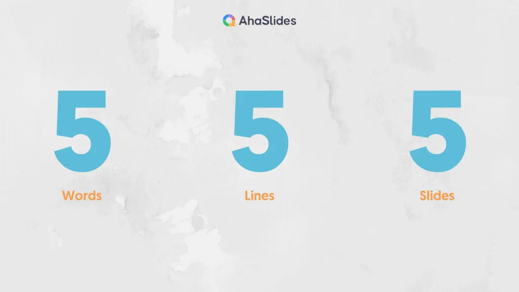
Your slides shouldn’t include everything you say; it’s a waste of time to read out loud what you’ve written (as your presentation should only last under 20 minutes ) and it’s incredibly dull for those in front of you. The audience is here to listen to you and your inspiring presentation, not to see a screen that looks like another heavy textbook.
The 5/5/5 rule does set boundaries for your slideshows, but these are to help you keep your crowd’s attention better.
Let’s break down the rule 👇
Five words on a line
A good presentation should include a mix of elements: written & verbal language, visuals, and storytelling. So when you make one, it’s best not to centre around the texts only and forget everything else.
Cramming too much information on your slide decks doesn’t help you at all as a presenter, and it’s never on the list of great presentation tips . Instead, it gives you a lengthy presentation and disinterested listeners.
That’s why you should only write a few things on each slide to trigger their curiosity. According to 5 by 5 rules, it’s no more than 5 words on a line.
We understand that you have a bunch of beautiful things to share, but knowing what to leave out is as important as knowing what to put in. So, here’s a quick guide to help you do this with ease.
🌟 How to do it:
- Use question words (5W1H) – Put a few questions on your slide to give it a touch of mystery . You can then answer everything by speaking.
- Highlight keywords – After outlining, highlight keywords that you want your audience to pay attention to, and then include them on the slides.
Take this sentence: “Introducing AhaSlides – an easy-to-use, cloud-based presentation platform that excites and engages your audience through interactivity.”
You can put it in fewer than 5 words in any one of these ways:
- What is AhaSlides?
- Easy-to-use presentation platform.
- Engage your audience through interactivity.
Five lines of text on a slide
Text heavy slide design is not a wise choice for a fascinating presentation. Have you ever heard of the magical number 7 plus/minus 2 ? This number is the key takeaway from an experiment by George Miller, a cognitive psychologist.
This experiment implies that a human’s short-term memory typically holds 5-9 strings of words or concepts, so it’s hard for most ordinary people to remember more than that in a really short period of time.
That means that 5 lines would be the perfect number for an effective presentation, as the audience can grasp important information and memorise it better.
- Know what your key ideas are – I know you’ve put tons of thought into your presentation, and everything you’ve included seems so vital, but you need to settle on the main points and summarise them in a few words on the slides.
- Use phrases and sayings – Don’t write the whole sentence, simply pick out the essential words to use. Also, you can add a quote to illustrate your point instead of throwing everything in.
Five slides like this in a row
Having a lot of content slides like this can still be too much for the audience to digest. Imagine 15 of these text-heavy slides in a row – you’d lose your mind!
Keep your text slides to a minimum, and look for ways to make your slide decks more engaging.
The rule suggests that 5 text slides in a row are the absolute maximum you should make (but we suggest a maximum of 1!)
- Add more visual aids – Use images, videos or illustrations to make your presentations more diverse.
- Use interactive activities – Host games, icebreakers or other interactive activities to connect with your audience.
Instead of giving your audience a lecture, try brainstorming together to give them something different that helps them remember your message longer! 👇
Benefits of the 5/5/5 Rule
The 5/5/5 not only shows you how to set a boundary on your word counts and slides, but it can also benefit you in many ways.
Emphasise your message
This rule ensures that you highlight the most critical information to deliver the core message better. It also helps to make you the centre of attention (instead of those wordy slides), which means the audience will be actively listening and understanding your content better.
Keep your presentation from being a ‘read-out-loud’ session
Too many words in your presentation can make you dependent on your slides. You’re more likely to read that text out loud if it’s in the form of long paragraphs, but the 5/5/5 rule encourages you to keep it bite-sized, in as few words as possible.
Alongside that, there are three no-nos you can gain from this:
- No classroom vibe – With 5/5/5, you won’t sound like a student reading everything for the whole class.
- No back to the audience – Your crowd will see your before more than your face if you read the slides behind you. If you face the audience and make eye contact, you’ll be more engaging and more likely to make a good impression.
- No death-by-PowerPoint – The 5-5-5 rule helps you avoid common mistakes while making your slideshow that can make your audience tune out quickly.
Reduce your workload
Preparing tons of slides is exhausting and time-consuming, but when you know how to summarise your content, you don’t have to put too much work into your slides.

Cons of the 5/5/5 Rule
Some people say that rules like this are made up by presentation consultants, as they earn a living by telling you how to make your presentations great again 😅. You can find many similar versions online, like the 6 by 6 rule or 7 by 7 rule, without knowing who invented stuff like this.
With or without the 5/5/5 rule, all presenters should always strive to reduce the amount of text on their slides. 5/5/5 is pretty simple and doesn’t get to the bottom of the problem, which is the way you lay out your content on the slides.
The rule also tells us to include, at most, five bullet points. Sometimes that means filling a slide with 5 ideas, which is way more than the widely held belief that there should be only one idea in a fall. The audience might read everything else and think of the second or third idea while you’re trying to deliver the first one.
On top of that, even if you follow this rule to a tee, you might still have five text slides in a row, followed by an image slide, and then a few other text slides, and repeat. That’s not appealing to your audience; it makes your presentation just as stiff.
The 5/5/5 rule can sometimes go against what is considered good practice in presentations, like having visual communication with your audience or including some charts, data , photos, etc., to illustrate your point clearly.
The 5/5/5 rule can be put to good use, but it does have its own pros and cons. There is still a bit of a debate here on whether it’s worth using, but the choice is yours.
Alongside using these rules, check out some tips to help nail your presentation.
Engage your audience better with your slides, learn more on AhaSlides interactive features today!
- AhaSlides Random Team Generator | 2024 Random Group Maker Reveals
- AI Online Quiz Creator | Make Quizzes Live
- What is a Rating Scale? | Free Survey Scale Creator
- Host Free Live Q&A with AhaSlides
- Reveal top 12 Free Survey Tools in 2024
How to reduce text-heavy slide design?
Be concise at everything like minimizing texts, headings, ideas. Instead of heavy texts, let’s show more charts, photos and visualizations, which are easier to absorb.
What is 6 by 6 rule for Powerpoint presentations?
Only 1 thought per line, no more than 6 bullet points per slide and no more than 6 words per line.

A lifelong learner, a traveller and content creator eager to explore the best of both worlds: the real and virtual one full of interactive activities with AhaSlides.
Tips to Engage with Polls & Trivia
More from AhaSlides

Discover all our templates for Google Slides and PowerPoint that include 5 options. These can be 5 steps in a process, 5 items in a list, 5 elements of a chart, etc.
5-Stage Merging Arrow
Google Slides , PPTX

Tabbed Timeline

Zigzag Growth Process
Ring Arrow Linear Process

5-Layer Pyramid Projection

5-Blade Pinwheel Diagram
5-Step Arrow Cycle Process

Puzzle Process Flow

5-Stage Cycle Tree

Pin Timeline

Alternating Hexagon Pair Process

5-Step Decision Funnel
Search templates by categories, search templates by colors.
Love our templates? Show your support with a coffee!
Thank you for fueling our creativity.
Charts & Diagrams
Text & Tables
Graphics & Metaphors
Timelines & Planning
Best-Ofs & Tips
Terms and Conditions
Privacy Statement
Cookie Policy
Digital Millennium Copyright Act (DMCA) Policy
© Copyright 2024 Ofeex | PRESENTATIONGO® is a registered trademark | All rights reserved.

To provide the best experiences, we and our partners use technologies like cookies to store and/or access device information. Consenting to these technologies will allow us and our partners to process personal data such as browsing behavior or unique IDs on this site and show (non-) personalized ads. Not consenting or withdrawing consent, may adversely affect certain features and functions.
Click below to consent to the above or make granular choices. Your choices will be applied to this site only. You can change your settings at any time, including withdrawing your consent, by using the toggles on the Cookie Policy, or by clicking on the manage consent button at the bottom of the screen.
Thank you for downloading this template!
Remember, you can use it for free but you have to attribute PresentationGO . For example, you can use the following text:
If you really like our free templates and want to thank/help us, you can:
Thank you for your support
WHITNEY D. WALTER

PowerPoint Made Easy with the 5 5 5 Rule
Whitney D. Walter
Looking for an easy way to create a more compelling PowerPoint presentation? Look no further than the 5 5 5 rule! This simple guideline makes it easy to lay out your slides in a clear, organized way that draws attention to the most important information.
Experts suggest that using this method – one of the many similar ones out there – will result in a better experience for your audience and better results for you as a presenter.
It can keep you from feeling overwhelmed.
Use images or icons to tell the story., what exactly is the 5 5 5 rule.

Simply put, the 5 5 5 rule (often written as the 5/5/5 or 5-5-5 rule) means that on each slide you should have no more than 5 lines of text. Within each line, there should be no more than 5 words. And finally, there should be no more than 5 text-heavy slides in a row.
5/5/5 Rule Powerpoint Example

Benefits of Using This Rule
Using this simple rule allows you to limit the amount of text on your slides which can be beneficial for many reasons.

You can focus on the main points.
Instead of putting all of your detailed ideas on each slide, this rule reminds you to focus on the main ideas and stops you from committing a major PowerPoint faux pas – reading directly from the screen.
Why shouldn’t you read from the slide?
First, directly from your presentation creates an extremely boring experience for your audience. They came to see you, not to read along with a slide.
Second, it’s often very difficult to read from a slide anyway, so you’re likely to make mistakes or lose your place.
Third, and most importantly, it takes away your chance to make eye contact with the audience and connect with them on a personal level.
So next time you’re giving a presentation, remember not to read directly from the PowerPoint slide – it’ll be better for both you and your audience.
And an added bonus? When you aren’t reading directly from the slide, you are encouraged to explain your ideas through storytelling which is a much better way to relay information.
In fact, studies have shown that our brains naturally look for stories and patterns to help us understand information.
Your audience will be more engaged.
Since your audience won’t be busy reading all of the text on your slide while you’re presenting, they will be more inclined to actually listen to what you’re saying.
Better yet, they will have the opportunity to be more engaged by responding to the things you’re saying or asking questions.
Remember, more than five text-heavy slides in a row will simply be a distraction for your audience and a guaranteed way to lose their interest.
You’ll end up with more professional-looking presentations.
If you’re looking for a quick and simple way to make your presentation look more professional the first thing you should do is evaluate whether you are using an unnecessary amount of text.
Professional presentations typically use clean and easy-to-skim designs. This means taking advantage of negative space (aka purposely leaving empty space on the slide).
If you’ve ever had to create a presentation in rush you know how stressful it can be.
The same is true for those who are new to using PowerPoint and those who are simply not comfortable with its capabilities.
Using this rule can make creating a presentation much less stressful because it gives you a guideline to work off of.
It also minimizes how much time you’ll spend on adding content to the slide because you know that each slide will have no more than 25 total words. (5 lines of text with 5 words each=25 total words.)
If you’re not sure where to start, add your thoughts for each slide to the Notes pane first and then copy/paste only the most necessary information to the actual slide.
How to Use This Rule Effectively
Include high-level, key data points..
Not sure what to include for the “main points” mentioned above? Think about the 5Ws; who, what, where, when, and why.
Try to avoid including information that doesn’t answer one of these questions.
Use headings, short phrases, and common abbreviations.
Using a heading is a great way to summarize the information that will be shown on a particular slide.
Within the slide, locate any complete sentences and determine whether they can be summarized with a short phrase instead.
Here’s an example.
Full Sentence: Our annual earnings were up 10% compared to last year.
Summarized: Annual Earnings: +10% YOY
(In this example, YOY means “year-over-year” which is a frequently used abbreviation in business.)
As you can see, the summarized version allows you to use less text. It also makes it easier for the audience to retain information and recall it later.
You can also remove text from your slide altogether by replacing it with images, icons, or easily recognizable symbols.
There have been numerous studies that show audiences remember information supported by images at a far higher rate than those told with text alone. Use this to your advantage!
Similarly, icons and symbols can easily replace text in many situations.
For example, text that says “this is important” can be replaced with a caution symbol. Text that says “key dates” can be replaced by a calendar icon.
Other Related Questions
What is the 2 4 8 rule in PowerPoint?
The 2 4 8 (also seen as 2/4/8 or 2x4x8) rule is another similar technique used by presenters to organize their slides.
This rule states that you shouldn’t spend more than 2 minutes presenting each slide. Each slide should contain no more than 4 main ideas or bullet points. Each idea or bullet should have 8 words or less.
This approach helps presenters to stay focused on their key points and avoid getting lost in too much detail or extraneous information.
By prioritizing the most important messages, you can ensure that their audiences will take away from the presentation only the most essential information.
What is the 10 20 30 slideshow rule?
The 10 20 30 (or 10/20/30) rule is another set of guidelines for creating effective presentations.
This rule means that your presentation should contain 10 slides total slides, last no more than 20 minutes, and use a font size of no less than 30 points.
The 10/20/30 rule was created by Guy Kawasaki, a venture capitalist and it has since been adopted by many business professionals.
While it’s not a hard-and-fast rule, it is a good general guideline to follow when creating presentations.
What is the rule of 7 in PowerPoint?
Also called the 7×7 rule, it means that for every slide, there should be no more than 7 lines of text or bullet points and no more than 7 words per line.
What is the 6 by 6 rule?
It is nearly identical to the 7×7 rule mentioned above. The 6 by 6 rule (or 6×6) means that for every slide, there should be no more than 6 lines of text or bullet points and no more than 6 words per line.
How many slides is a 5-minute presentation?
Generally speaking, a 5-minute PowerPoint presentation should have somewhere around 5 to 7 slides . This is an ideal number because it strikes the right balance between being concise and providing enough information to engage your audience.
Ultimately, how many slides you need in your presentation will depend on a variety of factors, including the nature of your topic and the specific goals of your presentation.
But with careful planning and clear communication, you can create an effective 5-minute PowerPoint that will help you achieve your objectives and “wow” your audience.
How do you plan a 5-minute presentation?
Planning a 5-minute presentation can be daunting and you might be wondering “how many slides should a 5-minute presentation be?”.
Here are a few steps you can take to make sure you make the most of your time.
First, determine the purpose of your presentation . Are you trying to educate, entertain, or persuade your audience?
Once you know the purpose of your talk, you can begin to plan what to include.
It is important to be concise and clear in your presentations, so plan to focus on just one to three main points . Make sure that you can provide a quick but impactful story (or any supporting evidence) to drive each point home.
Finally, practice your presentation several times before delivering it . This will help you ensure that you stay within the time limit and that your talk flows smoothly while also making sure you don’t forget any important details.
By following these tips, you can plan an effective 5-minute presentation that is sure to engage your audience.

Time to clap it up because you’ve just added some serious productivity-boosting info into your PowerPoint toolkit. Want to dive into even more tips for reducing text? Download the full, free cheatsheet here.
The 5/5/5 rule is a powerful tool for creating effective PowerPoint presentations. It can help you to summarize your ideas, makes your slides more visually appealing, and can even result in increased audience engagement during your presentation.
So when it’s time to draft your next presentation, keep the 5/5/5 rule in mind. It may take a bit of patience to get the process down but, once you do, you’ll see what a significant difference it can make.
Have you used this rule – or similar rules – when creating presentations? Do you know of any other rules that help with efficiency and design? Drop a comment below and let’s talk about it!

Whitney is a recognized Professional Development Expert, professional speaker, and the founder of Harness Your Power. She holds a Master’s in Business Administration from Florida State University and a Microsoft PowerPoint Specialist certification. She has been featured in Yahoo Finance, AOL, Authority Magazine, Business Insider, Fox and more. Read more.
Similar Posts

3 Quick Ways to Embed an Excel File in PowerPoint
When I talk to other PowerPoint users, one of the common statements I hear is “I know there’s an easier way to do it but this is the only way I know”. Whether we’re talking about creating templates, adding video, or exporting to PDFs – this statement is likely to make its way into the conversation. The…

PowerPoint for New Audiences
PowerPoint is a great way to get in front of new audiences. Whether you’re creating stellar presentations behind the scenes or presenting to groups outside of your normal range, you can go from unknown to having raving fans when done right. Either way, these tips for creating PowerPoints for new audiences will help you succeed…

Using PowerPoint’s Compare Feature
When I was a kid, there were two things I loved about doctor’s visits. One- the endless supply of free lollipops. (Obviously.) And two- the Highlights magazines in the waiting room. Do you remember those? Sure they were old and most of the word searches and other puzzles had already been solved but they were…

PowerPoint Agenda Slide: What It Is & Easy Ways to Make One
If you’ve been creating Microsoft PowerPoint presentations for a while, you already know the benefits of starting with a good agenda. As a presenter, it allows you to take control of the conversation from the very beginning. You’ll also have the ability to eliminate audience distractions by clarifying the meeting objective and pointing out when…

How to Add, Align & Delete Text Boxes in PowerPoint
PowerPoint allows you to add a text box to any slide so you can have more control over the placement of your text. Once you’ve added a new text box, you’ll have a variety of formatting options. If you chose to delete a text box, it can be done in just a few clicks. You…

Random PowerPoint Timesavers: Part 1
What if I told you I could give you eight and a half hours back in your workweek? What would you do with this time? Create a plan for your next promotion? Take advantage of a four-day workweek? Perhaps, you’d simply be happy to make it home in time for dinner with the family. The…
Privacy Overview
The 5/5/5 Rule for Presentations: How to Use it and Examples
Last updated on April 10th, 2024

In today’s fast-paced world, delivering effective presentations is more important than ever. Whether you are presenting to colleagues, clients, or conference attendees, the ability to communicate your message clearly and concisely is essential.
One proven method for creating visually appealing presentation slides is the 5/5/5 Rule. This rule is designed to streamline the presentation design process and keep your audience engaged. By following the 5/5/5 Rule, you’ll be able to create presentation slides that are both visually appealing and informative, leading to more successful presentations.
What is the 5/5/5 Rule?
The 5/5/5 Rule is a simple yet powerful guideline for creating presentation slides that are easy to understand and visually engaging. The rule breaks down into three components:
5 words: Limiting 5 words per line
When creating slide templates, it’s essential to prioritize readability. By limiting the number of words on a single line to five, you ensure that your text is easy to read and comprehend, even from a distance. This constraint forces you to be concise and choose your words carefully, ultimately leading to clearer and more effective communication.
The first “5” in the 5/5/5 Rule also encourages presenters to use succinct, powerful language. By condensing your message into a few essential words, you increase the likelihood that your audience will remember and understand the key points of your presentation.
5 lines: Limiting lines of text per slide
Too much text on a single slide can overwhelm your audience, making it difficult for them to process and retain the information being presented. By limiting the number of text lines to five, you reduce the cognitive load on your audience, allowing them to focus on the most important aspects of your message.
Visually appealing slides are crucial for keeping your audience engaged. When you limit the number of text lines on a slide, you create more white space, which can make your presentation slides look cleaner and more professional. This increased visual appeal can help maintain your audience’s attention and contribute to the overall success of your presentation. You can combine this idea with the rule of threes for presentations .
5 slides: Limiting consecutive slides with text
To keep your audience engaged, it’s important to break up long stretches of text-heavy slides. By limiting the number of consecutive slides with text to five, you encourage the use of visuals, multimedia, and other forms of content that can help maintain interest and enhance understanding.
Incorporating visuals such as images, infographics, charts, and videos into your presentation can help illustrate complex concepts and reinforce key points. You can separate essential parts of your presentations into different topics, then keep up to 5 slides in each section. Following the third “5” of the 5/5/5 Rule ensures that your presentation is balanced, engaging, and informative.
Benefits of the 5/5/5 Rule for Presenters
Implementing the 5/5/5 Rule in your presentation design process can lead to several benefits, including:

1. Enhanced audience focus
By reducing the amount of text on your slides and incorporating more visuals, you can help your audience focus on the essential aspects of your message. This focused attention can lead to increased understanding and retention of your presentation’s key points.
2. Improved information retention
When you simplify your slides and present information in a clear, concise manner, your audience is more likely to remember what you’ve shared. The 5/5/5 Rule helps you distill complex ideas into easily digestible slides, increasing the likelihood that your audience will retain the information long after your presentation has ended.
3. More effective communication
The 5/5/5 Rule encourages presenters to be mindful of their audience’s needs and attention spans. By following this guideline, you can communicate your message more effectively, making it easier for your audience to understand and engage with your content.
4. Reduced cognitive load
Limiting the amount of text on your slides and interspersing visuals helps reduce the cognitive load on your audience. When they are not overwhelmed by information, they can better process and remember the key points of your presentation.
How to Implement the 5/5/5 Rule in your own Presentations?
To incorporate the 5/5/5 Rule into your presentation design process, consider the following steps:
1. Analyzing your content
1.1 Identifying key points. Before you start designing your slides, take the time to identify the most important points of your presentation. This process will help you determine what information to include on your slides and how to structure your content effectively.
1.2 Simplifying complex ideas. Once you have identified your key points, consider ways to simplify and distill complex ideas into easy-to-understand concepts. This will make it easier for your audience to grasp your message and increase the likelihood that they will retain the information.
2. Designing your slides
2.1. Emphasizing brevity and clarity. As you design your presentation slides, focus on keeping your text concise and clear. Use the 5x5x5 Rule to guide you in limiting the amount of text on each slide, prioritizing readability and visual appeal.
2.2. Using visuals and multimedia effectively. Incorporate visuals, such as images, graphs, and videos, to support your message and engage your audience. Be mindful of the third “5” in the 5/5/5 Rule, and ensure that you break up long stretches of text-heavy slides with visually appealing and informative multimedia content.
3. Balancing text and visuals
3.1. Knowing when to break the rules. While the 5/5/5 Rule is a helpful guideline, it’s essential to recognize that there may be instances when it’s appropriate to deviate from it. Depending on the complexity of your topic or the needs of your audience, you may need to adjust the rule to suit your specific situation.
3.2. Tailoring your approach to your audience. Consider the preferences and expectations of your audience when designing your slides. Some audiences may appreciate a more text-heavy approach, while others may respond better to visuals and multimedia. Be flexible and adapt your presentation design to meet the needs of your audience.
Relevant Facts Related to 5/5/5 Rule for Presentations
- Attention spans: According to a study conducted by Microsoft, the average human attention span has decreased from 12 seconds in 2000 to 8 seconds in 2013, which is shorter than a goldfish’s attention span (Microsoft, 2015). The 5/5/5 Rule for presentation helps presenters deliver information concisely, catering to these shorter attention spans and improving audience engagement.
- Information overload: A study by the University of California, San Diego, estimated that the average American consumes about 34 gigabytes of data daily (Bohn & Short, 2009). The 5/5/5 Rule for presentation design helps presenters avoid overwhelming their audience with excessive information, allowing them to focus on key points and better retain the presented content.
- Visual learning: According to research, 65% of the population are visual learners (Bradford, 2016). By implementing the 5/5/5 Rule, presenters can create a balanced mix of text and visuals, enhancing understanding and information retention for a majority of the audience.
- Presentation effectiveness: A study from the University of Tennessee found that presentations using visual aids were 43% more persuasive than those without (Vogel et al., 1986). By limiting consecutive text-heavy slides, the 5/5/5 Rule for presentations encourages the use of visual aids, which can improve the overall effectiveness of a presentation.
- Cognitive load: Reducing cognitive load by simplifying information is an essential aspect of effective instructional design (Sweller, 1994), also relevant with the ADDIE model . The 5/5/5 Rule addresses this by limiting words per line and lines per slide, making it easier for the audience to process and retain the presented information.
The 5/5/5 Rule is a powerful presentation design tool for creating visually appealing and effective presentation slides. By limiting the amount of text on your slides, incorporating visuals and multimedia, and tailoring your approach to your audience, you can improve the overall success of your presentations. As you embark on your next presentation design process, consider implementing the 5/5/5 Rule to enhance your PowerPoint slides or Google Slides, and make your message more engaging and memorable for your audience.
Leave a Comment Cancel reply
Your email address will not be published. Required fields are marked *
Save my name, email, and website in this browser for the next time I comment.
Sign up to our newsletter
We will send you our curated collections to your email weekly. No spam, promise!
Home Blog Presentation Ideas 10+ Outstanding PowerPoint Presentation Examples and Templates
10+ Outstanding PowerPoint Presentation Examples and Templates

Nobody said it’s easy to make a PowerPoint presentation . There are multiple design decisions to consider, like which layout is appropriate for the content you have to present, font pairing, color schemes, and whether to use animated elements or not.
Making these choices when working under the clock is overwhelming for most people, especially if you only intend to make a report more visually appealing. For this very reason, we curated a selection of 11 good PowerPoint presentation examples categories in different niches to give you insights into what’s valued and how to take your presentations to a professional quality. All the templates used on each case will be linked for easy access.
Table of Contents
General Guidelines for Professional-Quality PowerPoint Presentations
Business pitch powerpoint presentation examples, marketing plan powerpoint presentation examples, company profile powerpoint presentation examples, quarterly/annual results presentation examples, project proposal presentation examples, training presentation examples, change management presentation examples, industry analysis presentation examples, financial planning examples, inspirational presentation examples, academic presentation examples, final words.
Before introducing our presentation slide examples, we need to discuss a list of factors that transform an average slide into a professional-quality one.
Design Principles
For any professional-level slide deck, a consistent layout, color scheme, and font pairing are required throughout the presentation. The slides should remain uncluttered, with proper care of white balance across their composition, and stick to the 10-20-30 rule of presentations ’s concept of one concept per slide.
Contrast between text and background color must comply with web design accessibility standards , meaning to work with a 4.5:1 contrast ratio for normal text, with exceptions for larger text. You can find more information in our article on accessibility for presentations .
A general rule in any graphic design project is to stick with fonts with ample legibility, like Arial, Helvetica, or Calibri. These are known as sans-serif fonts, and they work better than serif ones (i.e., Times New Roman) for larger text blocks.
Avoid using more than two different font families in your presentation; otherwise, the overall design will lose cohesion. Since you ought to ensure readability, the minimum size for body text should be 18pt, opting for larger variations and/or bold text for titles.
Using a combination of font pairing and font sizing helps create a hierarchy in your slides’ written content. For more insights on this topic, browse our article on fonts for presentations .
Color Scheme
Sticking to a color palette selection is one of the first design decisions to make when creating a custom slide deck . Colors have their own psychological impact on presentations, as explained in our article on color theory , so presenters must stick to 3-4 colors to avoid mixing up content in the slides. That being said, the colors have to be carefully selected according to the typical color scheme configurations, and using contrast to highlight key points on presentation slides.
Slide Layout
We can apply multiple graphic design guidelines to create professional-quality presentation slides, but in order to simplify the process, here are the key points to take into account:
- Grids and Guides: Divide your slide into sections using guides in PowerPoint or Google Slides. Then, you can build a grid that helps place elements and catch the viewer’s interest as they follow a logical flow while looking at the slide.
- Whitespace : Empty space is not your enemy. Slides shouldn’t be dense or feel hard on the eyes to read; therefore, work with a minimum of 30% whitespace.
Multimedia Elements
According to our expertise, video presentations and animation effects certainly increase the retention rate of the content you present. This is because they reduce the tiresome 2D presentation layout and add dynamism to the slides. Testing their functionality across different devices is a must to incorporate these elements into your presentation, especially if we consider that not all PowerPoint animation effects are compatible with Google Slides animations .
Sound can be distracting in many scenarios unless you opt for an interactive presentation and require an audio track for an exercise. Action buttons in the form of quizzes or multiple-choice questions are fine examples of how we can integrate hyperlinks in interactive presentations.

The first professional PowerPoint example we will cover is when creating a problem slide business pitch. This selected business pitch PPT template has a 50/50 image-to-content balance that allows us to add images from our organization (or stick to the corporate placeholder image design) and quickly summarize the issue or need that our business aims to solve.
Remember that the selected colors for the text background area and text color are not 100% pure values—they are slight variations to reduce eye strain, making this slide a perfect choice for any kind of meeting room. Ideally, you can present up to three different problems to solve; otherwise, the text will look too small.

Another fine example of a PowerPoint presentation comes at the time of delivering an elevator pitch . As we all know, this concise presentation format requires a considerable amount of presentation aids to briefly expose each point in the speech under the allotted time frame. In this Revenue Model slide, we can find the answers to typical questions that help us shape the speech, all of them with icons and cues to remember from which areas the information comes.

If we aim to create a sponsorship pitch deck , it is important to bring proof of past sponsorship experiences to build our credibility in front of prospective sponsors. With this best PPT template tailored for sponsorship pitch presentations, we can display such data in an attractive visual format. The neat layout balances whitespace with content, with three distinctive KPI areas to talk about your history in sponsorship experiences.

Talk about the market segmentation strategies of your marketing plan with this creative infographic template. This slide clearly illustrates that not all examples of PowerPoint presentations follow the same structure in terms of graphics-to-text balance. You can introduce data on how purchasing habits, user status, and brand loyalty influence buying decisions. Present key information about demographic & geographic segmentation and how psychographic information can provide deeper insights into consumer motivations to purchase.

Another PowerPoint example comes in the format of presenting market opportunities in marketing plans . You can list up to four points, which can be extracted from the outcomes of a SWOT analysis or from retrieved data from polls or stakeholders’ insights. The icons are entirely editable, and the crisp layout makes readability much easier.

Marketing agencies can benefit from this presentation PowerPoint example, which illustrates how easy it is to customize the content and repurpose slides for different client meetings. This and the other slides of this marketing plan slide deck allow professionals to discuss their expertise, past projects, and proposals for their target clients. In this case, the agency in question is offering insights on their work ethics through a clean slide layout with icons to flag key areas.

Our next PPT presentation example is suited for a Company Profile presentation in which we have to disclose key financial data. Thanks to the pie chart, presenters can segment revenue streams or do a balance between investments and profit. Additionally, the box placeholders allow us to deepen our knowledge of precise areas of interest.

Organizations who are looking to create a company profile can opt for a one-page arrangement to introduce the team members in charge, the overall services or products, the business model, the market, competitors, and relevant strategy information. The text boxes placed in the right area are a perfect opportunity to highlight KPIs.

In any company profile presentation, we have to introduce the organization’s Mission and Vision Statements. This presentation sample slide allows us to creatively discuss those topics. Including icons, users can summarize the primary aspects of their mission statement in one single, professionally styled slide.

Quarterly reports don’t need to be depicted as boring PDF files. We can work with clean layouts that provide information in an easy-to-follow format that focuses on the core elements of the report. This quarterly report presentation example is perfect for detailed reports as we cover all essentials in a one-page format for an employee’s performance review.

If, instead, you opt for a department-by-department approach, this slide presentation example illustrates two out of four quarters in the annual report. You can compare the product’s performance by production, allowing room to perform further optimizations based on sales behavior.

The construction industry requires a detailed presentation that covers all planned and contingency strategies for a project. Such an approach builds trust in the client, and that’s why we believe this PPT template for contractors is an essential tool for securing business deals. This presentation example template shows how to deliver a project proposal in style with accurate cost estimates.

A generic PPT project proposal template allows us to repurpose the slide for many projects—ideal for agencies, consultants, and academics. With this visual project proposal timeline, you can discuss the different stages of a project, plan for resources (both material and workforce), seek funding, or prepare for contingencies.

Once the project proposal’s core aspects are approved, teams must align efforts for project deliverables, acceptance criteria, and delivery format. This PPT presentation example illustrates a slide in a multi-team meeting to fine-tune aspects of the project deliverables, with an accurate representation of the due date and expected products.

Team training requires a framework in which the objectives of the workshop, coaching, or mentoring programs are laid out for management. HR teams can benefit from this presentation example by summarizing the objectives about missed business opportunities or expansion plans for the organization.

Before even delivering a training program, HR teams discuss the content to cover with the head of each department, mainly to spot any missing area of knowledge required for optimal operations. Presenters can repurpose this slide for that kind of training proposal presentation or the training presentation itself.

Intended for the early planning stages of a training program, this diagram is a well-rounded presentation example of how to discuss all points in one single slide, from the training budget to how to process employee feedback. We can expand each of these six topics in companionship slides.

Companies undergoing change management processes can opt to apply the DMAIC or the ADKAR frameworks to orient the workforce. This presentation slide allows management to compare both methodologies and pick the one best suited for their organization.

Since data sharing is delicate in charge management situations, implementing an information flow diagram is a good practice to orient your team, get the new owners or management the required information, and exchange information between departments.

For change management directed at process optimization, this example slide allows management to stress the importance between the current situation and the expected improved state. This PPT template can also introduce the different milestones per stage and involve the management parties per area.

Startups often present their industry analysis to procure investment from venture capitalists. This industry analysis presentation example showcases a typical FinTech segmentation. Presenters can describe the different types of crowdfunding, credit, and factoring services and provide examples of companies or platforms in each subcategory. They can discuss areas like asset management, payments, and other relevant aspects in detail, with successful stories from referents that helped shape their business model.

STEEPLE stands for Social, Technological, Economic, Ethical, Political, Legal, and Environmental factors. This framework allows us to perform a multidimensional industry analysis in which stakeholders can evaluate the appropriate approaches for venturing into a new business niche, renewing their overall strategy, or pursuing new goals based on recent industry changes, even those we don’t initially acknowledge.

The Gap Analysis concept compares a company’s current status to a desired future state. By doing so, organizations can identify deficits or areas that require improvement in alignment with the future state. Presenters can work with this metaphorical gap analysis template and express the need for a plan that bridges such a gap.

The next example of a PowerPoint presentation is oriented to the financial area, in which a consultant can refer to an organization’s asset management. By Scope, we imply the extent and boundaries of the asset management activities within an organization. It outlines what will be included in the asset management plan and what will not. On the other hand, Inventory points to a comprehensive and detailed list of all the assets owned by an organization. It includes essential information about each asset to facilitate effective management.

In financial presentations, the information must be clearly arranged so decisions can be made easily. In this case, we observe how a financial dashboard template can represent an organization’s relevant KPIs.

Think about TEDx presentations or Pecha-Kucha . They all have one factor in common: quality graphics to talk about inspirational stories. Graphics can feel overwhelming for some presenters, which ends in picking low-quality pictures or stock images unsuitable for the context of your slide deck. For this reason, we highly recommend you implement vector illustrations into your motivational presentation slides. Easy to customize, they are a valuable asset to mix & match PPT templates and create your custom deck.

Aligning efforts toward a common goal requires a powerful visual communication language. Images are easier to retain than words, so imagine adding a storytelling factor and turning a goal into a mountain to conquer. Presenters can work with this mountain PPT template and signal the different milestones to reach prior to fulfilling a significant goal for the company/organization.

Another take in inspirational presentations is when we need to share our success stories with investors or in networking environments to inspire others. With this roadmap PPT template, presenters can go stage by stage and present the key stages that made them reach their success, or even project for expected goals to achieve.

Academic presentations don’t have to look dull or excessively formal. We can incorporate a sleek layout into our slides and use icons to highlight key points. In this case, we observe a project overview for a research project, and the icons represent the main aspects to cover in this research.

A thesis presentation requires properly introducing the methodology to demonstrate the hypothesis. Rather than adding complex figures, we can work with a minimalistic slide design and briefly describe the research methods. This slide deck is suitable for thesis presentations as well as academic projects, research papers , and more.
As we can see, counting with a professionally designed slide deck makes a difference in how your presentation is perceived by the audience. By working with SlideModel PowerPoint templates, we can reuse and repurpose our slide templates as often as required or mix elements from different slides seen in these PowerPoint presentation examples to create uniquely styled slide decks.

Like this article? Please share
Presentation Approaches, Presentation Ideas Filed under Presentation Ideas
Related Articles

Filed under Google Slides Tutorials • May 22nd, 2024
How to Add Audio to Google Slides
Making your presentations accessible shouldn’t be a hard to accomplish task. Learn how to add audios to Google Slides and improve the quality and accessibility of your presentations.

Filed under Design • May 22nd, 2024
Exploring the 12 Different Types of Slides in PowerPoint
Become a better presenter by harnessing the power of the 12 different types of slides in presentation design.

Filed under Design , Presentation Ideas • May 1st, 2024
The Power of Mind Map Note Taking for Presenters
Add a new tool to your repertoire of presentation skills by mastering the art of mind map note taking. An ideal process to facilitate content retention.
Leave a Reply
- Add an image
- Draft and add content
- Rewrite text
- Chat with Copilot
- Create a summary
- Copilot in Word on mobile devices
- Create a new presentation
- Add a slide or image
- Summarize your presentation
- Organize your presentation
- Use your organization's branding
- Copilot in PowerPoint for mobile devices
- Draft an Outlook email message
- Summarize an email thread
- Suggested drafts in Outlook
- Email coaching
- Get started with Copilot in Excel
- Identify insights
- Highlight, sort, and filter your data
- Generate formula columns
- Summarize your OneNote notes
- Create a to-do list and tasks
- Create project plans in OneNote

Create a new presentation with Copilot in PowerPoint
Note: This feature is available to customers with a Copilot for Microsoft 365 license or Copilot Pro license.
Create a new presentation in PowerPoint.

Select Send and Copilot will draft a presentation for you!
Edit the presentation to suit your needs, ask Copilot to add a slide , or start over with a new presentation and refine your prompt to include more specifics. For example, "Create a presentation about hybrid meeting best practices that includes examples for team building.”
Create a presentation with a template
Note: This feature is only available to customers with a Copilot for Microsoft 365 (work) license. It is not currently available to customers with a Copilot Pro (home) license.
Copilot can use your existing themes and templates to create a presentation. Learn more about making your presentations look great with Copilot in PowerPoint .

Enter your prompt or select Create presentation from file to create a first draft of your presentation using your theme or template.

Edit the presentation to suit your needs, ask Copilot to add a slide , organize your presentation, or add images.
Create a presentation from a file with Copilot
Note: This feature is available to customers with a Copilot for Microsoft 365 license for full options, or a Copilot Pro license for limited options.

With Copilot in PowerPoint, you can create a presentation from an existing Word document—or a PDF if you have a Copilot for Microsoft 365 (work) license. Point Copilot in PowerPoint to your document, and it will generate slides, apply layouts, create speaker notes, and choose a theme for you.

Select the document you want from the picker that appears. If you don't see the document you want, start typing any part of the filename to search for it. You can use a Word document—or, if you have a Copilot for Microsoft 365 (work) license, you can use a PDF, and encrypted documents are available as well.
Note: If the file picker doesn't appear, type a front slash (/) to cause it to pop up.
Select Send and Copilot will draft a presentation for you!
Best practices when creating a presentation from a Word document
Leverage word styles to help copilot understand the structure of your document.
By using Styles in Word to organize your document, Copilot will better understand your document structure and how to break it up into slides of a presentation. Structure your content under Titles and Headers when appropriate and Copilot will do its best to generate a presentation for you.
Include images that are relevant to your presentation
When creating a presentation, Copilot will try to incorporate the images in your Word document. If you have images that you would like to be brought over to your presentation, be sure to include them in your Word document.
Start with your organization’s template
If your organization uses a standard template, start with this file before creating a presentation with Copilot. Starting with a template will let Copilot know that you would like to retain the presentation’s theme and design. Copilot will use existing layouts to build a presentation for you. Learn more about making your presentations look great with Copilot in PowerPoint .
Tip: Copilot works best with Word documents that are less than 24 MB.
Welcome to Copilot in PowerPoint
Frequently Asked Questions about Copilot in PowerPoint
Where can I get Microsoft Copilot?
Copilot Lab - Start your Copilot journey

Need more help?
Want more options.
Explore subscription benefits, browse training courses, learn how to secure your device, and more.

Microsoft 365 subscription benefits

Microsoft 365 training

Microsoft security

Accessibility center
Communities help you ask and answer questions, give feedback, and hear from experts with rich knowledge.

Ask the Microsoft Community

Microsoft Tech Community

Windows Insiders
Microsoft 365 Insiders
Find solutions to common problems or get help from a support agent.

Online support
Was this information helpful?
Thank you for your feedback.
Contribute to the Microsoft 365 and Office forum! Click here to learn more 💡
April 9, 2024
Contribute to the Microsoft 365 and Office forum!
Click here to learn more 💡
PowerPoint Forum Top Contributors: Steve Rindsberg - John Korchok - Bob Jones AKA: CyberTaz ✅
May 10, 2024
PowerPoint Forum Top Contributors:
Steve Rindsberg - John Korchok - Bob Jones AKA: CyberTaz ✅
- Search the community and support articles
- Microsoft 365 and Office
- Search Community member
Ask a new question
How to combine 5 multiple PPTs into a single PPT with only one slide which has all the slides of those 5 PPTs?
My manager has given me 3 PPTs and each PPT has 2 slides with multiple images attached in each slide and now he wants me to combine all those PPTs to create a new PPT with only one slide with all the images and slides taken from the 3 different PPTs (basically a combination of all the 3 PPTs into a single PPT with single slide? How to do it?)
- Subscribe to RSS feed
Report abuse
Reported content has been submitted
Replies (1)
- Volunteer Moderator
You can do this with animations to make the images appear and disappear in sequence. It's more work to set up than simply having separate slides, but it's possible.
Was this reply helpful? Yes No
Sorry this didn't help.
Great! Thanks for your feedback.
How satisfied are you with this reply?
Thanks for your feedback, it helps us improve the site.
Thanks for your feedback.
Question Info
- Norsk Bokmål
- Ελληνικά
- Русский
- עברית
- العربية
- ไทย
- 한국어
- 中文(简体)
- 中文(繁體)
- 日本語
- /
Publication and presentation roundup — Summer 2024

The latest scholarly work from the UNC School of Nursing
Carolina Nursing faculty, staff and students are actively sharing their research findings on critical health care topics through publications in academic journals and presentations at national and international conferences.
Take a look at the selection of publications and presentations below to learn more about how Carolina Nursing experts are advancing health for all by addressing the greatest health care challenges of our time.
Please note that the following list was compiled based on information submitted by our researchers and is categorized into presentations and publications.
Have a publication or presentation to share? School of Nursing faculty, students and staff can submit publications and presentations here to be included in the next roundup.
- Publications
2024 ACC Expert Consensus Decision Pathway for Treatment of Heart Failure With Reduced Ejection Fraction: A Report of the American College of Cardiology Solution Set Oversight Committee
As a board-certified practicing nurse practitioner and expert in caring for adults with chronic cardiovascular conditions, Leslie Davis , PhD, RN, ANP-BC, FAAN, FAANP, FACC, FAHA, FPCNA, served as a coauthor for the recently published 2024 American College of Cardiology Expert Consensus Decision Pathway for Treatment of Heart Failure with Reduced Ejection Fraction. As the sole nurse on the group of experts Dr. Davis led the writing of sections related to how to optimize care coordination, patient adherence to the treatment regimen, and managing patient cost and access to needed therapies. Expert consensus decision pathways provide real-world clinicians easy with a framework to guide decisions required in the management of patients with chronic heart failure. These documents include checklists and algorithms to guide clinicians into providing the latest evidence-based care.
Data Interoperability for Ambulatory Monitoring of Cardiovascular Disease: A Scientific Statement From the American Heart Association
Leslie Davis , PhD, RN, ANP-BC, FAAN, FAANP, FACC, FAHA, FPCNA, served as a coauthor for the recently published American Heart Association scientific statement on data interoperability for wearable devices in patients with cardiovascular disease. As wearable devices designed to detect and track the progress of cardiovascular conditions become more mainstream it is important to optimize how patients and the health care system receive and use this information for improving care outcomes. This scientific statement reviews the current landscape and gaps in technology, including recommendations for what is needed to optimize interoperability among systems of care.
Multilevel Intervention Stepped Wedge Designs (MLI-SWDs)
Shawn Kneipp , PhD, RN, ANP, APHN-BC, and her research team were invited by NIH to contribute to a special issue on multilevel designs in Prevention Science. Published in the May 2024 issue, the article addresses randomization and employer enrollment challenges in the NC Works4Health study that Dr. Kneipp serves as PI on.
Presentations
From Pressure to Problems: Navigating the Impact of Hypertension on Cardiovascular Disease
Leslie Davis , PhD, RN, ANP-BC, FAAN, FAANP, FACC, FAHA, FPCNA, recently served as chair of a Heart House Roundtable entitled: From Pressure to Problems: Navigating the Impact of Hypertension on Cardiovascular Disease. Heart House Roundtables convene groups of experts from around the world to discuss gaps in care for patients at risk or with cardiovascular disease in order to develop actionable solutions.
Breaking the Silence in Mental Health
The 2024 Royster Global Conference was held from June 4-7 on the campus of King’s College London, focusing on the theme “Beyond the Research: Communities and Knowledge Equity.” Jian (Lily) Chen, a second-year PhD student and Royster Fellow, attended the conference. She presented her work titled “Breaking the Silence in Mental Health.”
- Areas of Expertise

5 Better Alternatives To Google Slides
I f you're looking to create a compelling presentation to showcase a new idea or persuade others, Google Slides may be the first option that comes to mind. But with few built-in templates, basic themes, and a limited graphics collection, you'll likely have a hard time making your presentation stand out against others.
If you want to make your presentation truly stand out, there are several alternatives to Google Slides that offer extra perks and features to give your presentations an edge. While Google focuses on integrating Slides with its other work-based apps like Sheets and Docs, other presentation apps focus more on design elements, transitions, and themes to help you convey your brand or personal image throughout your presentation.
We've tested these Google Slide alternatives to give you an idea of other available options to deliver impactful presentations. If you're looking for a way to make boring information more fun and engaging, here are the best presentation apps to replace Google Slides.
Read more: Major Graphics Card Brands Ranked Worst To Best
Microsoft PowerPoint
There's a reason so many businesses around the globe use Microsoft PowerPoint. Building its reputation as the go-to option for delivering high-quality presentations, the software generated $100 million in annual sales only three years after its initial release in 1990.
Microsoft PowerPoint may be Google Slides' largest competitor, but there are plenty of unique features that can add an extra flourish to your slides. PowerPoint excels in its impressive library of custom animations and slide transitions, which are fairly limited in Google Slides. Another unique feature is its AI-powered Designer tool. This provides professional design schemes that mirror the words used in your slides. For instance, if your title slide is named "Basketball Team 2024," Designer will automatically suggest pictures and slide layouts associated with basketball.
As PowerPoint has been in development longer than Google Slides, it naturally offers more nuanced features if you're looking for something specific. For example, you can save individual slides as an image file (using .png or .jpeg formats) or as a separate presentation file. There's also a large library of free PowerPoint templates designed to speed up your workflow. Moreover, PowerPoint integrates seamlessly with Microsoft Teams with its PowerPoint Live function, allowing you to easily share your presentation with your co-workers.
Prezi offers an innovative approach to showing presentations with its unique canvas feature. Unlike traditional presentation software, Prezi lets you zoom and pan around a flexible canvas. The canvas may feel distant to something of a presentation program, but there is still some linear order provided thanks to the Timeline view.
Finding ways to visualize data is one of the biggest challenges when dealing with presentation software. Prezi resolves this struggle with the help of its Story Blocks: a series of infographics available in multiple designs to visually represent data. You can easily edit infographics and even add animations to individual shapes. This can help add a story to your presentation and help you emphasize key points.
To further enhance your presentation visually, Prezi offers several topic path settings, which let you change how Prezi transitions from one topic to another. These options include subtopics, which are super helpful for breaking large chunks of information down. If you're looking for a unique, modern approach to presenting information, Prezi is a top pick.
If you're looking to create a professional presentation to convince potential clients about your business idea, Slidebean is a popular choice among professionals with plenty of customization options. One of the issues with Google Slides is its fairly limited template library, which is filled mostly with basic designs. Slidebean offers a better alternative with a broad selection of innovative templates split into categories for convenience.
The app's user interface is easy to navigate so that you can create slides in less time. Each slide has a dedicated Design and Outline tab. You can use the Outline tab to quickly edit the information on each slide without being distracted by all the visual elements. Another productivity-enhancing feature is the ability to generate a presentation theme from your website. Simply enter your URL, and Slidebean will automatically apply the theming to your presentation.
Slidebean is another presentation app to take advantage of AI. Using the Auto-Design feature, you can generate recommended slide layouts based on your existing content. It also features AI text suggestions designed to suit different industries. Overall, Slidebean offers a quicker, more efficient method for creating stunning presentations compared to Google Slides.
Canva is a well-known app among graphic designers, but it's also capable of making stunning presentations. The app also has mobile editions, so you can easily create and edit presentations on your Android phone , iOS device, or tablet. As long as you have an internet connection, you can modify your designs wherever you are.
To get started, head to Canva's online presentation maker . Canva offers a vast range of templates categorized by topic, which easily surpasses the simple templates in Google Slides . While some of the templates are only available to Canva Pro members, there is an ample amount of free templates to help you get started. You'll also find a large selection of stock photos, shapes, and illustrations to create beautiful customized slides.
Because Canva is built for graphic designers, you can access several features to give your presentation consistent theming. These include color palettes, font sets, and even a brand kit that allows you to add your company's fonts (available to Pro members only). One time-saving feature is Canva's Uploads tab, which lets you access recently uploaded media files. This offers a convenient way to copy content between different presentations.
Visme is a powerful visual design tool able to create videos, infographics, and presentations. One of the perks of using Visme is the company's free educational content, which offers advice on how to create impactful content to boost your brand. After signing up, the company also asks whether you're using Visme for your business, education purposes, or personal use to offer personalized tips.
In terms of charts and graphs, Visme offers some of the most impressive features we've seen from a presentation app, so you can effortlessly convey important statistics. From the Data tab, you can access dozens of graph styles to visually represent your data. Then, simply double-click a chart inside your presentation to edit the values instantly in a simple table format.
Another area that Visme excels in is collaboration. You can either generate a link to publish your presentation on the web or share your presentation privately with others. For each team member, you can choose who can view, edit, and comment slides for a seamless workflow. There's also a Slack integration that lets you receive messages whenever changes are made to your presentation. Visme is free for all users, with limited features available in its premium plans.
Read the original article on SlashGear .

IMAGES
VIDEO
COMMENTS
How many slides are in a 5-minute presentation? Five or six slides, or about one per minute, is a good baseline for a 5-minute presentation. Depending on your subject matter, however, you might use up to 20 slides and spend about 10 or 15 seconds on each. More important than your slide count is what each slide contains.
Quickly grab it before you read on. Jump to content in this section. Make Amazing 5-Minute Presentations (Quickstart Video) Step 1. Know Your Audience Well. Step 2. Choose the Right 5-Minute Presentation Topics. Step 3. Use a Professional Presentation Template for Your Mini Presentation.
Therefore, for a 5-minute speech, you might aim for: At 130 words per minute: 130×5=650 words. At 150 words per minute: 150×5=750 words. That calculation can help you curate the script for your speech. In general lines, our expertise tells us that selecting a topic that can be covered within 5 minutes is roughly 60% of the job.
However, a 5-minute speech is roughly 700 words long. Secret tip: Go the extra length by making your presentation interactive. You can add a live poll, Q&A section, or quiz that illustrates your points and leaves a lasting impression on the audience. Get Interactive, Fast 🏃♀️.
Short PowerPoint Presentation Example #1: The Five-Minute / Five-Slide Presentation. A classic example here is the five-minute presentation. This is similar to a Pitch-Presentation , but structured slightly differently. Read on to see how. What does a 5-minute / 5-slide presentation entail?
Apply the 10-20-30 rule. Apply the 10-20-30 presentation rule and keep it short, sweet and impactful! Stick to ten slides, deliver your presentation within 20 minutes and use a 30-point font to ensure clarity and focus. Less is more, and your audience will thank you for it! 9. Implement the 5-5-5 rule. Simplicity is key.
Creating a mini-slideshow? Let's explore how to make a successful short presentation. In this video, we'll discuss five-minute presentation topics, look at s...
Use Google Slides to create online slideshows. Make beautiful presentations together with secure sharing in real-time and from any device.
Instead of typing out your entire presentation, include only main ideas, keywords, and talking points in your slide show text. Engage your audience by sharing the details out loud. Follow the 5/5/5 rule. To keep your audience from feeling overwhelmed, you should keep the text on each slide short and to the point.
Presentation templates. Design a presentation that blows your audience away with our stunning collection of high-quality slide templates. Free to personalize online so you can collaborate and present with your colleagues. Create your next awesome presentation with our stunning slide templates. Completely online and free to personalize.
Design, present, inspire with Canva Presentations. Reimagine Presentations with cinematic visuals that captivate your audience - no matter how or where you're presenting. With features to collaborate smarter, create stunning data visualizations, and deliver confidently, Canva Presentations bring impact to your ideas. Create a presentation.
The 5/5/5 Rule explains what it is right in the name: when creating slides for your presentation, use at most: 5 words on a single line. 5 lines of text on a single slide. 5 slides that apply the first two rules in a row. Now, let's take a closer look at each part of the rule, and see how it helps build a better presentation.
The swapping of orientations will show people that the presentation is progressing nicely. It can help you make a strong, almost physical, distinction between ideas, sections or topics. 10. Make your audience laugh, or at least chuckle. Source. Sometimes you need to not take your business presentations too seriously.
This clarifies the overall purpose of your talk and reinforces your reason for being there. Follow these steps: Signal that it's nearly the end of your presentation, for example, "As we wrap up/as we wind down the talk…". Restate the topic and purpose of your presentation - "In this speech I wanted to compare…". 5.
6. "Blitzscaling: Book Trailer," Reid Hoffman. If you're going to go the minimalistic route, I'd take note of this PowerPoint presentation example from Reid Hoffman. This clean design adheres to a simple, consistent color scheme with clean graphics peppered throughout to make the slides more visually interesting.
SMART Goals PowerPoint Presentation Examples. This template assists you in making structured goals. Smart goals stand for Specific, Measurable, Achievable, Relevant, and Time-bound. It means your goals should be specific and easy to measure. The goal should be achievable and relevant and have a deadline.
Free online presentation maker. Try our new tool to edit this selection of templates for people that want to let their creativity run free. Create interactive resources easily, quickly and without the need for any software. A really useful tool for teachers and students. Move the content, add images, change colors and fonts or, if you prefer ...
To do that, simply go up to the Home tab and click on New Slide. This inserts a new slide in your presentation right after the one you were on. You can alternatively hit Ctrl+M on your keyboard to insert a new blank slide in PowerPoint. To learn more about this shortcut, see my guide on using Ctrl+M in PowerPoint.
Download the Pink Theme presentation for PowerPoint or Google Slides and start impressing your audience with a creative and original design. Slidesgo templates like this one here offer the possibility to convey a concept, idea or topic in a clear, concise and visual way, by using different graphic resources.
The 5/5/5 rule sets a limit on the amount of text and the number of slides in a presentation. With this, you can keep your audience from being overwhelmed with walls of text, which can lead to boredom and searching elsewhere for distractions. The 5/5/5 rule suggests you use a maximum of: Five words per line. Five lines of text per slide.
5 options. Discover all our templates for Google Slides and PowerPoint that include 5 options. These can be 5 steps in a process, 5 items in a list, 5 elements of a chart, etc. Charts & Diagrams Circular Processes.
The 5/5/5 rule is a powerful tool for creating effective PowerPoint presentations. It can help you to summarize your ideas, makes your slides more visually appealing, and can even result in increased audience engagement during your presentation. So when it's time to draft your next presentation, keep the 5/5/5 rule in mind.
The 5/5/5 Rule is a powerful presentation design tool for creating visually appealing and effective presentation slides. By limiting the amount of text on your slides, incorporating visuals and multimedia, and tailoring your approach to your audience, you can improve the overall success of your presentations.
Scope slide to establish the financial assets and financial health of an organization. Create a similar design by using our Asset Management PowerPoint Template. The next example of a PowerPoint presentation is oriented to the financial area, in which a consultant can refer to an organization's asset management.
Create a new presentation in PowerPoint. Select the Copilot button in the Home tab of the ribbon. Click or type Create a presentation. Complete the prompt with what you would like Copilot to help you draft. Select Send and Copilot will draft a presentation for you! Edit the presentation to suit your needs, ask Copilot to add a slide, or start ...
Replied on June 5, 2024. Report abuse. You can do this with animations to make the images appear and disappear in sequence. It's more work to set up than simply having separate slides, but it's possible. Author of "OOXML Hacking - Unlocking Microsoft Office's Secrets", ebook now out. John Korchok, Production Manager. [email protected].
Remember, presentation slides complement a story, but a good story should be written first. Use a Word document or iPad to outline your ideas. Write full sentences and compelling stories.
This presentation template is perfect for business professionals who need to showcase their 5G wireless technology ventures. With its basic illustrated style, this slideshow template combines blue and orange tones to create a visually appealing narrative. Ideal for pitching ideas, presenting company profiles, or outlining strategic plans, it ...
Presentations. Breaking the Silence in Mental Health. The 2024 Royster Global Conference was held from June 4-7 on the campus of King's College London, focusing on the theme "Beyond the Research: Communities and Knowledge Equity." Jian (Lily) Chen, a second-year PhD student and Royster Fellow, attended the conference.
I f you're looking to create a compelling presentation to showcase a new idea or persuade others, Google Slides may be the first option that comes to mind. But with few built-in templates, basic ...