

UX Case Study:
Digital Concept for university students who suffer from symptoms of impostor syndrome.
- Team Project
- Agile Development, SCRUM
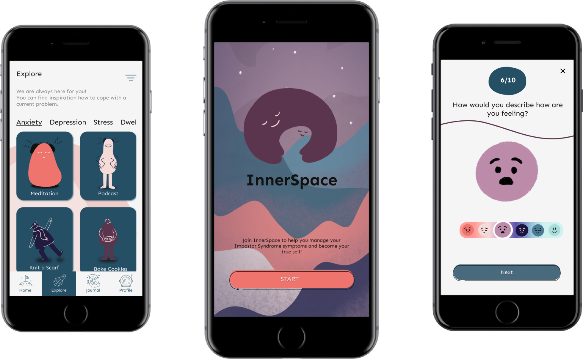
InnerSpace - Overview
Impostor Syndrome(IS) is a psychological pattern in which an individual goes through an internal experience that affects a sense of self-worth. IS reduces self-confidence, causes stress and anxiety, and makes a person suffer from a lack of professional progression at some time in life. All of which, if it’s unaddressed, has a negative impact on one’s wellbeing and that is why we came up with InnerSpace.
The Client (fictional)
What would happen if you could have a partner in crime who would help to overcome your struggles? InnerSpace is for people suffering from impostor syndrome. It focuses on helping them with personalized activities and guidelines based on their needs and accompanies them in their journey of becoming their true self.
The Audience
College students suffering from impostor syndrome and its symptoms.
The Challenge
How can we use AI and machine learning to create a digital solution that helps students to overcome the symptoms of impostor syndrome?
My Contribution
This is a summary of my contribution to the InnerSpace project. Even though I was actively involved in the whole process, these are the hats that were the most enjoyable for me to put on.
Project Management
As a Project Manager I prepared a visual representation suitable for our process. Subsequently, I supervised the proper implementation of all steps and the execution of our strategy. This approach helped my team and me keep up with the tasks, focus on the right things at the right time, and mostly focus on delivering outputs.
UX Researcher
As a UX Researcher I put my hands on collecting insights regarding the target audience. Predominantly, I got involved as an interviewer asking questions about imposter syndrome. These questions have helped us discover the extent to which people’s lives are affected by this mental-health struggle. I was also the main facilitator of user testing during our design process.
UI Designer
As a UI Designer, I took care of the design process. I made sure that the conceptual goal was achieved through visual design when creating mock-ups and prototypes.
InnerSpace - The Development Process
Firstly, given a four-week time span, our team decided to follow agile development methodology which refers to rapidly building a desirable solution with constant interaction with the end-users. Therefore, by following this method we split our process into three individual sprints. The result of each sprint is to deliver a testable prototype in order to go through an iterative design process.
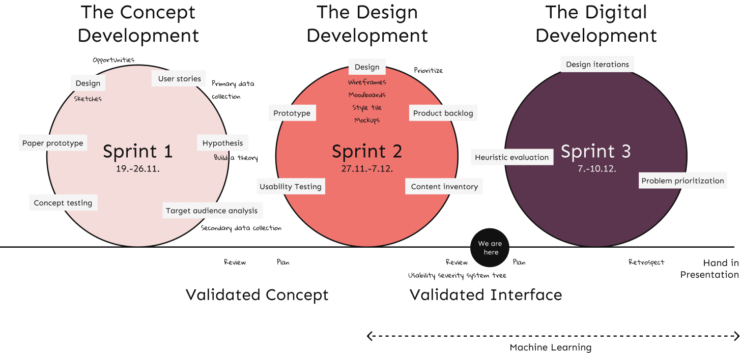
You can choose which part of the process you want to look into. Have fun!
The Concept Development
Secondary data collection.
Firstly, the process began with online desk research that focused on understanding the obstacles impostor syndrome creates in one’s life. That way, we framed a playground for our project and got to understand the seriousness of the topic.
As a result, the research uncovered the following information:
Impostor syndrome affects more women than men up to 70% of the world population students as a result of an academic life
Universally, the symptoms of impostor syndrome group into 5 types:

Perfectionist

Natural Genius
Primary Data Collection
Then, we set hypotheses. To clarify, we based these hypotheses on general statistics. Therefore, they only scratched the surface of information about the target audience – college students.
After that, we challenged the assumptions with our primary data collection. At first, an online survey was carried out, collecting data from 68 students out of which:
The survey pointed at the areas which needed further exploration:
- the impostor type
- the emotional level
- the areas of awareness, and resources for coping with IS.
In order to get a better insight into the needs of students, five unstructured interviews were conducted. Before that, we screening the interviewees based on their previous experiences with impostor syndrome.
The key insights from the interviews showed that the respondents feel: insecure, sensitive, angry, sad, and unproductive. The students also doubt themselves and they feel stuck. In addition, they often isolate themselves and close up in their worlds. Furthermore, they do not know how to ask for help or help themselves and they lack progress in their life.
User Stories
To summarise the insights, user stories were formed as an actionable plan for further process. The individual user stories pointed at specific features/functionalities for the concept that were desired by the students.
Additionaly, the stories focused on the end goal, and therefore these elements would bring value to their lives.
As who I want what so I can why .
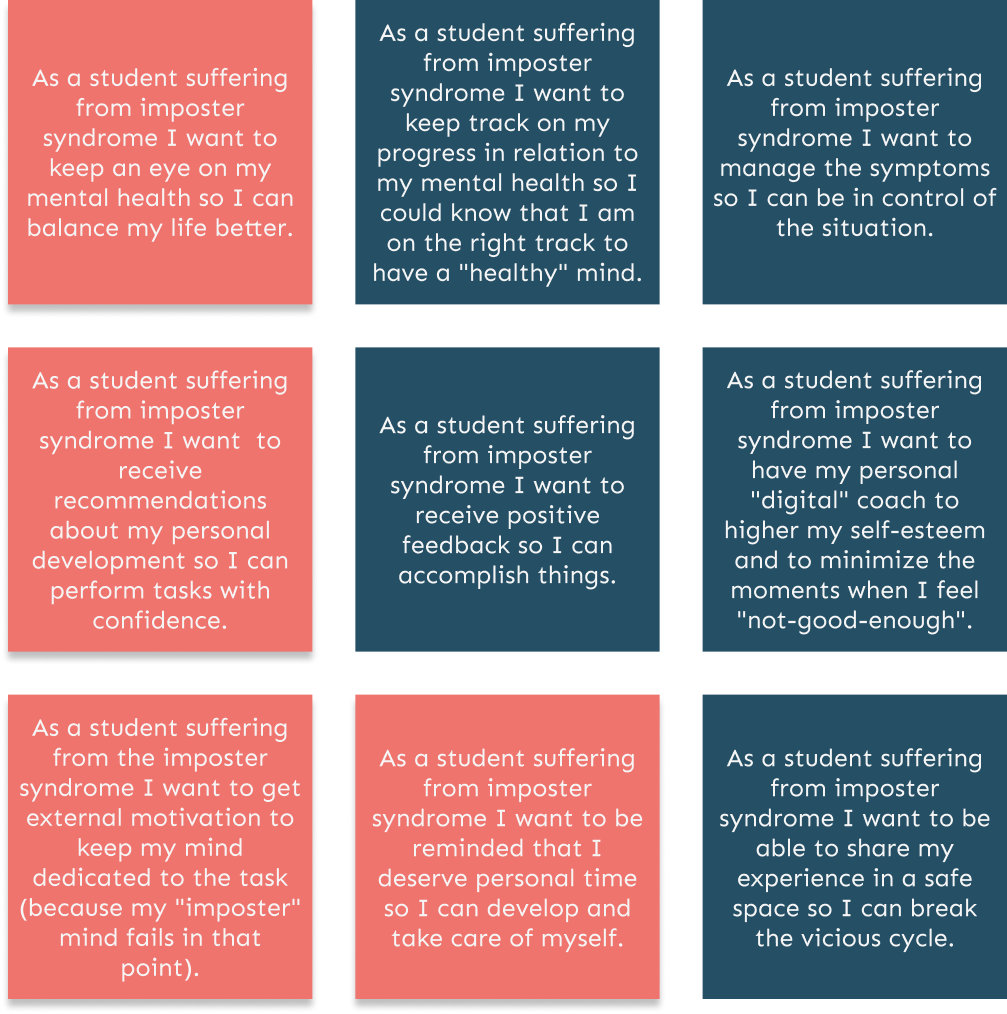
To sum up, all the user stories were considered valuable insights. Nevertheless, the most relevant ones are those highlighted in a salmon colour.
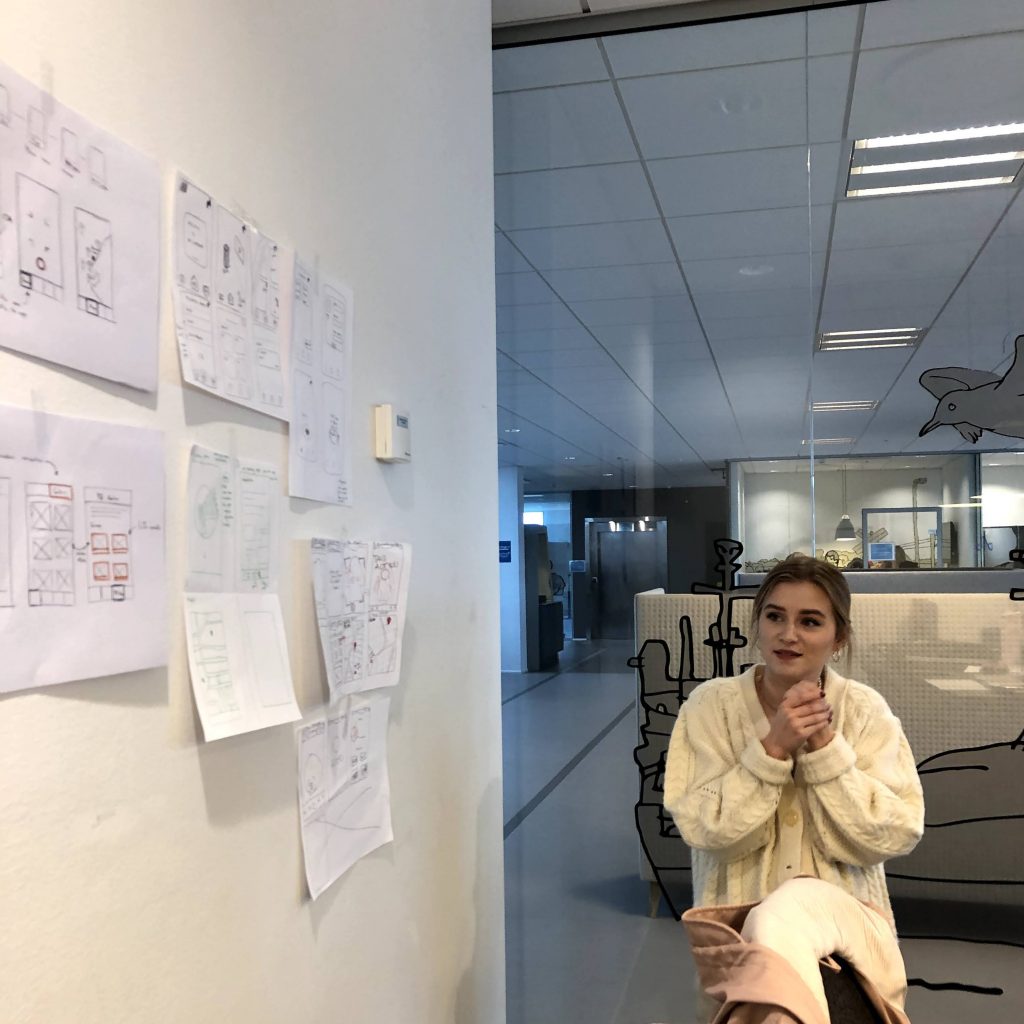
To define the concept and illustrate how it should look like, we drew sketches. Each of the features on the sketches was created to fulfill the user’s needs.
The sketches consisted of an onboarding process with a test that will collect the data for the ML to learn about the user. Then, there will be a “Reflection/ Journal” section so the ML can generate content according to the progress of the user.
Lastly, there will be an “Activities” section where the user will have recommended activities.
The “Profile” section will include the settings and the progress of the user in a form of an art board.
Paper Prototype
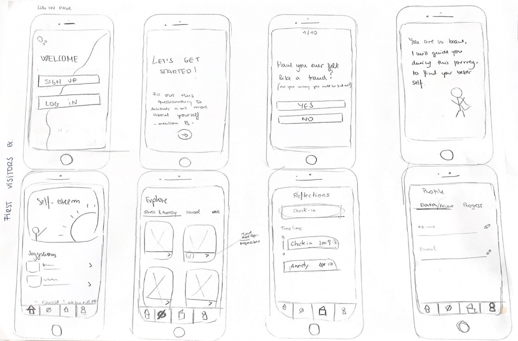
- The onboarding should explain the concept idea + value it can bring to users
- Include a checkbox at the beginning to ask the user how much time they want to spend on the app and how much learning they want to do per day
- Show appreciation in the middle of the test/reflection/journal to keep the user motivated
- Send motivational tips to keep the user motivates using AI/ML statistics
- In the profile section, the artboard should be visible. It would be more encouraging to see the progress and have it personalized. Moreover, as the user improves the art changes, this explanation should be included in that section
Empathy Map, Value Proposition Canvas
To conclude sprint 1, we used an empathy map to unify the insights into the users. That way, we were able to map as-is and to-be scenarios. The main goals for the users are:
- have a sense of belonging
- develop self-confidence in specific situations
- take care of themselves.
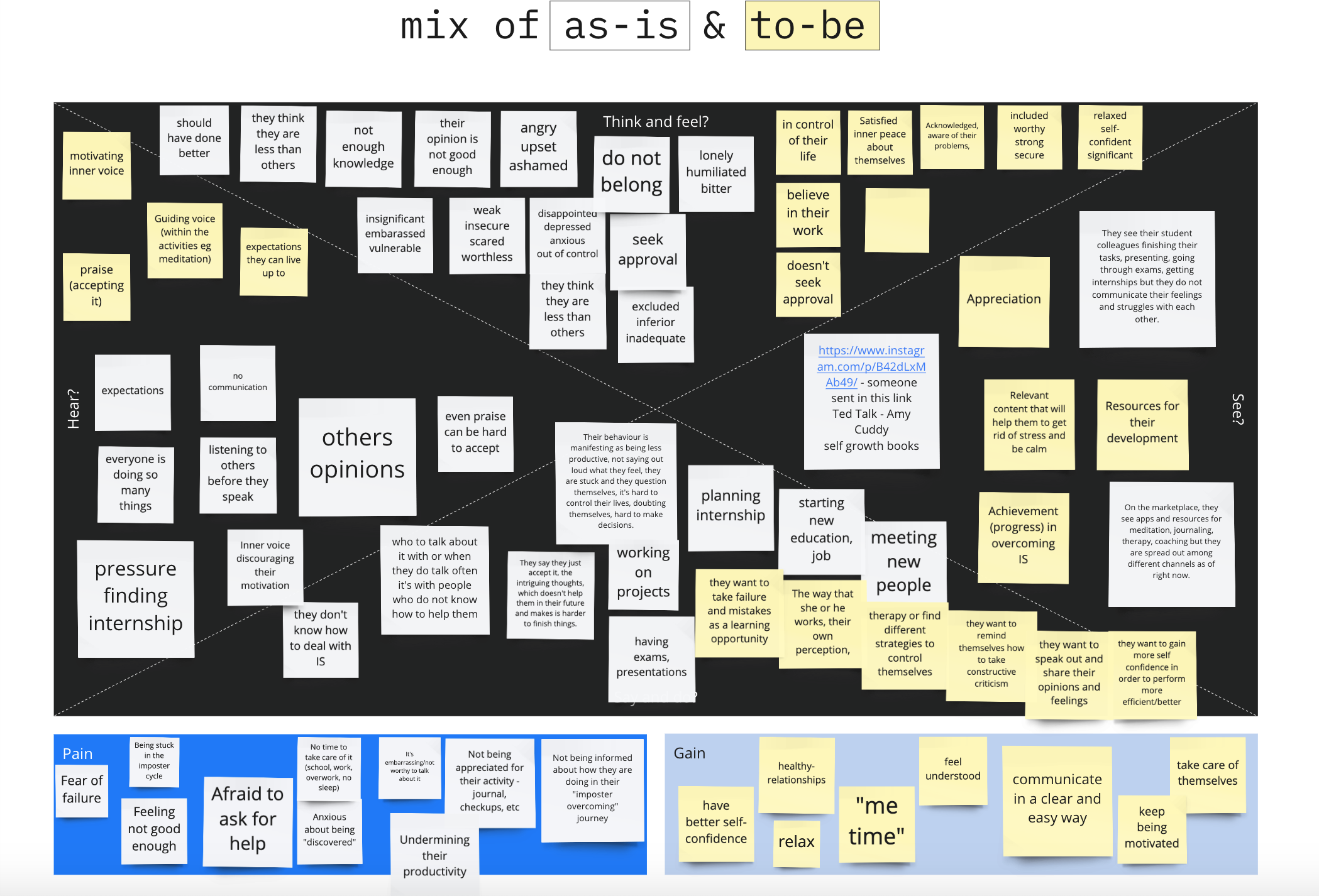
Most importantly, the challenges they are facing: intrusive thoughts, comparison, and feeling stuck. When tackling these problems the users will be able to reach their goals and learn how to gear with different situations impacted by IS.
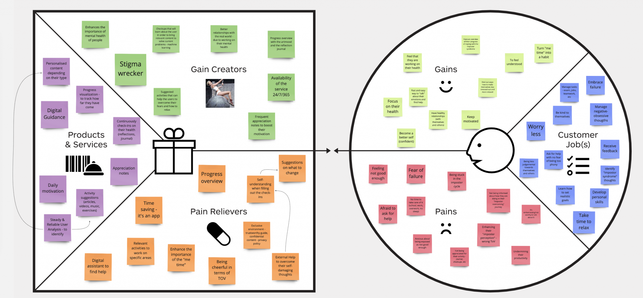
Later on, we used VPC to turn these needs into conceptual features.
The concept “InnerSpace” helps users to deal with the symptoms of IS offering services such as digital guidance and personalized content. Similarly, it creates gain by giving a 24/7/365 service and enhancing the importance of mental health. It relieves some pains the user has by giving relevant activities to work on and giving away self-understanding when doing check-ins in the app.
The Design Development
Content inventory.
As the first step to the interface development, the content inventory was made. Here, the ideas from the sketching + insights from the testing came back to life. The navigation across the platform consisted of four sections:
Firstly, the landing page contains a motivational quote that welcomes the users to the InnerSpace app. There is a list of recommended activities, customized to each user based on his impostor type and progress. In addition to that, a list of recently done activities signifies the latest progress of the user.
- list of activities
- motivational quote
Secondly, the explore page works as an activity library with content that helps a user with overcoming his mental struggles. The content can be sorted by name of a mental struggle, category, or activity. The activities are presented in a form of UI cards.
- search button
- mental struggle categories
Thirdly, the journal page helps a user to map his feelings through checkups which can be taken on a daily basis. The checkups help machine learning to track the user’s progress of how he copes with impostor syndrome. Additionally, this progress is displayed in the form of an artboard on the home page and profile page.
- check-up button
- check- up form
Lastly, the profile page has two sections – account information of the user and progress tracking with artboard. The profile section also includes settings where the user can de/select if he wants to get notifications or not.
- account info (name, avatar, email)
- setting icon
Data Structure for Machine Learning
As seen in the inventory, the ML collects information from:
- the onboarding test
- the check-ups
- the activity of the user.
Then, based on the collected information the user’s impostor type, level and progress is detected.
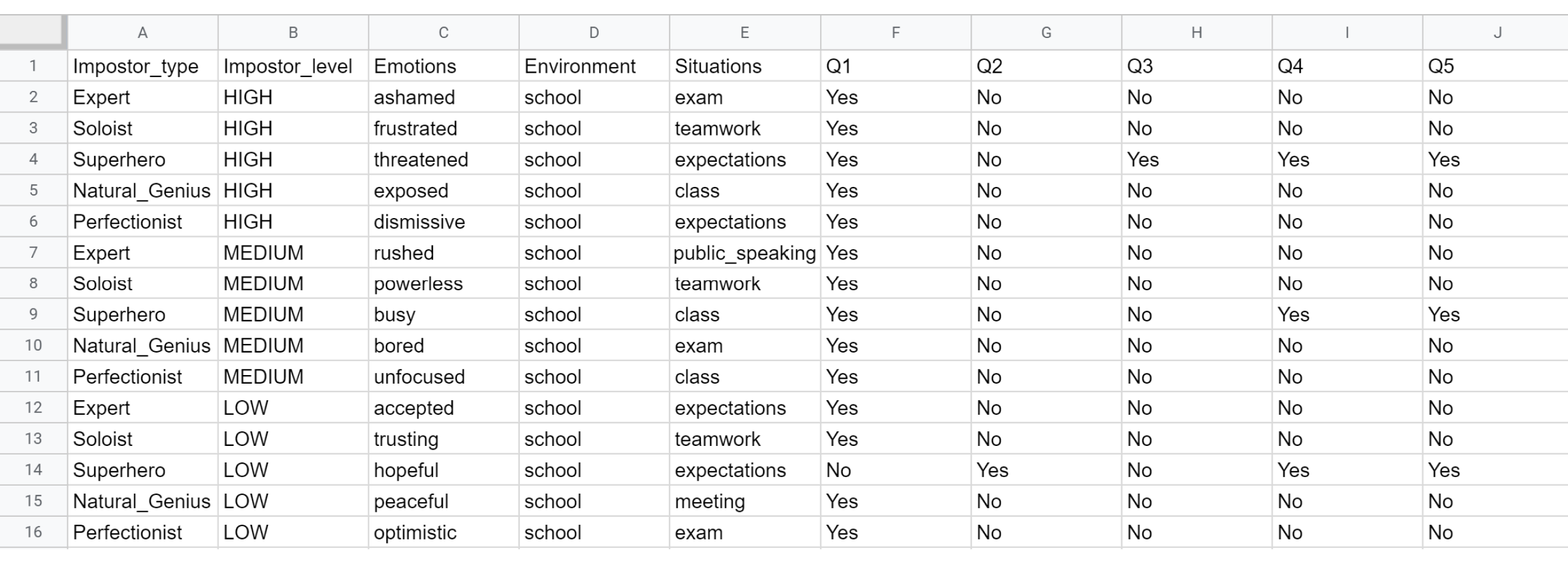
The algorithm uses the information for “Recommended activities”. The progress is showcased in the profile section in a form of an artboard.
Lastly, for machine learning the modeler was set up to fit the criteria of detecting impostor type and level.
User Journey
Moving on, we created a user journey to map the interaction between the user and the solution. Above all, the potential pain points were spotted so we turned them into opportunities.
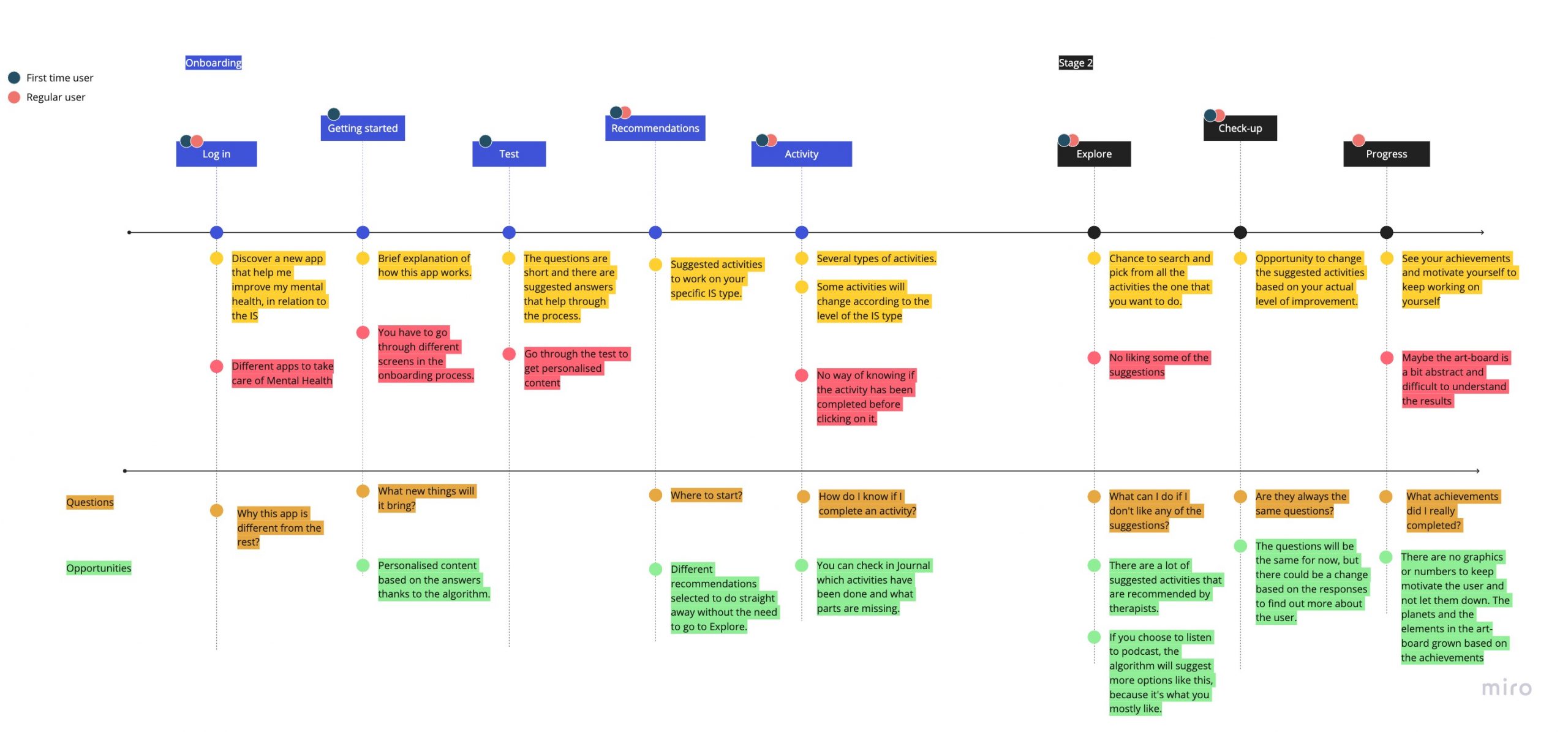
To showcase the user flow wireframes were built.
Most importantly, wireframes also served as a tool to determine the layout and composition of the interface. We achieved that by following the industry standards in order to ensure a user-friendly design that is easy to understand.
Furthermore, wireframes also helped us with maintaining consistency across the whole interface in terms of spacing.
Mood boards & Style Tile
After the wireframes, it was time to dress our concept into fancy clothes. We started building mood boards to unite our vision for the “look & feel” the interface should obtain.
Then, we focused on individual-style tiles. The idea was to combine two concepts; privacy/ safe space, and willingness of working on yourself and improving your lack of self-esteem. These aspects also reflected in the design of the app.
The name selected for the app was InnerSpace, representing the same initials as impostor syndrome – IS. The InnerSpace logo represents how one should take care of his/her inner self.

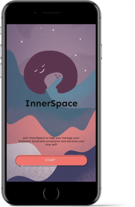
Later on, we designed the mockups according to the style tile that is displayed above. We built the consistency of the colors and elements, as well as bringing the calmness, safety, comfortable space that we wanted to transmit for the users.
In addition, we established a prototype by interconnecting the mockups.
Usability Testing
Firstly, you have been having mental struggles for a while now. You found this app called “InnerSpace” in the store, downloaded it and now you want to know what it is about.
Now, try to adjust the app setting based on your preferences.
After that, you want to find out which type of impostor syndrome you suffer from/have the strongest symptoms of.
Now, that you know your type try to complete an activity.
As you have made some progress with the activity, maybe it’s a good idea to fill out how you feel after that.
Lastly, your feelings and thoughts have changed. That means there’s a progress in, check it out.
The Digital Solution
Problem prioritization.
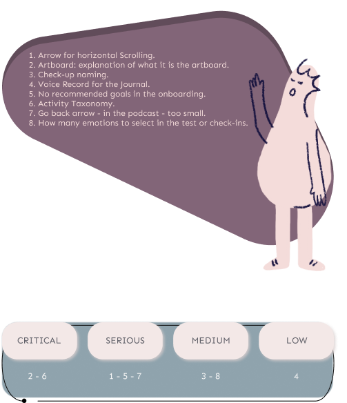
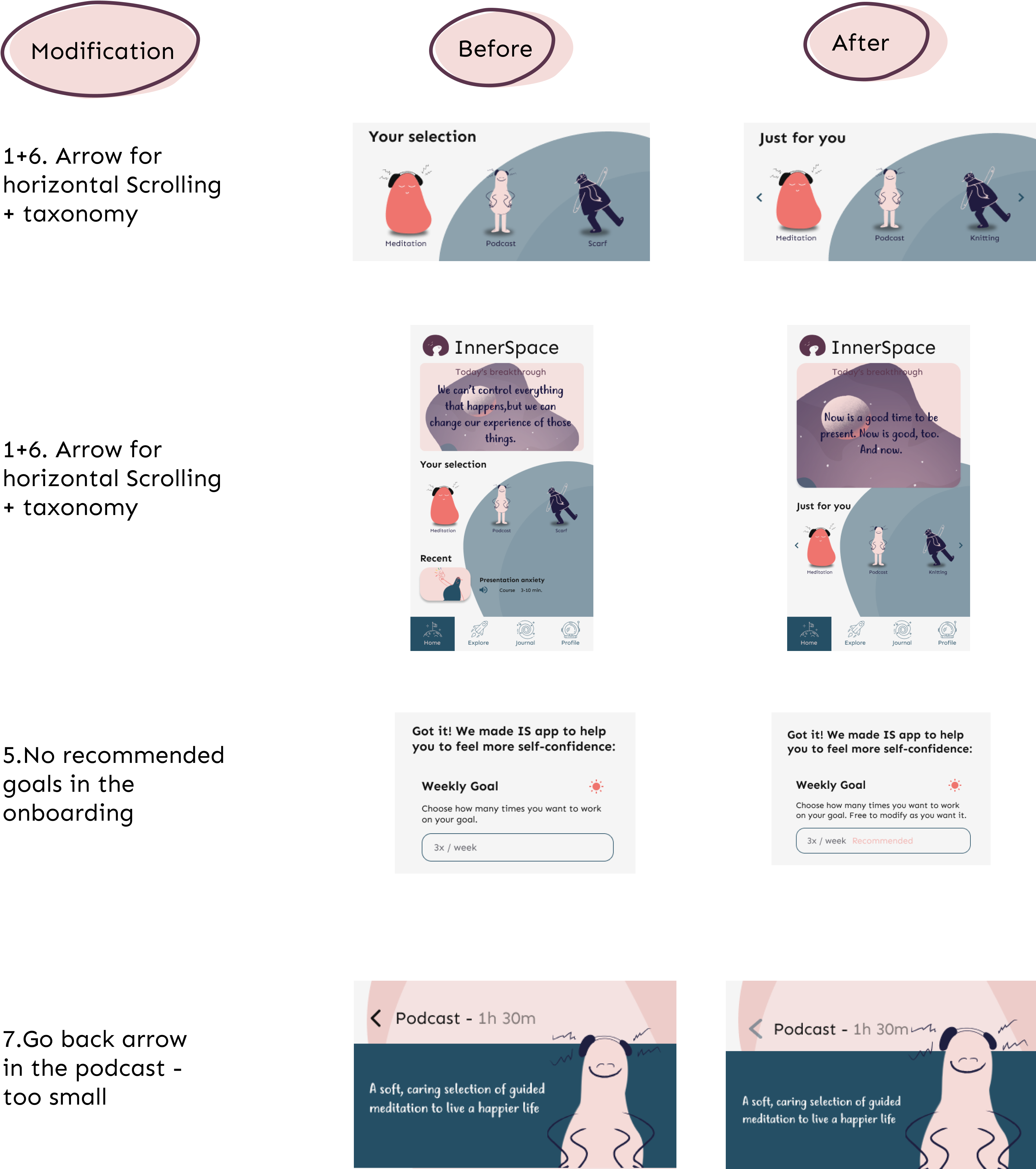
As a result, the problems that were found during the testing were listed and prioritized by following the Usability Severity System Tree, according to a grade of severity influenced by three factors: impact of the issue, the number of users affected by it and the repetition of the issue.
Firstly, issues 2 and 6 are classified as critical. 2 has a high impact on the understanding of the concept. 6 needs to be addressed since the naming of the categories might play a crucial role in terms of user understanding. In other words, it’s important for the users to understand what to expect.
Secondly, issues 1,5, and 7 are serious problems that happened repeatedly for many participants. However, these issues didn’t have high impact.
Thirdly, the medium problems are 3 and 8. They had a low impact but the problem was persistent.
Design Iterations

Heuristic Evaluation
To have the prototype validated on a professional level, 5 experts were asked to evaluate the interface based on rules of thumb.
Above all, the results of the evaluation pointed at contents within the interface and opened space for future improvements and potential iterations:
“ add help button to the interface to help users turn to somebody in case they are confused.”
“ improve the hierarchy in filters to avoid misunderstanding.”, “ reduce the noise a bit that is happening in the background.”.
Overall, the solution helps students to overcome the symptoms by guiding them through a journey of development and self-growth.
Since the ML predicts the type and level of the user it will showcase suggested activities and resources. To clarify, it’s a tool that functions as an interdisciplinary platform of self-help resources. The goal is that the user will reach their desired outcomes in situations when they are dealing with symptoms of IS (eg: presentation, exam, interview).
Finally, the digital solution has the potential to allow students to gain more self-confidence and overcome the syndromes while providing the possibility to reflect on their progress.
Now, let’s dive into the interactive Figma prototype that will guide through the onboarding experience to the app interface. Enjoy!
Learned Lessons
I must admit that InnerSpace it is one of my favorite projects to this day. I loved how my team and I managed the planning and preparations of the process. The execution of the three sprints ran smoothly. Also, we managed to engage our end-users in the process by constantly asking/observing them. That way, I believe I gained confidence in my project management skills and I am looking forward to seeing how I will use them for the upcoming projects.
Nevertheless, given more time, I would have worked more on the interface design, exploring the wonders of interaction design. Also, I would have put bigger importance on the specific activities taking place in the progress. These would be the next points I would pay attention to.
Lastly, I would like to give a shoutout to my amazing team:
- Andrea Gavira Hernandez
- Silvia Artero Alcaraz
- Virág Sákovitsh
Working with a bunch of motivated people always brings me joy and with these talented ladies, we got along as team colleagues and friends who always have fun no matter the case.
Like My Work? Get In Touch!
And don’t forget to check me on my SoMe profiles
Thank you for your visit. I hope I will see you soon

Using Technology to Promote Self-Care and Personal Growth: A Case Study
This case study aims to investigate the impact of COVID-19 stay-at-home orders on mental health and identify potential ways a product could address these challenges.
Problem and Solution
Role : UX/UI Designer
Date : June 2020 - July 2020
Tools : Figma, UsabilityHub, Google Suite
The COVID-19 pandemic has presented many challenges and uncertainties, leading to high levels of anxiety, loneliness, and stress among people. User research has also revealed that there is a need for more consistent practices such as meditation and journaling to help individuals manage these challenges and improve their mental health.
Peace of Mind aims to provide users with the tools and resources they need to take control of their mental health and find peace of mind. By consistently engaging in practices such as meditation and journaling, users can strengthen their psychological well-being and gain a greater understanding of themselves and how to cope with the stresses and changes that life brings. POM is designed to be a supportive and empowering resource for individuals seeking to improve their mental health and wellbeing.

Discovery Research
Research goals.
Clarity on the participant’s mindset and emotional health during the pandemic
Determine the frequency in which the participant engages in the practice of meditation and journal writing
Understand the reasons for engaging in the practice of meditation and journal writing
Gauge the person’s opinion of the effectiveness of meditation and journaling
Understanding Our Target Audience
To fulfill the research goals, I created an online survey using Google Forms and accumulated responses from Slack and Reddit . Take the survey here .

According to user surveys, a significant portion of respondents reported experiencing mental health challenges such as stress and difficulty relaxing. In order to address these issues, many of the respondents turn to meditation and journal writing as effective means of managing their stress and improving their mental health. In fact, 87% of respondents reported using meditation to relieve stress, while 63% used it to alleviate anxiety and depression. These findings suggest that there is a strong need for resources and support related to meditation and journal writing as stress management techniques within this user group.

According to the data provided, journaling was found to be effective by the majority of participants, with an additional 28% finding it "somewhat effective". However, the inconsistent practice of both meditation and journaling seems to decrease their overall effectiveness. In fact, there appears to be a correlation between the frequency of these habits and their perceived efficacy, with only 18.8% of participants practicing meditation daily and 27.8% journaling once a month.
To maximize the benefits of these practices, it may be beneficial to implement an accountability factor in the product to encourage more consistent use. This could involve setting goals or reminders for users to engage in meditation and journaling on a regular basis or providing rewards or incentives for those who do so. By increasing the use of the app, the effectiveness of these habits may be greatly enhanced.
Looking at the Market
In order to better understand the needs and preferences of my target audience with regard to mental health and wellness, I conducted a competitive analysis of two popular meditation and journaling apps: Calm and Headspace. Both of these apps offer a range of meditations for various mental health challenges, as well as features like mood tracking and the ability to share progress on social media. They also provide users with the option to set reminders to hold themselves accountable for their practice. In addition, Calm and Headspace have responded to the COVID-19 pandemic by offering their free subscription to members of certain health insurance providers or to those who have lost their jobs.
However, these apps also have some weaknesses in the market. One common complaint among users is the high price of the subscription, which has been cited as a concern in app store reviews. In addition, some users have reported feeling overwhelmed by a large number of overlapping meditations available on these platforms. These issues could potentially be addressed in order to improve the user experience and make the app more appealing to potential customers.

Empathizing with our Users
Taking all the findings from the user surveys and competitive analysis, I was able to create two user personas to help put a face and backstory on the target audience. In addition, to truly understand what the persona is feeling, I created an empathy map. The empathy map allows me to put myself in their shoes and appreciate their thought process.

Information Architecture
What is their story.
After thoroughly researching and understanding the goals, motivations, and pain points of my target users, I selected 5 user stories as the key features of my product. Using the Pareto principle, I focused on the 20% of features that would be used by 80% of my users, ensuring that the resulting minimum viable product (MVP) would meet the needs of the majority of users while minimizing development time and resources. The user stories that make up the MVP are as follows:
As a user, I want to start a meditation on a specific topic.
As a user, I want to start a journal entry.
As a user, I want to rate my mood.
As a user, I want to rate my sleep.
As a user, I want to set a mindfulness reminder.
User Stories Guide the Flow
To help clearly visualize the steps that users would take when using the key features of my product, I created user flows. These flows detailed the various actions and decisions that users would make as they progressed through each user story, allowing me to better understand the user experience and identify potential points of friction or confusion. By mapping out the user journey in this way, I was also able to create wireframes that captured the overall layout and functionality of the product. This helped me to effectively communicate my design ideas and get a sense of how the product would look and feel for users.

Low-Fidelity Wireframes
To begin the process of crafting wireframes for my product, I first engaged in a quick brainstorming session to generate ideas for the main pages of the product. This involved sketching out various layouts and design concepts to explore different options. Once I had a sense of which sketches to move forward with, I used the user flows I had previously created to guide me in creating each screen of the wireframe.
In the second phase of wireframe development, I used Figma to translate my sketches into low-fidelity wireframes, which provided a more detailed and interactive representation of my design ideas. This allowed me to make adjustments and test out different layouts and features. Once the low-fidelity wireframes were complete, I conducted user testing to gather feedback and identify any areas for improvement. This helped me to refine the wireframes and ensure that they effectively met the needs and goals of my target users.

Visual Design
Brand characteristics.
As the project progressed, I began the process of developing the branding and identity for my product. To ensure that the brand accurately reflected the key characteristics that I wanted it to embody, I used the following values as guiding principles: growth , understanding , tranquility , and accountability . These values informed my decision-making process as I selected the typography and color palette for the brand.
I carefully considered how each font and color choice would contribute to the overall tone and personality of the brand, and experimented with different options to find the best fit. By staying true to these core values, I was able to create a cohesive and consistent brand identity that accurately conveyed the essence of my product.
When selecting a typeface for the meditation aspect of my product, I wanted to find a font that conveyed a sense of lightness and openness. I ultimately decided on a lightweight, wide sans serif typeface, as the thinness of the font could symbolize the burden and stress being lifted through the act of meditation.
For the journaling aspect of the product, I wanted to choose a font that had a more handwritten feel to it, to reflect the informal and personal nature of journaling. I, therefore, decided on a serif typeface that had a brisk, lively quality, evoking the feeling of quickly noting one's thoughts in a notebook. This led me to choose Playfair Display and Manrope as the brand's typefaces. These fonts helped to create a cohesive and visually appealing brand identity that accurately reflected the essence of my product.

Color Palette
Based on my research, it is clear that many people use meditation apps to help them manage their anxiety, reduce stress, and achieve personal growth. With these findings and the desired brand characteristics of growth, understanding, tranquility, and accountability in mind, I wanted the colors used in my product to create a sense of safety and serenity for users. To achieve this, I chose colors that were low in saturation, which can convey a sense of calmness and peacefulness.
Additionally, I carefully considered how each color would contribute to the overall tone and personality of the brand, and selected shades that aligned with the values I wanted to embody. By thoughtfully choosing colors that reflected the goals and needs of my target users, I was able to create a cohesive and consistent visual identity for my product that effectively conveyed its purpose and benefits.

Usability Testing
Testing process.
During the development process of Peace of Mind (POM), I conducted two rounds of in-person user testing to gather feedback and validate my design decisions. The first round was focused on testing the assumptions I had made in the low-fidelity wireframes, while the second round took place after I had incorporated typography, imagery, and color palette into the screens to create a high-fidelity prototype.
I recruited two participants for both rounds of testing: a 29-year-old nurse with a Bachelor's degree and a 26-year-old behavioral technician with a Bachelor's degree. To gather feedback, I asked questions at three different points: before the test (focusing on demographics, relationship with stress, and experiences with meditation and journaling), after the task was completed (to understand motivations for taking specific actions), and after the test was completed (focusing on overall experience with the product). This helped me to gather valuable insights and make informed decisions about the design and functionality of POM.
Results and Takeaways
First Round of Testing:
During the first round of testing, users identified an issue with the process of selecting a meditation lesson. They reported finding it confusing and mentioned that they felt that the user interface (UI) elements did not provide enough information about the content of each lesson. Upon further clarification, it became clear that users would benefit from having more descriptive information about each lesson in order to better understand what they might entail and decide which session to choose.
To address this issue, I could consider adding more detailed descriptions of each lesson to the UI, or providing users with the option to preview or sample the lessons before making a selection. By providing users with more information about the content and focus of each lesson, I can help to improve the clarity and usability of the meditation selection process.

Second Round of Testing:
During the second round of testing, participants noted that the screens related to the task "Adding a mindfulness reminder" did not match the visual style of the rest of the app. They suggested revamping these screens to better align with the overall aesthetic of the project.

What worked?
As I reflect on the development process of Peace of Mind (POM), I believe that two things went particularly well. First, the visual design of the product effectively conveyed the mood and characteristics that I wanted it to embody. Through the use of colors, typography, and a style guide, I was able to create a cohesive and consistent visual identity that accurately reflected the values and goals of the brand.
Second, the user research I conducted proved to be invaluable in identifying and addressing the needs and challenges of my target audience. The assets I created, such as user personas and an empathy map, helped me to deeply understand the experiences and issues faced by my users, and the problem was clearly defined. Through this research, I was able to develop solutions that effectively addressed the problems users had been dealing with, such as:
COVID-19 and stay-at-home orders were taking a mental toll on people.
Two mental health exercises that professionals deem beneficial, which are journaling and meditation are being practiced by the users but not on a consistent basis. This doesn’t help train the mind as effectively as it can be trained.
Through my research, I have identified several solutions that Peace of Mind (POM) offers to users in order to address their needs and challenges:
A space where they can practice meditating using different topics and journal writing.
Accountability - by allowing them to do daily check-ins on their sleep and mood and by setting reminders for sleep, meditation, or journaling.
These solutions have been developed based on a thorough understanding of the goals, motivations, and pain points of my target audience, and are designed to help users improve their mental health and well-being through the practices of meditation and journaling. By offering a range of resources and tools to support these practices, POM aims to empower users to take control of their mental health and find greater peace of mind.
What would you do differently next time?
To further expand and improve the Discovery Phase of my project, there are a few additional steps I would consider taking. First, I would conduct a competitive analysis of note-taking apps in the market to better understand the landscape and identify areas for differentiation. Second, I would add a diary study to gather more in-depth insights about the effectiveness of journaling and journal writing with users. This could involve asking users to keep a journal for a set period of time and tracking their experiences and outcomes. Finally, I would add user interviews after the surveys to provide more context and depth to my personas.
In terms of usability testing, there are also a few ways I would aim to improve the process if I had more time. First, I would create usability test goals to structure the questions I ask during the test and focus on specific topics. This would help me to better understand the user experience and identify areas for improvement. Second, I would conduct more tests to gather more data. One way to do this would be to use tools like maze.design, which allow designers to upload their screens, set goals, and gather feedback from participants. Another option would be to conduct more remote testing, which could allow me to reach a wider and more diverse group of users. By implementing these improvements, I can gather more thorough and actionable insights about the usability and effectiveness of my product.
What are the next steps?
Looking ahead, there are a few areas of Peace of Mind (POM) that I would like to focus on improving. First, I plan to spend more time refining the visual design of the project, including iterating on the logo and possibly adding an icon. By continuing to develop and polish the visual identity of POM, I hope to create a more cohesive and visually appealing product.
Additionally, I plan to re-conduct usability tests to gather more in-depth insights about the user experience. This time, I will be sure to set written goals, focus my questions on specific topics, and include more participants in the testing process. By using a more structured and systematic approach to usability testing, I can gather more actionable and reliable data to inform my design decisions. By making these improvements, I hope to create a product that is intuitive, user-friendly, and effective at meeting the needs of my target audience.

Illustrator
Mental Health App- My First UI/UX Case Study

Creative Fields

- first case study
- mental health
- Mental Health App
- UX Case Study
No use is allowed without explicit permission from owner
Up to 40pc of mental health conditions are linked to child abuse and neglect, study finds
In 1996, Ange McAuley was just 11 years old when ABC's Four Corners profiled her family living on Brisbane's outskirts.
At the time her mother was pregnant with her sixth child and her father had long ago moved back to Perth.
WARNING: This story contains details that may be distressing to some readers.
It was a story about child protection and the program was profiling the role of community volunteers helping her mother, who had been in and out of mental health wards.
Ange was the eldest and it fell to her to get her younger siblings ready for school.
By the time the new baby arrived, she would stay home and change nappies.
"It was pretty crazy back then — I wasn't going to school a lot," she said.
By that age she was already holding a secret — she'd been sexually abused at age six by her stepfather, who would later be convicted of the crime.
"Back in the nineties, a lot of people kept stuff hidden and it wasn't spoken about outside of the family," she said.
"I've carried all these big burdens that weren't even mine. Sexual abuse happened to me. I didn't ask for it."
She says the trauma triggered a lifetime of mental health problems from substance abuse and self-harm as a teen, right through to post-natal depression.
Hidden source of our mental health crisis
A new study from the University of Sydney's Matilda Centre has established just how much Australia's mental health crisis can be traced back to this kind of childhood abuse and neglect.
The research has found that childhood maltreatment is responsible for up to 41 per cent of common mental health conditions including anxiety, depression, substance abuse, self-harm and suicide attempts.
The research, which draws on a 2023 meta-analysis of 34 research studies covering 54,000 people, found maltreatment accounted for 41 per cent of suicide attempts in Australia, 35 per cent of self-harm cases and 21 per cent of depression episodes.
It defined childhood maltreatment as physical, sexual, emotional abuse, emotional or physical neglect and domestic violence before the age of 18.
Lead researcher Lucy Grummitt said it is the first piece of work to quantify the direct impact of child abuse on long-term mental health.
It found if childhood maltreatment was eradicated it would avert more than 1.8 million cases of depression, anxiety and substance use disorders.
"It shows just how many people in Australia are suffering from mental health conditions that are potentially preventable," she said.
Dr Grummitt said they found in the year 2023 child maltreatment in Australia accounted for 66,143 years of life lost and 118,493 years lived with disability because of the associated mental health conditions.
"We know that when a child is exposed to this level of stress or trauma, it does trigger a lot of changes in the brain and body," Dr Grummitt said.
"Things like altering the body's stress response will make a child hyper-vigilant to threat. It can lead to difficulties with emotion regulation, being able to cope with difficult emotions."
While some areas of maltreatment are trending down, figures from the landmark Australian child maltreatment study last year show rising rates of sexual abuse by adolescents and emotional abuse.
That study found more than one in three females and one in seven males aged 16 to 24 had experienced childhood sexual abuse.
Dr Grummit says childhood trauma can affect how the brain processes emotions once children become teens.
"It could be teenagers struggling to really cope with difficult emotions and certainly trauma can play a huge role in causing those difficult emotions," she said.
Mental health scars emerge early
For Ange, the trauma of her early years first showed itself in adolescence when she started acting out — she remembers punching walls and cars, binge drinking and using drugs.
"I would get angry and just scream," she said.
"I used to talk back to the teachers. I didn't finish school. Mum kicked me out a lot as a teenager. I was back and forth between mum and dad's."
By the time she disclosed her abuse, she was self-harming and at one point tried to take her own life.
"I was just done," she said.
"I was sick of having to get up every day. I didn't want to do it anymore."
Later on, she would have inappropriate relationships with much older men and suffered from depression, including post-natal depression.
"It's definitely affected relationships, it's affected my friendships, it's affected my intimate relationships," she said.
"Flashbacks can come in at the most inappropriate times — you're back in that moment and you feel guilt and shame.
"I feel like it's held me back a lot."
Calls for mental health 'immunisation'
Dr Grummitt said childhood abuse and neglect should be treated as a national public health priority.
In Australia, suicide is the leading cause of death for young people.
"It's critical that we are investing in prevention rather than putting all our investments into treatment of mental health problems," she said.
Her team has suggested child development and mental health check-ins become a regular feature across a person's lifetime and have proposed a mental health "immunisation schedule".
Chief executive of mental health charity Prevention United, Stephen Carbone, said they estimate that less than 1 per cent of mental health funding goes toward prevention.
"There's been a big steady increase in per capita funding for mental health over the last 30 years but that hasn't translated into reductions," Dr Carbone, a GP, said.
"You're not going to be able to prevent mental health conditions unless you start to tackle some of these big causes, in particular child maltreatment."
He said most of Australia's child protection system was about reacting to problems rather than trying to prevent them.
"If you're not tackling the upstream risk factors or putting in place protective factors you just keep getting more and more young people experiencing problems and services being overwhelmed," he said.
Now a mother of two teens herself, Ange says she wants to break the cycle and has been going to therapy regularly to help identify and avoid destructive patterns that she's seen herself fall into.
"I love my girls so much and I want better for them."
- X (formerly Twitter)
Related Stories
Generation overwhelmed: these kids fought back against a national health crisis — and won.
'It's a really massive deal': Unpacking what's going on with Gen Z and ways to improve teen mental health
'The air went out of the room': Shocking new statistics on the abuse and neglect of Australian children
- Child Abuse
- Child Health and Behaviour
- Mental Health
- Post Traumatic Stress Disorder
- University of New South Wales

IMAGES
VIDEO
COMMENTS
A situation that generates deep concern and is a call to national health authorities is that 60% have felt the need to ask for help concerning their physical and mental well-being. Despite this, 40% did not ask for help. Symptoms of an anxiety attack include: feeling faint or dizzy. shortness of breath. dry mouth. sweating. chills or hot flashes.
Hints: an app that cares about your mental health — UI/UX case study. ... Anyone of us could meet, at some point, with the struggle of a mental health issue, or become trapped in depression or loneliness. Most people also wish they could develop their social skills to build better relationships and truly connect with others. Our approach to ...
Sage is a mental health application that I designed through Springboard's UI/UX Design Bootcamp. This case study elaborates on the design process followed. Problem. Mental health has always been a neglected area within the Healthcare Sector. These issues have been and continue to be stigmatized, especially in India.
Up to Mark😎. In a 4-week design sprint, my team and I designed a solution to help de-stigmatise the idea of mental health illnesses, build awareness, provide help, support and resources to manage the same.. Basic Intro😅. My Role — — Ideation, Research, Define, User Interface & Design Flow. Key Skills — — Extensive Research and Analysis, Visual Design.
Cognitive Model or Cognitive Behavioral Therapy is based on the idea that how we think (cognition), how we feel (emotion) and how we act (behavior) all interact together. Specifically, our thoughts determine our feelings and our behavior. In case if you want to read more about the form structure: Source Link.
Case study: Designing a mental health application. It's been over a year now that we are all dealing with the Covid-19 pandemic. Some of us lost some of our relatives or friends. Many of us couldn't travel and see our loved ones for several months. Some lost their job, and most of us are still dealing with the curfew or even confinement.
1. M ental health is in the worst situation. Mental Health is a very broad term and it has always remained Personal to each Individual. Recently millennials have started openly expressing it but there seems to be no good remedy. Since 2013, millennials have seen a 47% increase in major depression diagnosis as per a report from Blue Cross Blue ...
The solution is the creation of a mental health counseling service application called Soul App. Through research, idea generation, design, and user testing, flaws are discovered, allowing for refinement of the Soul App concept. Further iterations are required to meet user needs. Lessons learned from this case study include the following:
21. Published: May 20th 2021. Bloom is your personalized journey to a healthy state of mind. It combines digital therapy, guided journaling, and emotional analysis to give you a new personalized digital therapy experience. Through guided video classes, you will learn new self-care….
You would be shocked to know that nearly 15% of the world's mental health problems are found in India. A severely understaffed sector serves the world's most populous nation with only 0.75 ...
Based on data in 2020, more than 1.2 billion children aged 10 to 19 years in the world. it is estimated that 13% of them have a mental disorder. This means that there are 86 million children aged 15-19 years and 80 million children aged 10-14 years who have mental disorders. Based on the literature, it is necessary to conduct further ...
Designing a mental healthcare platform — a UX case study. According to the State of Mental Health in America (2019 ), 56.4% of adults (over 24 million) suffering from mental illness receive no treatment. Major barriers listed were "no insurance or limited coverage of services, shortfall in psychiatrists, lack of available treatment types ...
81% practice mindfulness by doing meditation and breathing exercises. 60% found meditation/ breathing exercises to be most effective. 68% practice to manage stress, anxiety, and depression. 44% ...
Later on, we used VPC to turn these needs into conceptual features. The concept "InnerSpace" helps users to deal with the symptoms of IS offering services such as digital guidance and personalized content. Similarly, it creates gain by giving a 24/7/365 service and enhancing the importance of mental health.
This case study aims to investigate the impact of COVID-19 stay-at-home orders on mental health and identify potential ways a product could address these challenges. Problem and Solution. Role: UX/UI Designer. Date: June 2020 - July 2020. Tools: Figma ... Both of these apps offer a range of meditations for various mental health challenges, as ...
Topic. Mental Health is a growing share of the health market, especially with the recent confinements due to Covid-19. There are many apps proposed on different app stores that cater to these issues, but our assumption is that the tone and design of these apps might turn-off some people with mental health issues, and wondered how the idea of an app with a more witty and sarcastic tone would be ...
In a study conducted by the AUCCCD in 2019, small-sized campuses have 1 mental health staff member for every 664 students, with midsize campuses having a ratio of 1 to 1,864, and large campuses 1 ...
This project to create a user-friendly mental health app aims to break down barriers to mental health support by providing easy access to resources and tools anytime and anywhere. By offering a mobile platform, to ensure that users can access the app conveniently. Incorporated features such as mood tracking and self-reflection are powerful ...
C. Having a solid understanding and the importance of the case study and its structure is very crucial in the UX process. D. Designing is a very smaller part of the huge system of UX. So more focus should be given to the discovery, research, and ideation part to make a project successful. My social links: Dribbble. Instagram. Linkedin. Wattpad----
It entails serious consequences for the social sphere, human rights, and the economy. Mental health is an integral part and an essential component of health. Facts in numbers: mental illness ...
UX/UI Case Study Mental Health. This design project was created to help people with mental health problems. It provides them with necessary information about their condition and Read More. This design project was created to help people with mental health problems.
UI/UX,Figma,Adobe Photoshop,Adobe Illustrator. Mental Health App- My First UI/UX Case Study
Amazing mental health ui ux case study work, designs, illustrations, and graphic elements. Explore thousands of high-quality mental health ui ux case study images on Dribbble. Your resource to get inspired, discover and connect with designers worldwide.
The key to making the research findings actionable is tracing the design decisions back to the research opportunity that originated them. In this article, I share my experience using workshops to ensure that the research projects deliver insights that are actively used by the organizations to make informed decisions.
The research has found that childhood maltreatment is responsible for up to 41 per cent of common mental health conditions including anxiety, depression, substance abuse, self-harm and suicide ...